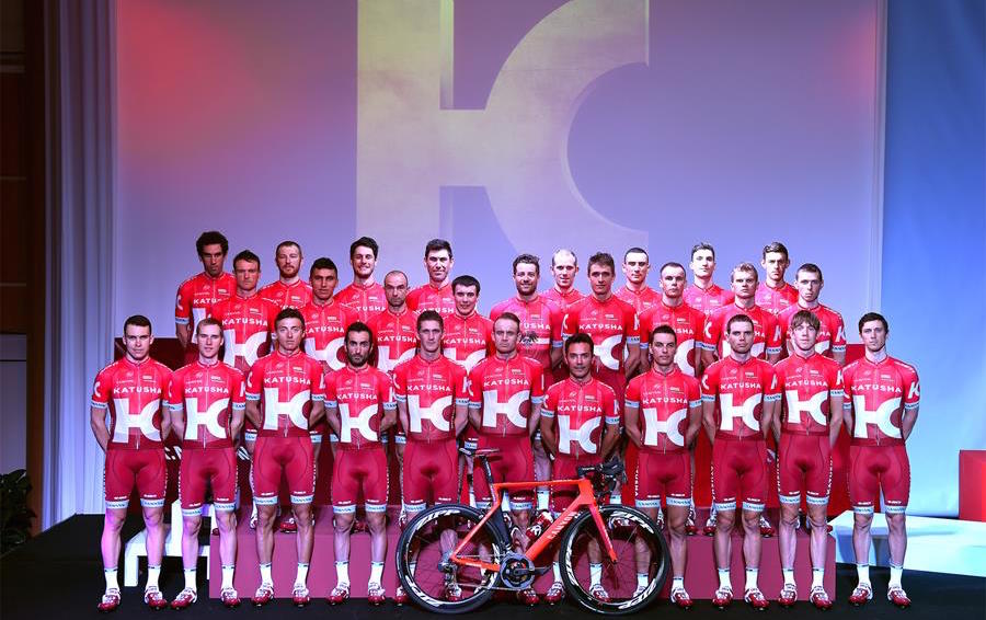
Katusha launch major rebrand with new-look kit
Russian squad unveil a redesigned jersey and rebrand for the 2016 season

Katusha riders will look decidedly different in the peloton next year, as the Russian team unveiled a completely new-look kit and brand for 2016.
The team revealed it has swapped its white, red and blue strip, for an entirely red jersey with a large white ‘K’ logo, and dark red shorts, at a launch for the new season in Calpe, Spain.
Previously dubbed the Global Russian Cycling Project, Katusha had said the rebrand was a bid to adopt a more international identity, as it prepares to embark on its eighth season in cycling.
>>> 2016 cycling team kits: latest strips revealed
Alexander Kristoff and Joaquim Rodriguez were on hand to model the new kit, which comes with the motto “race to win”, alongside new signings such as Jurgen van den Broeck and Rein Taaramäe.
The team’s general manager Viatcheslav Ekimov said the aim in 2016 is to become the best cycling team in the world and finish top of the WorldTour team ranking — they finished second to Movistar this year.
“We only missed a few points to be the number one team in the world [in 2015] and this gives us motivation to strive for more,” he said.
The latest race content, interviews, features, reviews and expert buying guides, direct to your inbox!
Kristoff also revealed he will race at the Amgen Tour of California in May for the first time in 2016, rather than at his home Tour of Norway as he has the last three years.
As well as the new kit and logo, Katusha announced it’s creating a clothing company called Katusha Sports, with a range of men’s performance clothing available in April, followed by a men’s and women’s urban range in the autumn.