2011 Team kit: Hot! or Not!
The 2011 season is ready to start. Never mind who's going to win races, which team has the best buses or whether Cav or Greipel's going to win stages at an early season training race. Let's ask the important question: which teams kits are hot, and which are not?
Words by William Irwin
HOT!
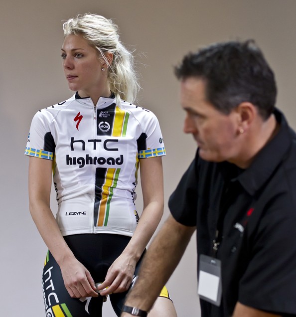
HTC
Some people love it, some people hate it. The people who hate it are wrong. It’s all about the vertical stripes in 2011. In four years’ time, everybody’s going to have 1970s-style vertical stripes and Vs, and we’ll all look the same again, but enjoy this kit while it stands out.
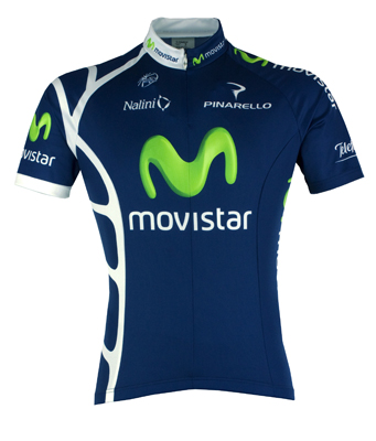
A few years ago, every team was wearing blue – it was the cycling equivalent of a wearing a Gap polo shirt. Then they all moved onto white, and now black. Good for Movistar – they’ve gone back to a very classy shade of blue, and even the lime-green M, which looks like the riders have been blowing snot out of their nose on a cold day, hasn’t managed to ruin it.
The latest race content, interviews, features, reviews and expert buying guides, direct to your inbox!
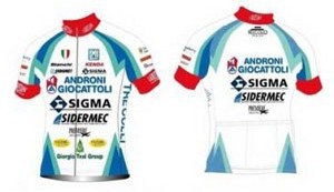
Androni Giocatelli
At first look, this is an aberration. But cast aside your prejudice. It’s got a kind of retro cool - like 1950’s and 60’s advertising. You might want to combine it with a cloth flat cap and a glass of Cinzano. Plus, everybody with an opinion and a broadband connection thinks it’s witty to slag this one off. Ha ha ha! Look! They’ve got lots of sponsors!
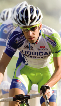
Liquigas
This year Liquigas have toned down the luminous rainforest camouflage and embraced more white in their jersey design. We nearly like it.
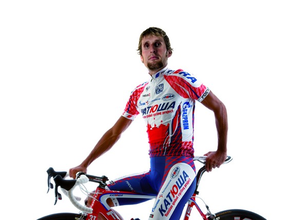
Katusha
This time last year, we were all tutting about how bad cityscapes look on cycling jerseys. This year, a straw poll in the office reveals that everybody actually quite likes this year’s Katusha kit. Fickle.
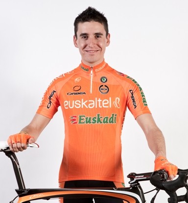
Euskaltel-Euskadi
Bright orange is not a look to be worked by anybody with pale skin, which makes this kit more or less unwearable in the British Isles. But the Euskies’ kit looks inexplicably good with black shorts, and all the black kit in the peloton this year is really going to bring out the orange.
YOU ALL LOOK THE SAME TO US!
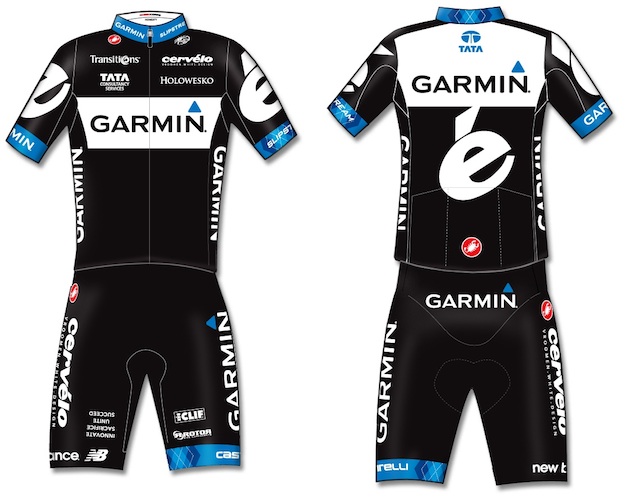
Garmin-Cervélo
Supporting the adage that good-looking parents often don’t have good-looking kids, combining the Garmin and Cervelo looks hasn’t exactly worked here. Oi, Vaughters! Give us back our Argyle!
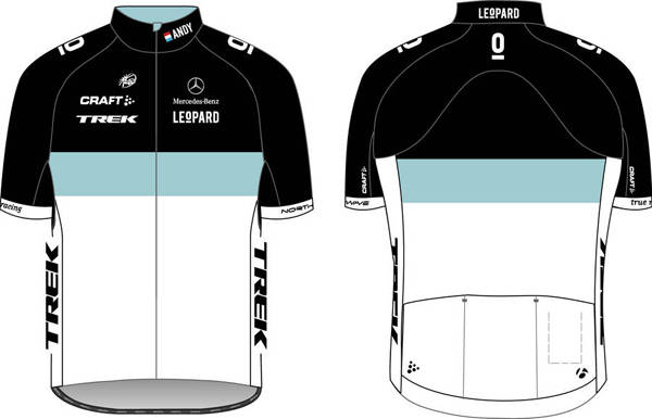
Leopard-Trek
This is about as interesting as train spotting or Kate Middleton or, well, Luxembourg. Neutral, easy colours with minimal design input. Nothing to see here. Next!
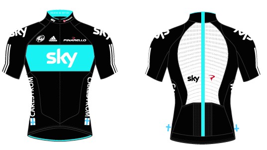
Sky
Nothing with that much black on it could ever look bad, but they’re suffering from the fact everybody’s copied their idea. It's going to make leadouts a nightmare in 2011 - Garmin will be leading Sky, Sky will be leading Leopard, and Cav's going to win anyway. It's also on probation for the big white panel on the back, and the marketing-inspired "thin line".
NOT!
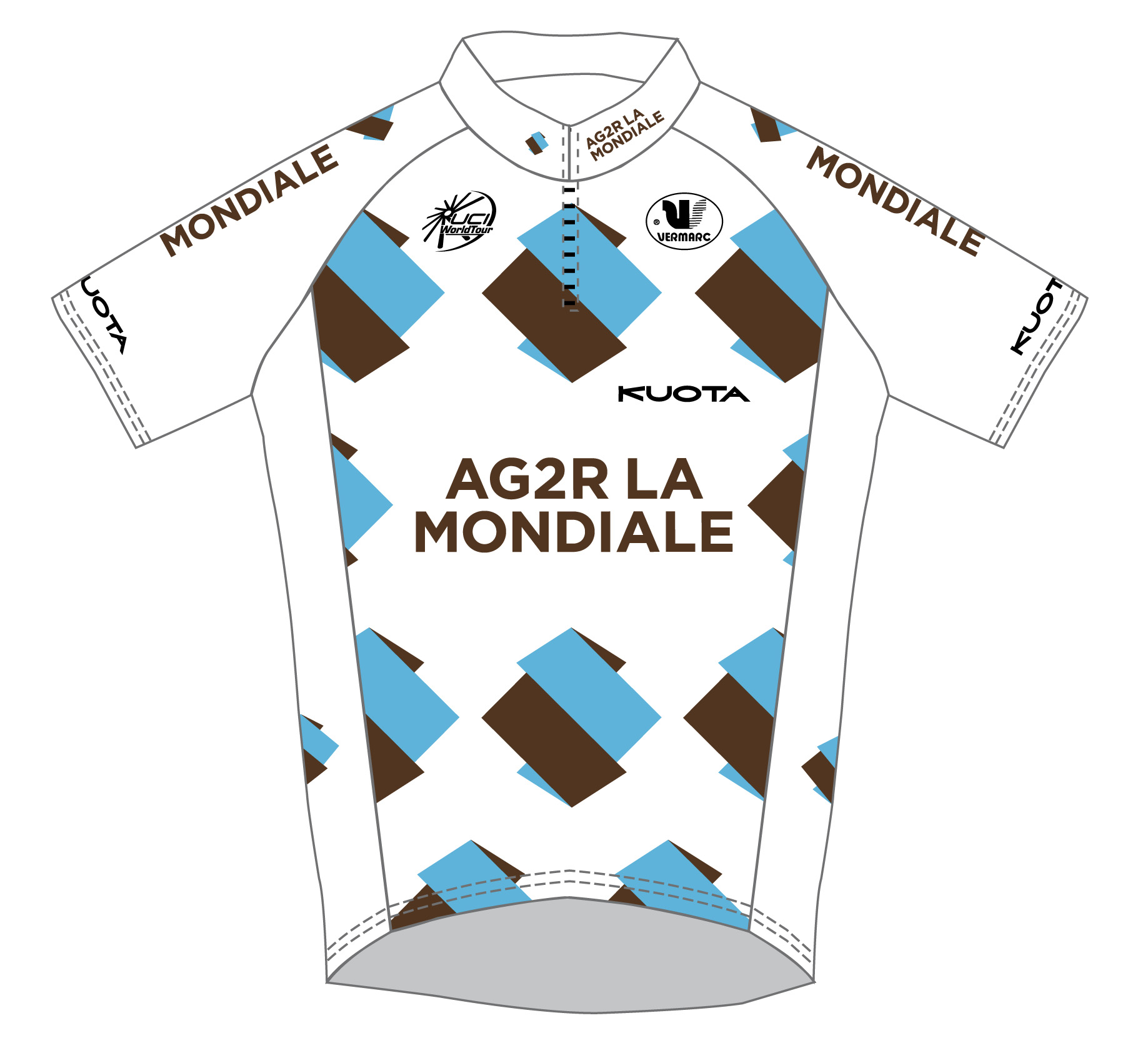
Ag2r
We’d have liked to have been a fly on the wall at Ag2r’s first design meeting – “we’re thinking we’ll have a white background covered in odd diamond thingies half coloured blue and half the colour of faeces”.
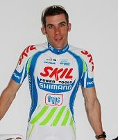
Skil
The Skil logo looks like its been designed on Microsoft Paint. We suppose they couldn’t help that, but did they really need the green? If this kit was a person, it would be one of those drunks on Croydon High Street, shouting aggressively at passers-by.
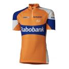
Rabobank
Throw a tangerine across a room and try to focus on it while it’s moving very fast. That is what you’ll look like cycling in one of these.
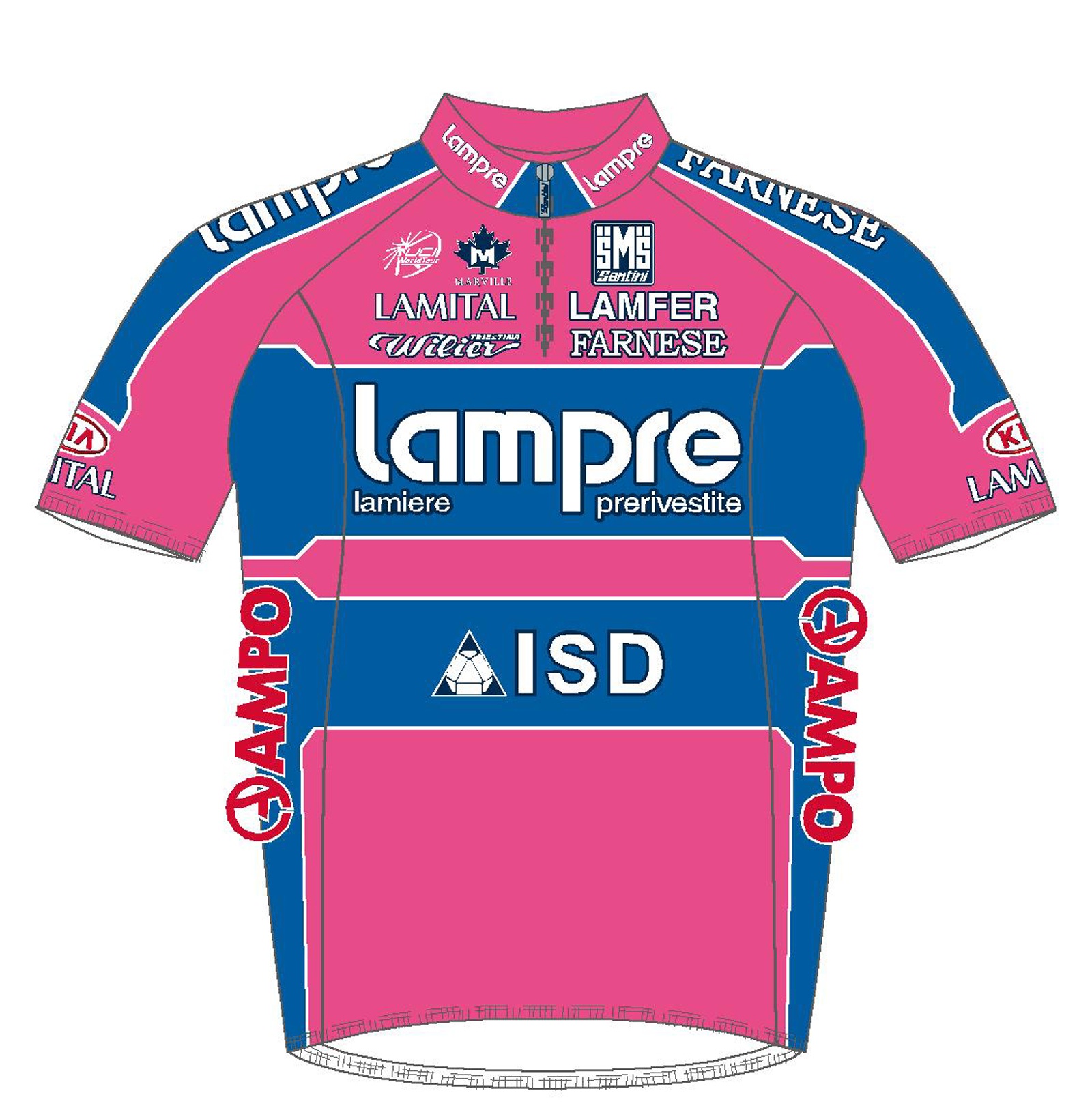
Lampre
Pink and blue. That should tell you everything you need to know about the Lampre kit.
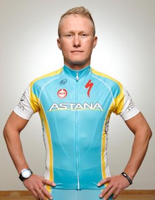
Cyan is always, always going to be rubbish. As is yellow. It looks like it was designed on a ZX Spectrum.
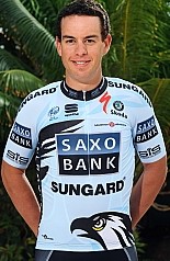
Saxo Bank
It looks like last year’s, only after having been through the hot wash with Movistar’s kit. There’s also a picture of a generic bird of prey on it, just poking its head out of the riders’ shorts.
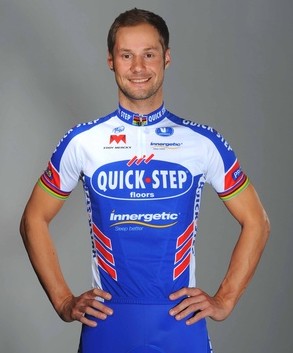
Quick Step
Quick Step had a winning jersey design last year and have somehow managed to butcher it whilst keeping it broadly similar. This is what happens when branding consultants stroke their goatee beards, adjust their trendy spectacles and add three red stripes to what would otherwise have been a decent design.
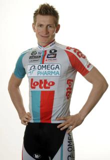
Omega Pharma-Lotto
The Omega Pharma logo is brutal. It shatters the continuity of the jersey’s otherwise retro design. Lotto shouts out tacky cash prizes while Omega Pharma makes you think of pill packets and clinical anti-itching ointment.
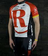
RadioShack
Excitingly rebranded as Team R, which will inevitably lead to the unfortunate rallying cry of supporters on the roadside: "Up the Rs!"
Follow us on Twitter: www.twitter.com/cyclesportmag
Edward Pickering is a writer and journalist, editor of Pro Cycling and previous deputy editor of Cycle Sport. As well as contributing to Cycling Weekly, he has also written for the likes of the New York Times. His book, The Race Against Time, saw him shortlisted for Best New Writer at the British Sports Book Awards. A self-confessed 'fair weather cyclist', Pickering also enjoys running.