Which team has the best or worst kit for 2023? We take a look through the wardrobe
Now the racing season is underway, it's time to talk jerseys

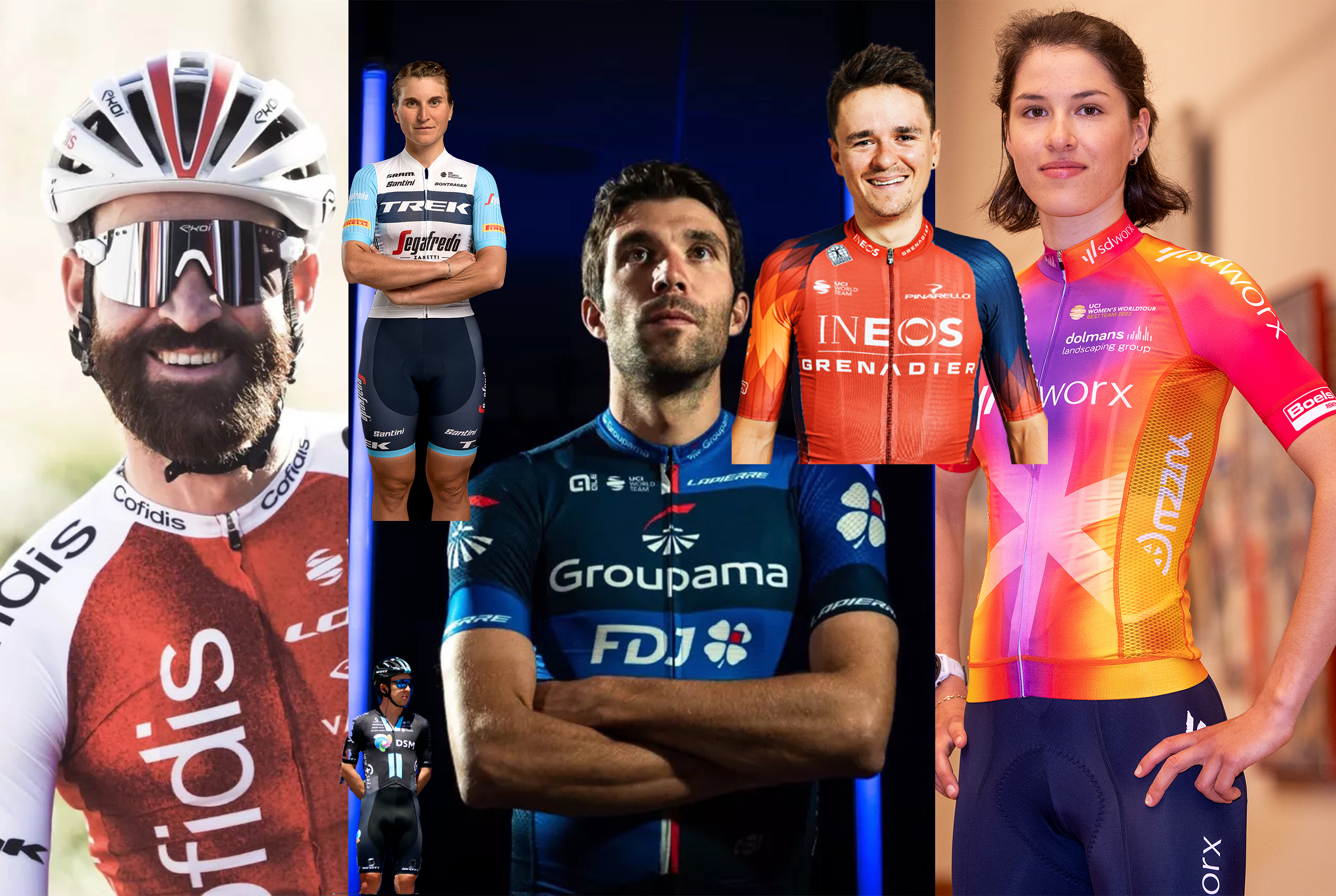
The season has begun, and we have all started the very odd process of trying to work out who is who in their new kits, whether they have moved team or not. Now the Tour Down Under has happened, we thought it was time to critique the outfits.
Some teams have departed wildly from previous offerings, with a whole host of name changes going on as well, so it is important to cast an eye over these strips.
While many teams and riders have maintained a relatively consistent aesthetic, it is worth brushing up on the colours they will be wearing this season before it all kicks off. It also gives us a chance to put on our fashion critic hat - a fetching beret, of course - and rate the kits.
You might not agree with all of these ratings, out of five, and of course appearance is a subjective decision. However, since I'm in charge of the narrative here, this is how I feel about the respective strips right now. Obviously, this will change once we see things happen in them.
The WorldTours
Ag2r Citroën - 4/5
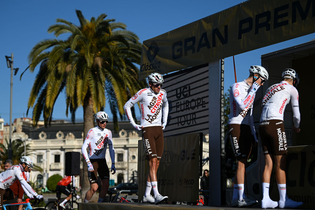
AG2R-Citroën go for the same look as last year, with the sponsor plastered diagonally across the largely white jersey. The French team has a habit of keeping the same kit for a few years at a time; it had the same horizontal blue, white and brown striped kit for three years between 2018 and 2020.
Let's tackle the brown shorts. Yes, they are a bit much, but they are a staple of the AG2R wardrobe, and mark the team out. Are they really that bad? I certainly don't mind them, and it would a shame to see them out of the peloton, they're something a bit different from all the blacks and blues, certainly.
Alpecin-Deceuninck - 3/5
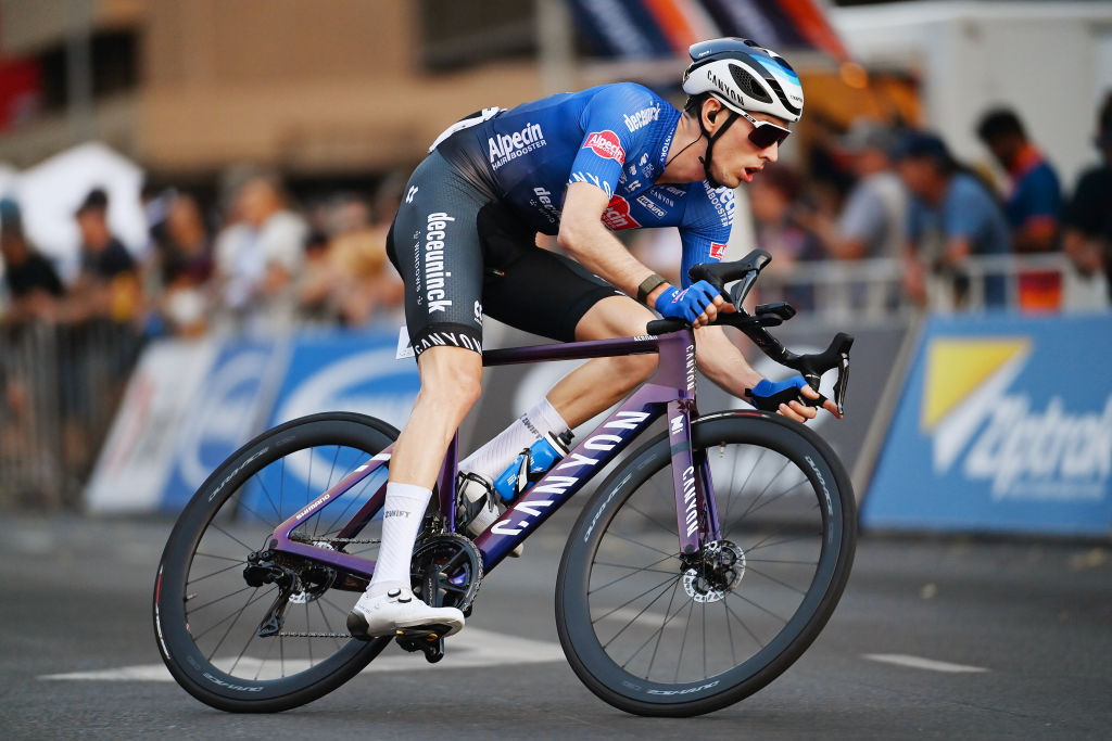
WorldTour newcomers Alpecin-Deceuninck only changed its name halfway through last year, and changed its kit as a result, so they've stuck with the tried and tested jersey.
The latest race content, interviews, features, reviews and expert buying guides, direct to your inbox!
Sadly, thanks to the influx of navy in the peloton, this has rather been crowded out this year, and has ended up looking like all the other kits. On its own, it's fine, but not particularly inspiring.
Arkéa-Samsic - 3/5
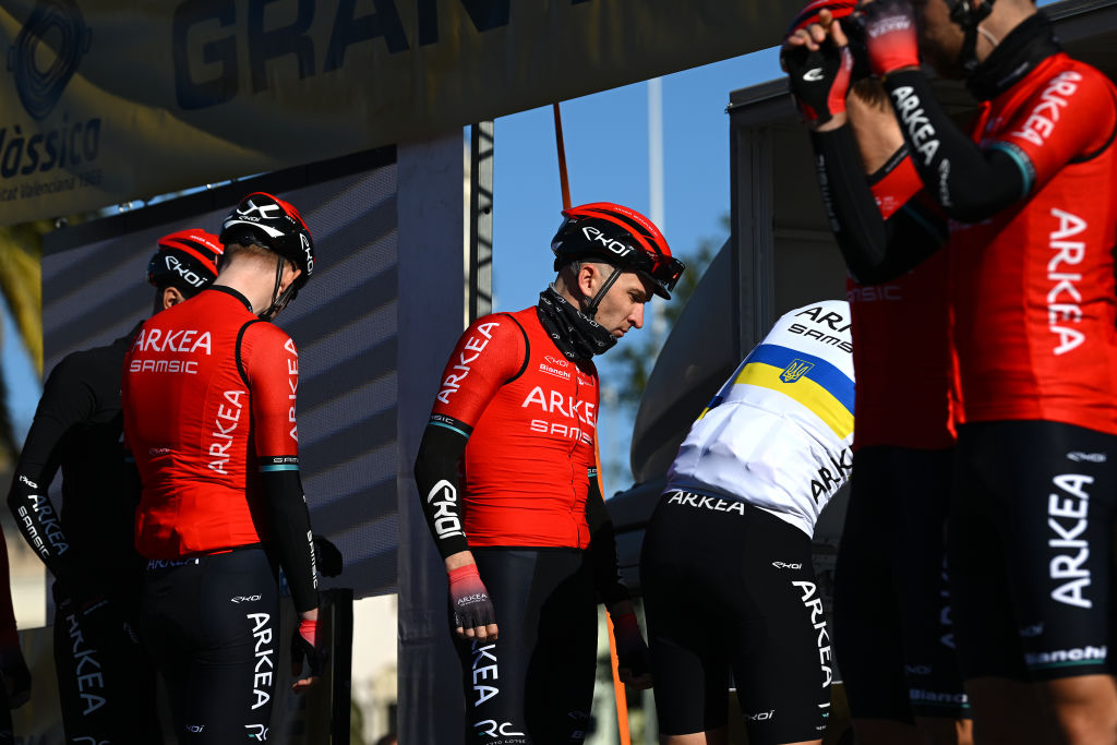
The blandest kit award in the WorldTour goes to... Arkéa-Samsic. The French team is newly promoted, and there could have been a bit more excitement to mark it, but no.
Red all over, that's about it. I guess it will stand out, but it looks a bit like Ineos Grenadiers too, try not to get them mixed up. No Nairo Quintana this year either.
Astana Qazaqstan - 2/5
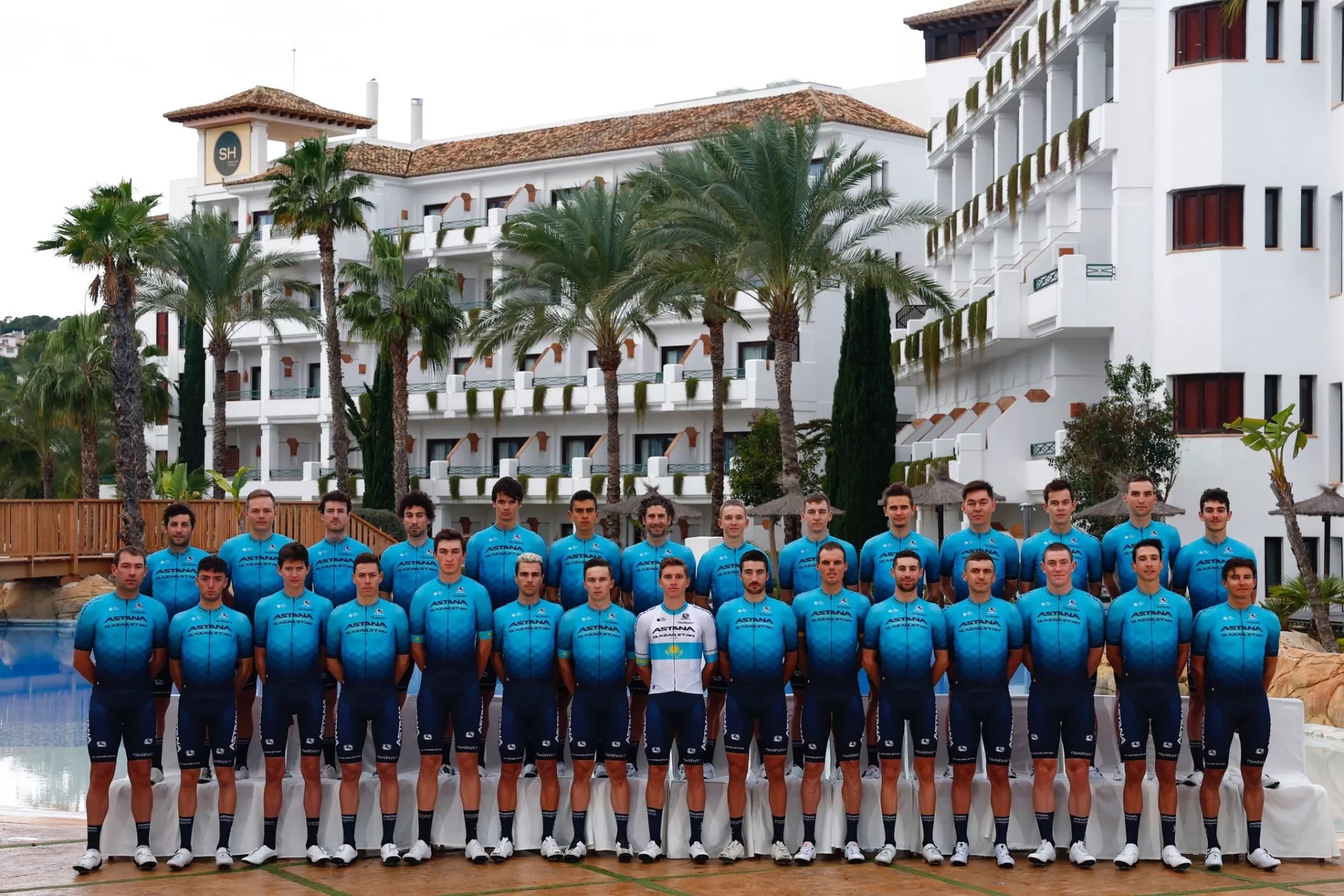
I think my immediate reaction to this kit is to shrug. It is exactly the same as their 2021 and 2022 kit, so reasonably boring.
There are too many blue tones in the peloton, and the fade into the diamond patterns on this kit does not save it. It could really do with an update, but props to the lack of confusion through using pretty much the same kit again.
Bahrain-Victorious - 4/5
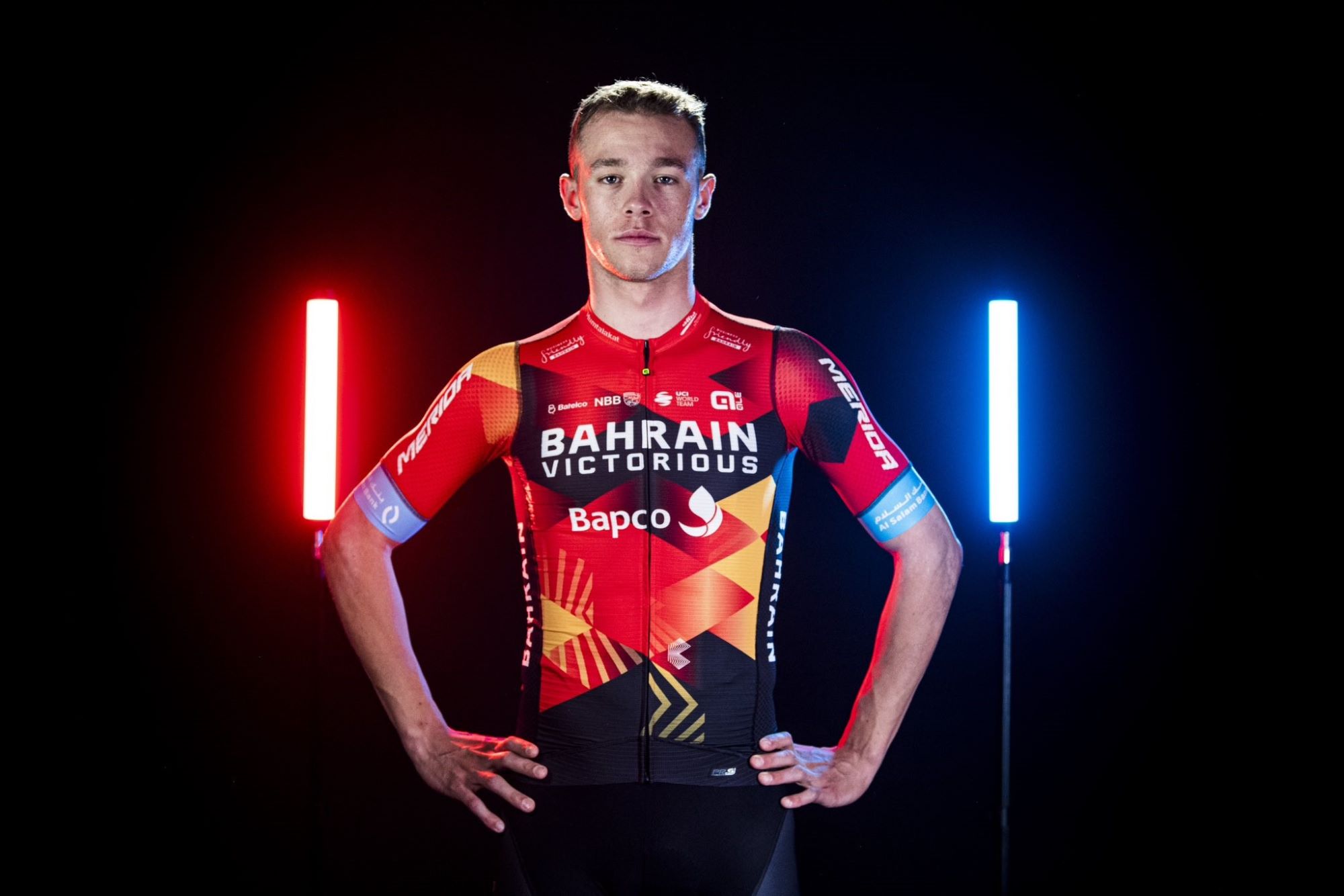
Yet another team to keep exactly the same kit - yawn - Bahrain stick with its Alé colours from last year. The sustainability argument is an appealing one, but I can't imagine these squads are really recycling the same kits, especially for new riders. One can't even use the same criticism of football teams changing kits, that it fleeces the fans, because cycling fans don't really buy kits anyway.
The block pattern is appealing, and I like the light blue sleeves, which add a little bit of excitement to the kit. It is very smart, just a shame that we do not get to seem something a bit different for the new year.
It's so smart that Ineos Grenadiers has practically copied it, but more of that later.
Bora-Hansgrohe - 4/5
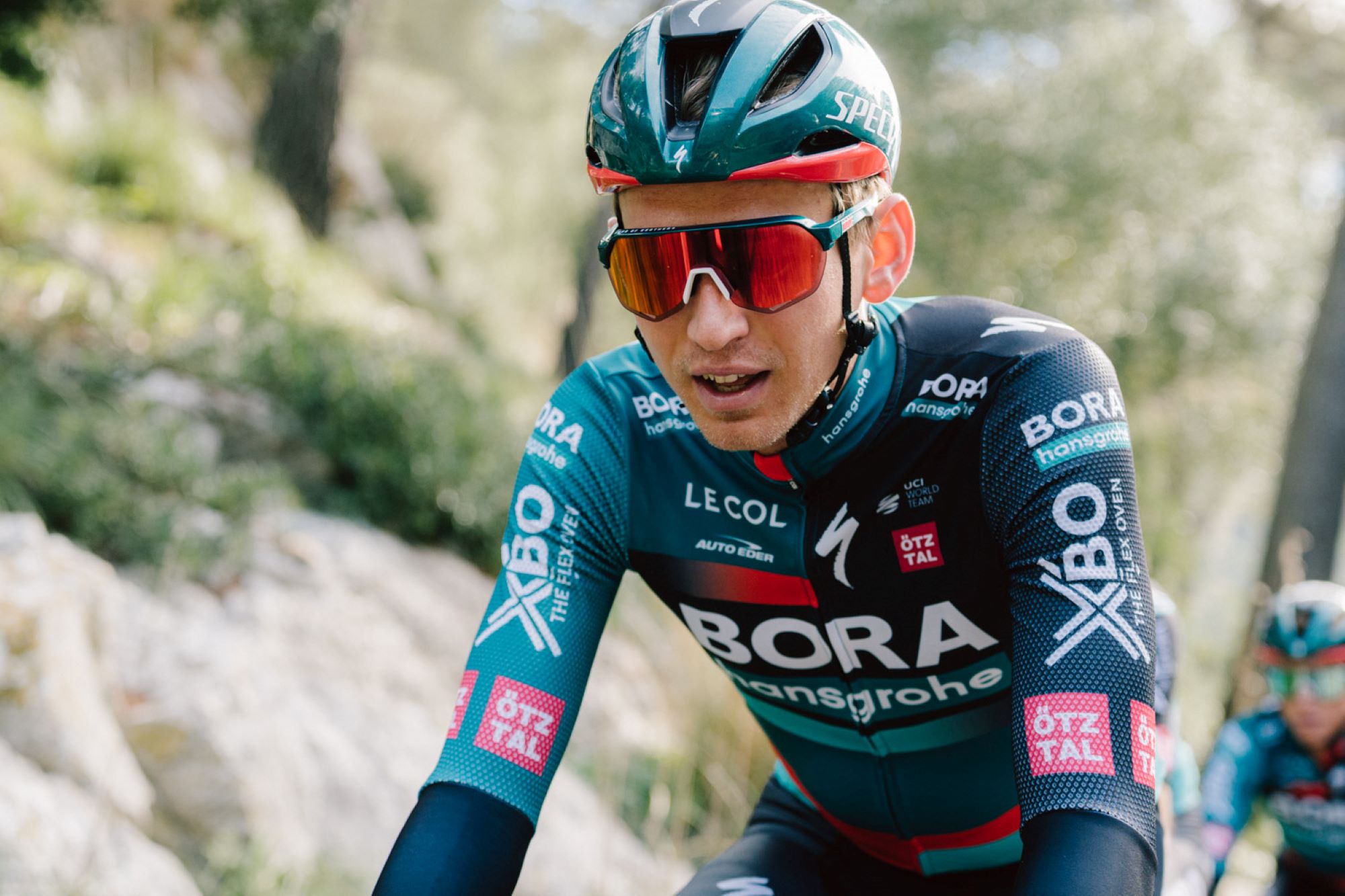
Bora-Hansgrohe’s kit is an elegant masterpiece: not too cluttered, not too confusing, just smooth blocks of green, black, and red altogether. One should expect nothing less from Le Col, really. If only they hadn’t done the whole photoshoot with gloves on.
It's also subtly different from last year, to which I say: good.
Canyon-SRAM - 5/5

Another kit that has stayed the same, but I love this one. It's another one in the Women's WorldTour that is pinky/purple, but it is distinctly different. It will certainly stand out in the peloton, with the green triangles on the shoulders.
I even like the strange meteorological symbols, even if I don't really understand what they mean, and I would happily wear this kit out and about myself. Canyon have outdone themselves in their first in-house made offering for the team.
Cofidis - 5/5
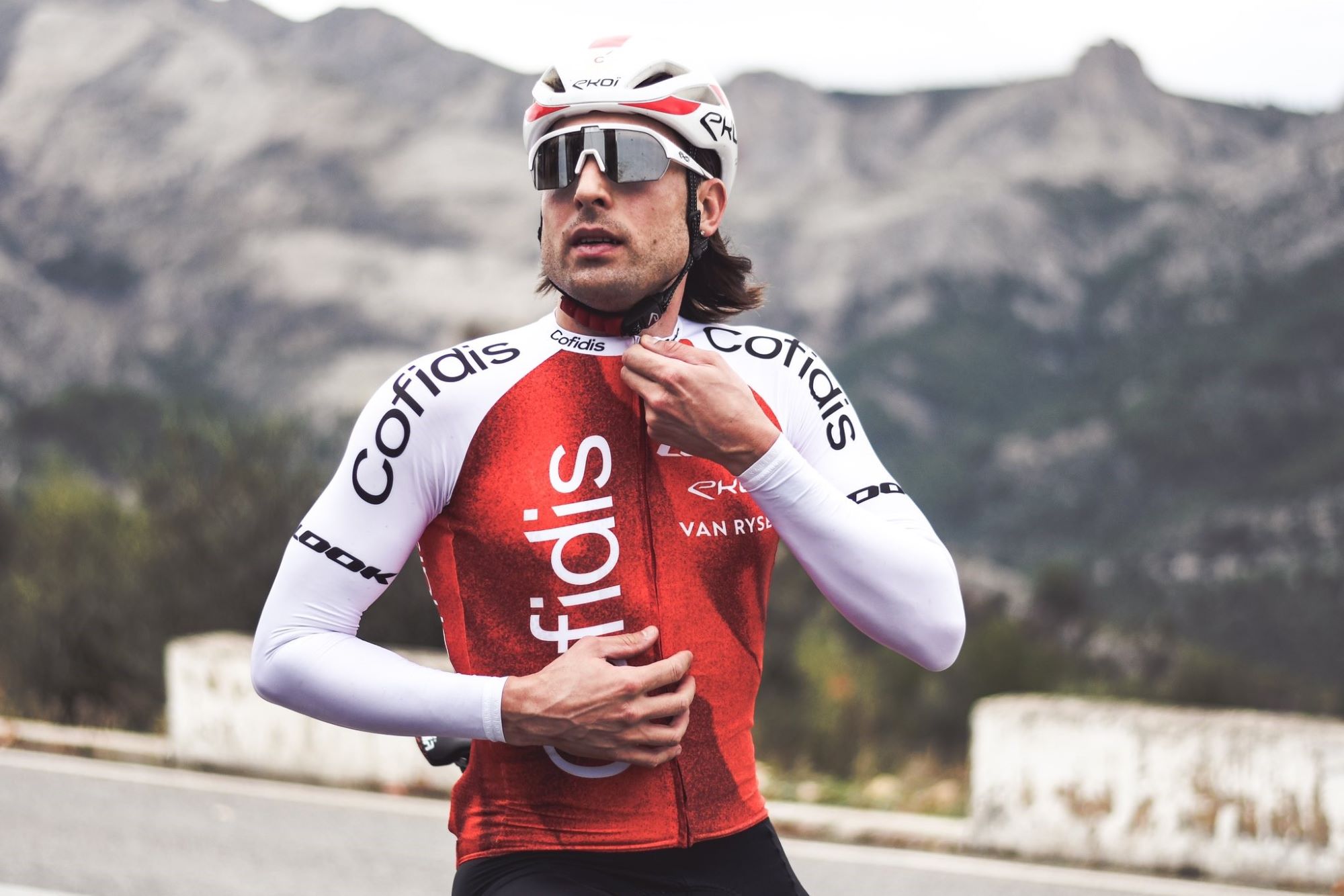
This swish red pattern from the Decathlon brand Van Rysel oozes class. According to the company, the design is a nod to the digital age: “Our connected era goes fast, very fast, and sometimes ‘glitches’, creating blurry, grainy images and jerky textures.” Let’s see if Guillaume Martin can glitch himself to a Tour podium wearing it.
The women's team wear exactly the same kit, which led to amusing scenes Down Under when Bryan Coquard was pictured wearing a jersey with "Women's Continental Team" on it. Poor Bryan.
DSM - 2/5
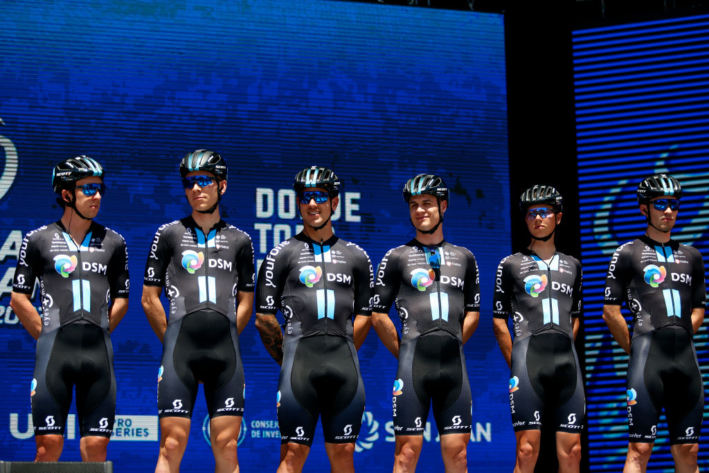
DSM has not changed their kit for this season, yet again, like so many other teams. Yawn. However, it is pretty smart. Unlike a few years ago, there aren't that many teams in black either, so they do stand out in the bunch.
The men's and women's teams wear exactly the same kit, with 'Keep Challenging' stripes down the middle of the jersey. It also manages to have a few little sponsors and yet not look cluttered.
EF Education-EasyPost/EF Education-Tibco-SVB - 3/5
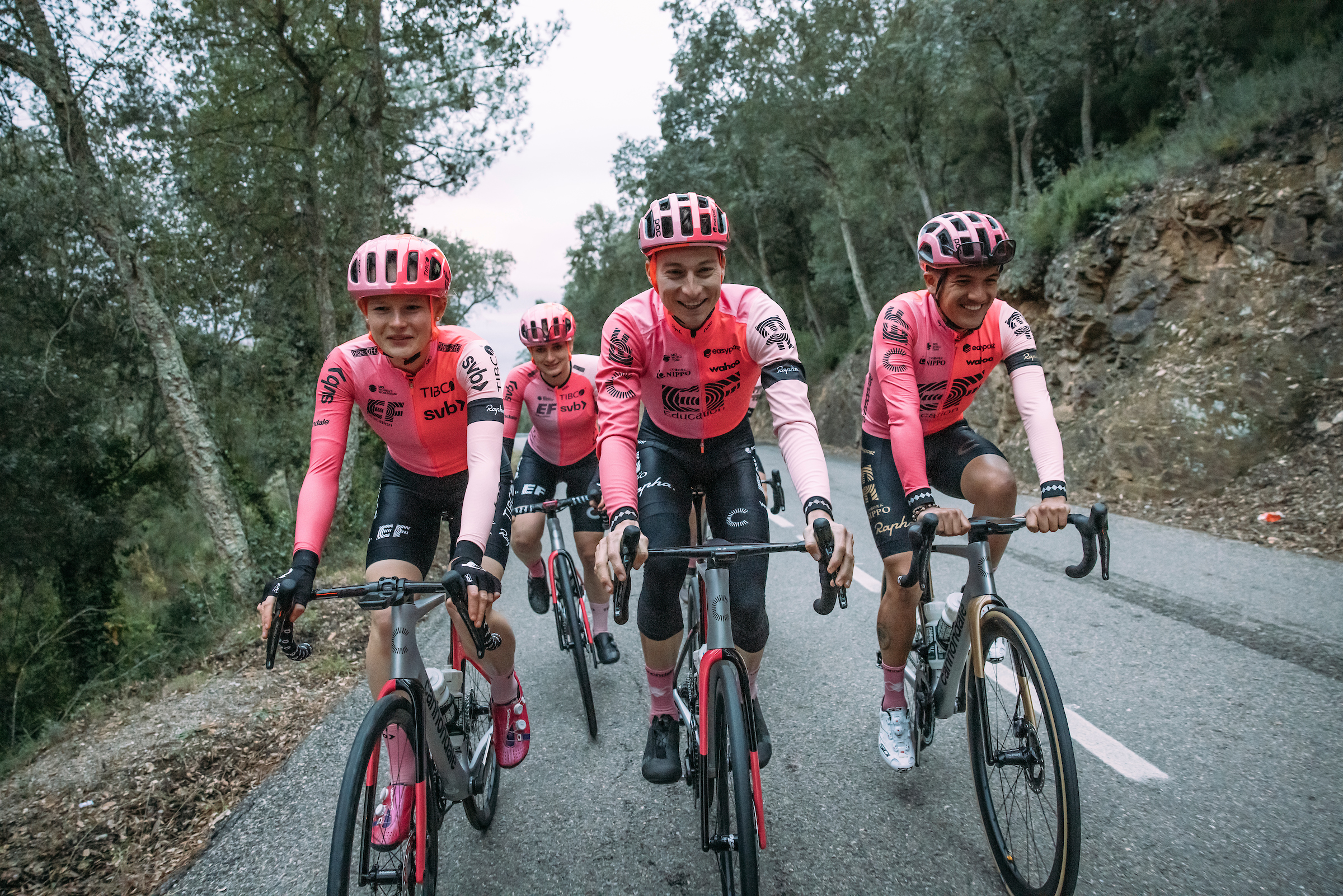
After new signing Andrey Amador leaked images on his Instagram, EF Education’s latest Rapha collaboration didn’t quite make the splash the squad craves. Perhaps also because it’s not as lairy as past versions, which peaked with the trendsetting tie-dye kit of 2019. The new pink panels are neat, but they don’t quite play into Lachlan Morton’s craft beer drinker aesthetic.
The women's team has the same colourway, which is fine, but is not groundbreaking. There has already been intrigue over the socks, which are supposed to match up with the jersey panels, with some riders getting it wrong.
Our very own Tom Davidson also spotted the fact that Richard Carapaz's Olympic champion special jersey was not quite compliant with UCI rules, which is a fun addendum.
FDJ-Suez - 5/5
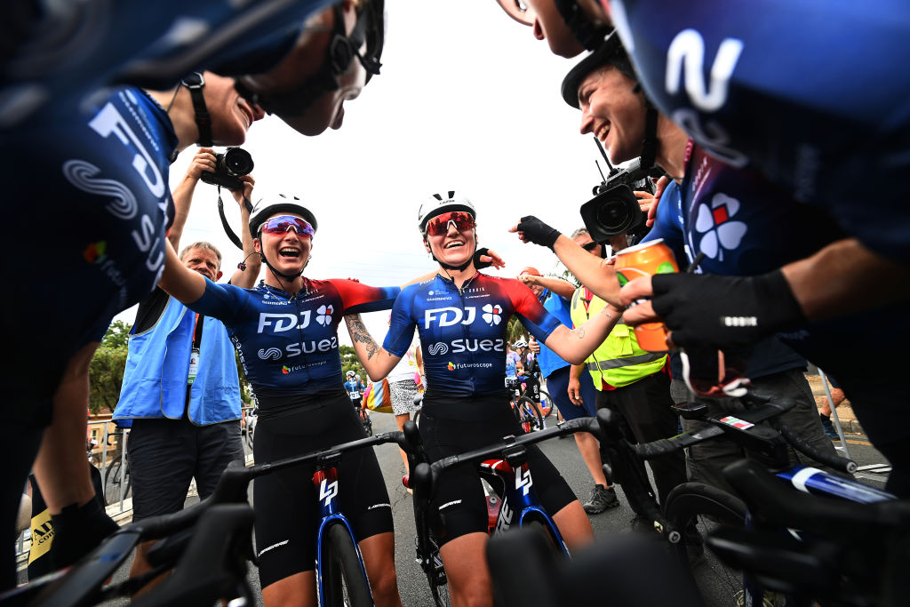
FDJ-Suez's is a great kit, stylish but different from a lot of the Women's WorldTour peloton.
The jersey is designed by Gobik, and is different from the similarly sponsored men's WorldTour team Groupama-FDJ. It is mostly vibrant blue, with a hint of red around one shoulder. The difference from last year is the sleeves, which are now the same colour as the rest of the body. The black shorts are nice and complement it as well.
In the women's peloton, FDJ don't suffer from the same blue-overload as the men's peloton, so stand out more.
Fenix-Deceuninck - 3/5
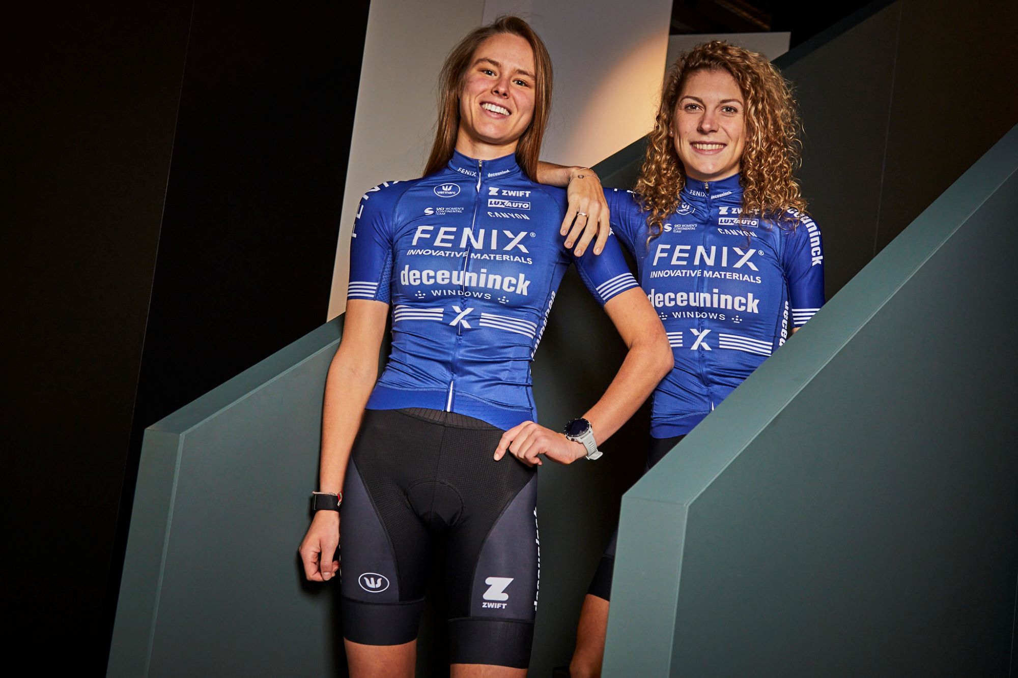
Another blue kit, but not an offensive blue, to me anyway. The belt round the middle is fun, but it might be easily confused with Movistar's offering.
It has a lot of sponsors, but it isn't offensive, and is different enough from the male Deceuninck squad to be something else.
Groupama-FDJ - 5/5
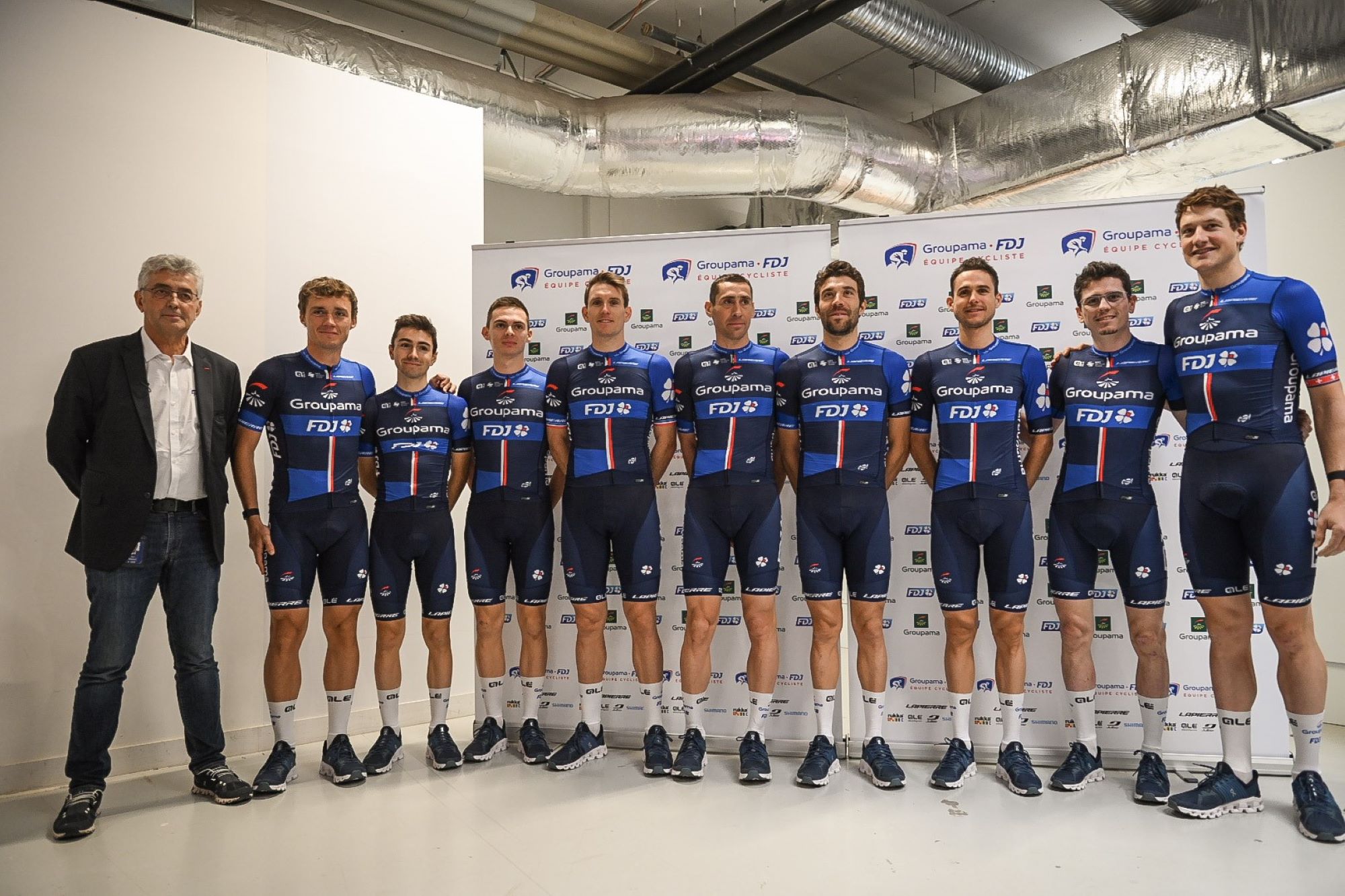
Revolution is in the air at Groupama- FDJ, as they forego a mostly white jersey for the first time since 2017. The resulting blue block pattern is very smart and modern. It’s a subtle French tricolore, which is pleasing.
It's a bit Bora-Hansgrohey, but then that's such a great kit, so why not copy but have it in a different colour? A fitting outfit for Thibaut Pinot's last season.
Human Powered Health - 4/5
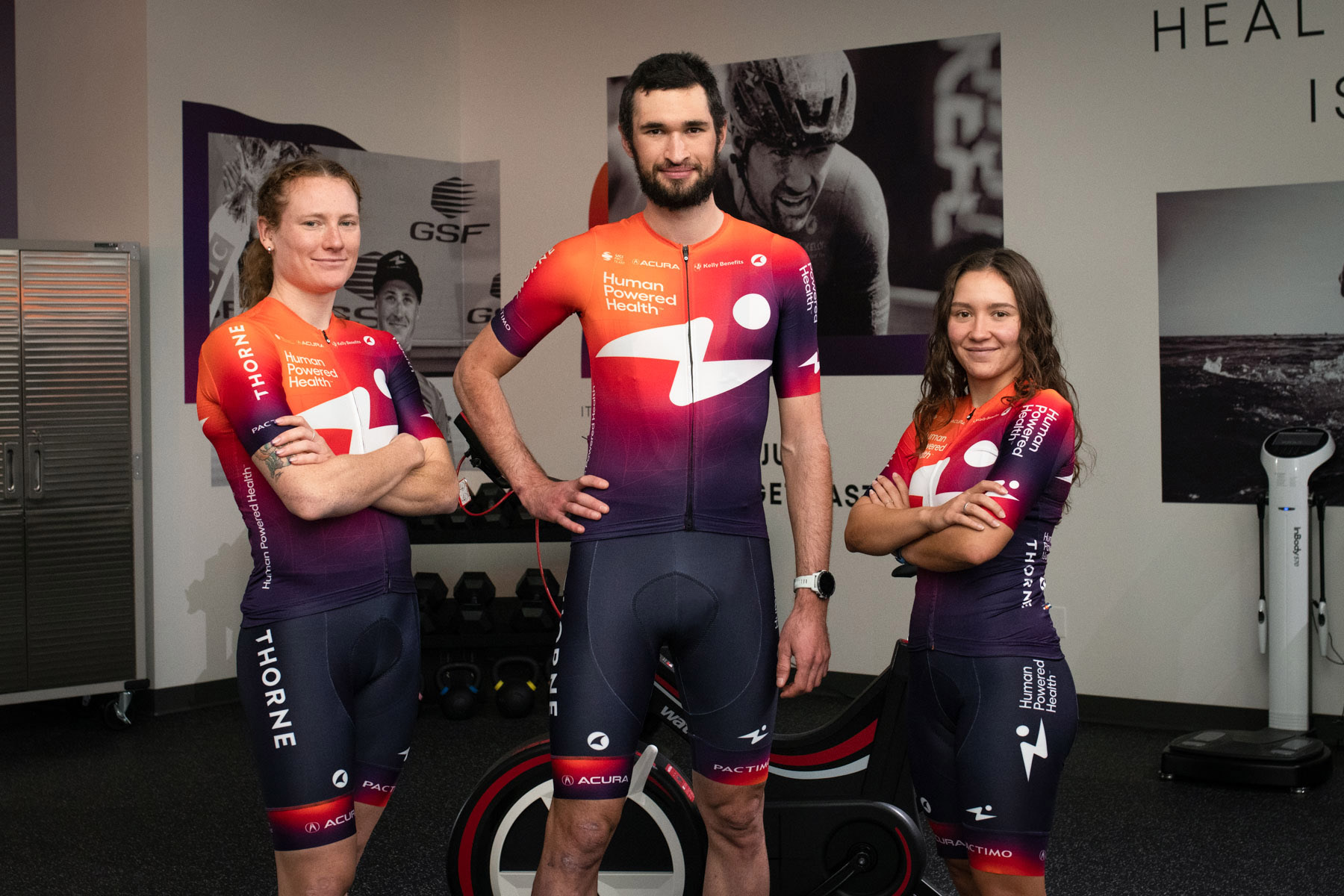
The jersey alone is great, with the same colours as last year, but with a bigger HPH logo in the middle. It is just a shame that they are not the only women's team to feature orange merging into purple and red, with SD Worx and UAE Team ADQ opting for similar designs.
The men's ProTeam will wear the same kit, and it is very smart, paired with black shorts. We will have to hope that the orange-purple kits all look very different from a birds-eye view once the teams all come together in races.
Ineos Grenadiers - 2/5
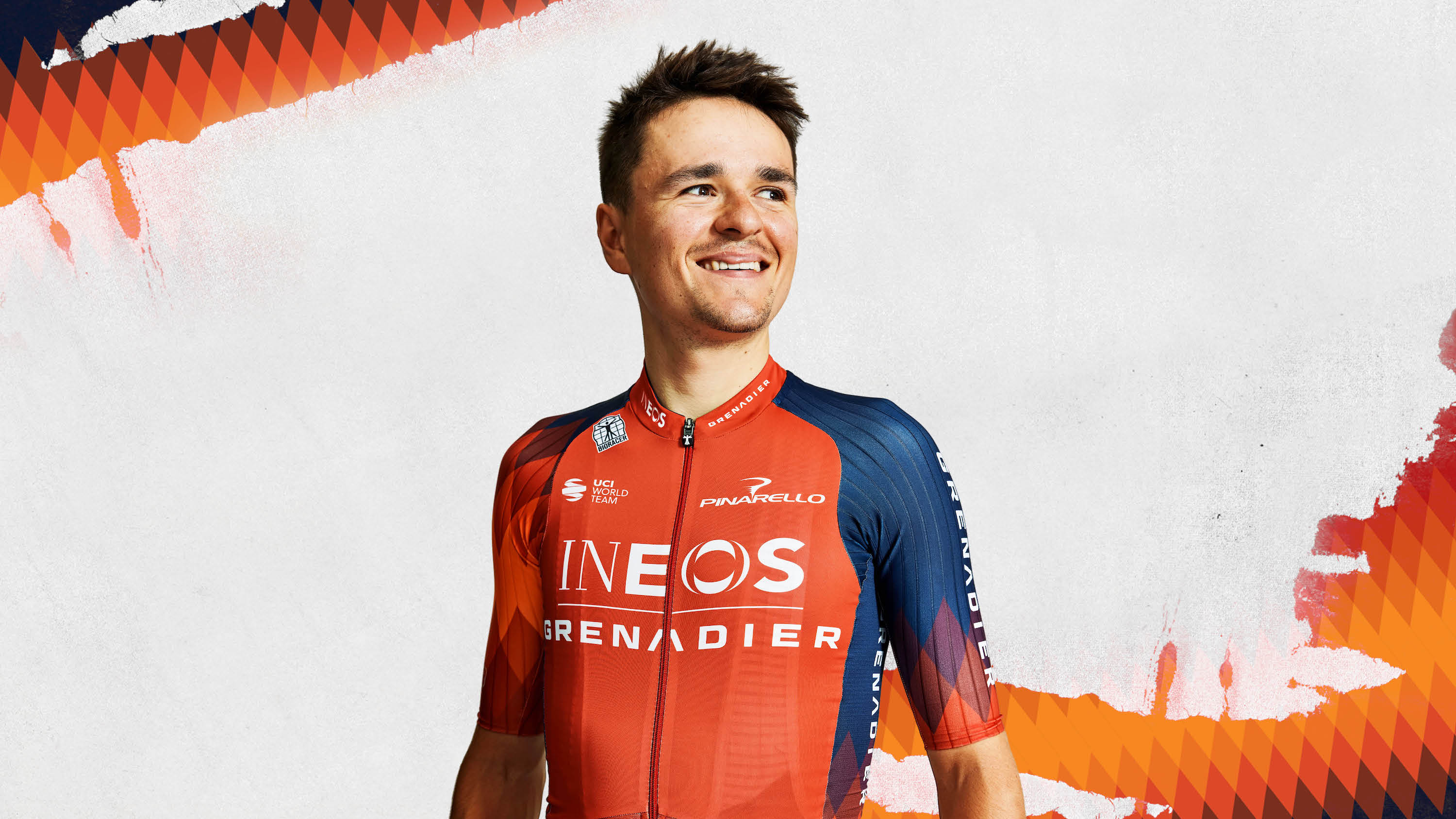
Dear Dave, First you steal Rod Ellingworth back from us and now this! Orange diamonds were our thing! They speak to the rich history of Bahrain… er… somehow. Whatever you do, don’t go getting eyes for Fred Wright, I know how you like to have all the British riders on the squad. You’ll be hearing from my lawyers. Yours, Milan Eržen, Bahrain Victorious managing director.
Not only does it look like a Bahrain kit, it also is just very meh. I look forward to the switch-out jersey they will surely bring out for the Tour de France.
Intermarché-Circus-Wanty - 4/5
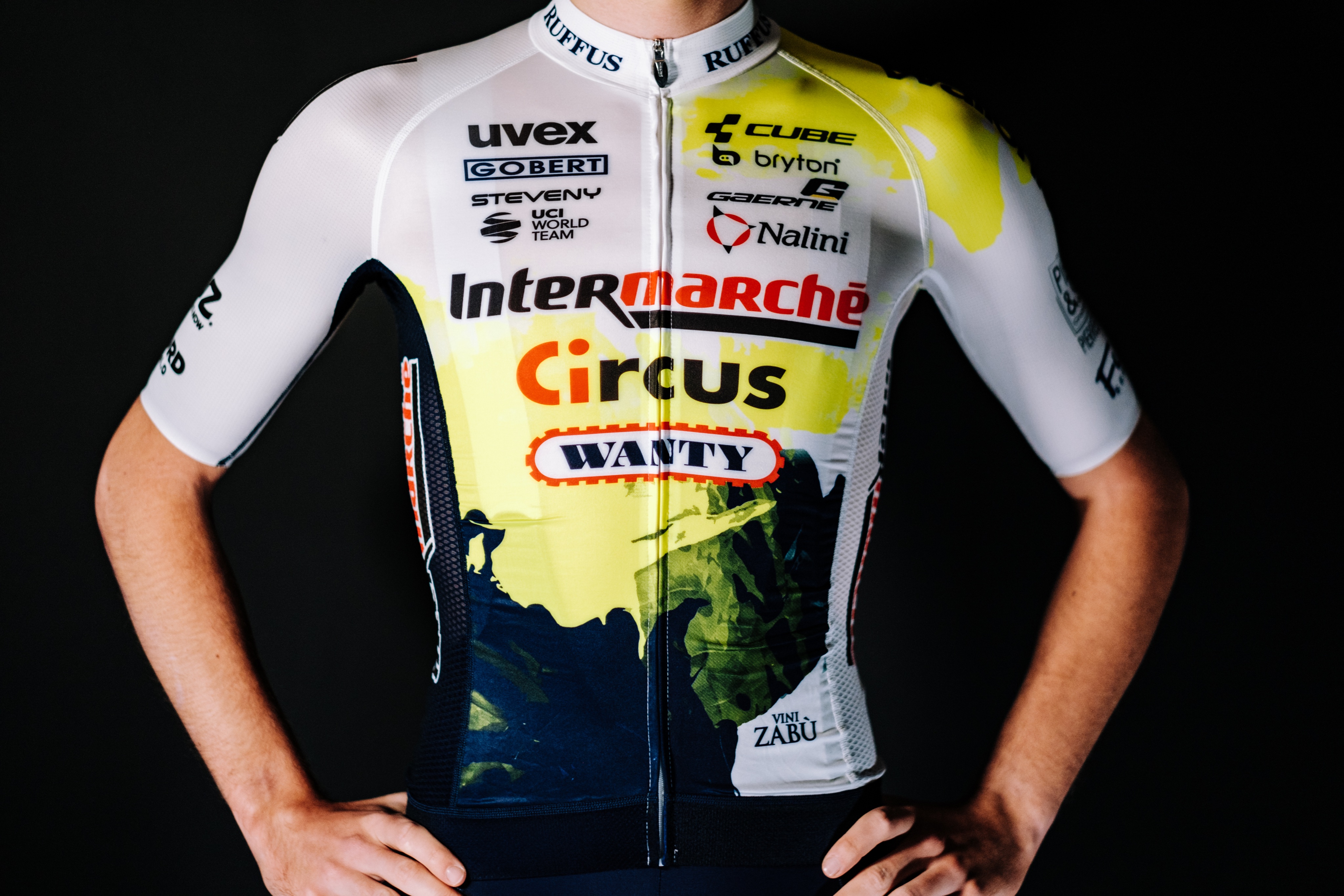
It's a big improvement for Intermarché as they shuffle their (18) sponsors around and become Intermaché-Circus-Wanty rather than Intermarché-Wanty-Gobert. Simple.
Gobert are still on the jersey, along with 17 other brands, but somehow it doesn't look too cluttered. The splotches of lime green and navy blue are funky, and hopefully will be seen a lot as Biniam Girmay has another excellent year.
Israel-Premier Tech-Roland/Israel-Premier Tech - 3/5
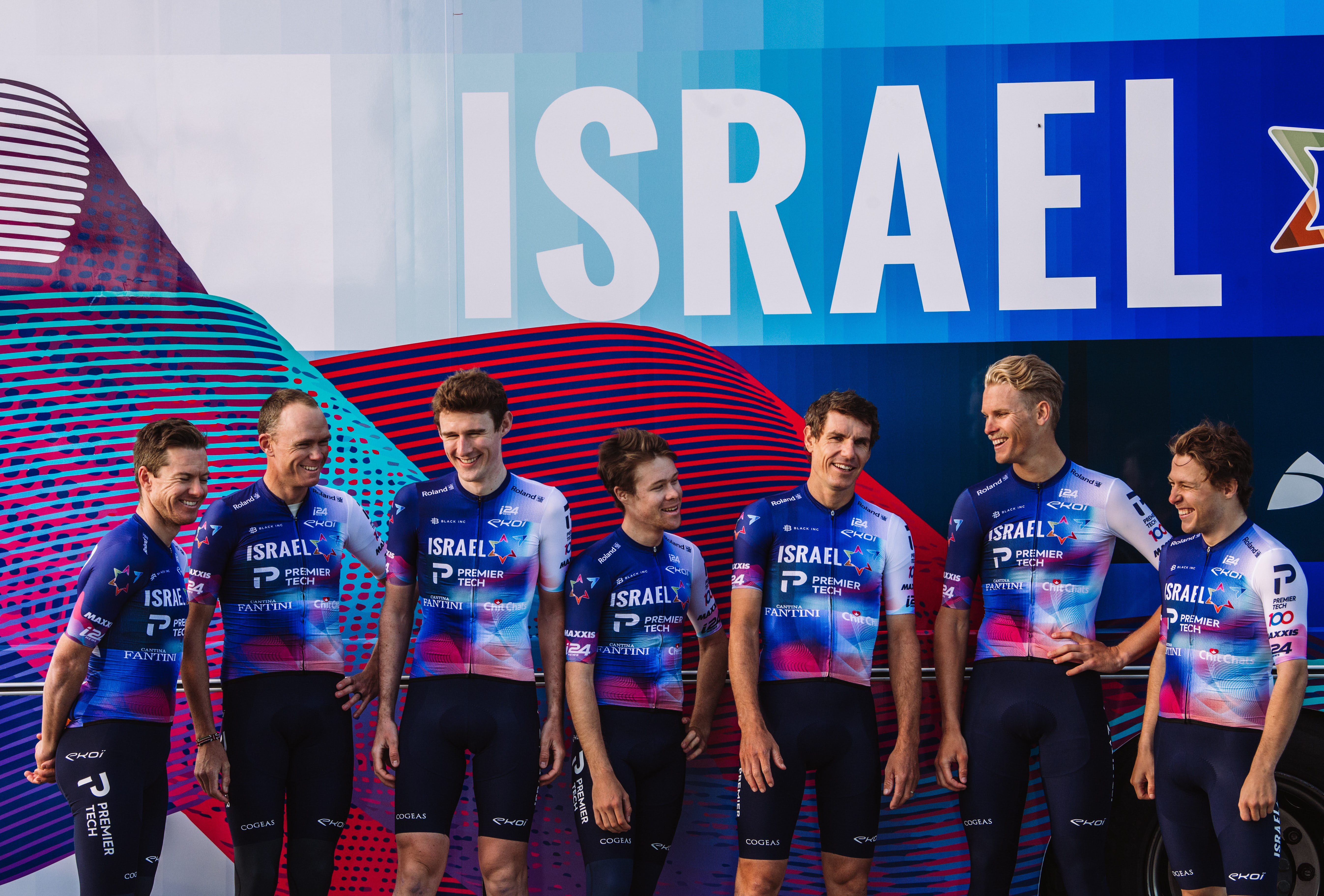
Looking like Chris Froome left a red sock in the wash shouldn’t be a recipe for success but on this occasion it has worked. Sure, casual observers might expect the eight men getting on the bus to play a set of 20-minute prog rock epics complete with lute solo but that’s an energy we can get behind.
Jayco AlUla - 3/5
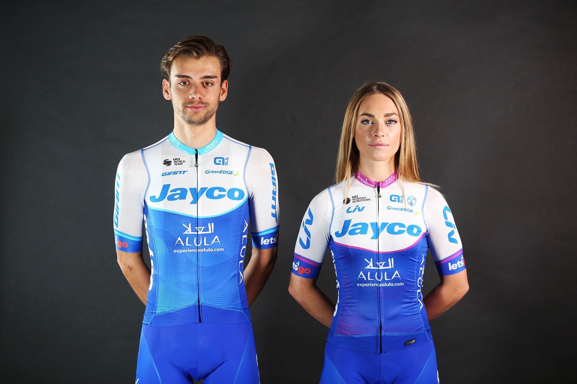
Better than last year, sure, but still very boring. What's with the blue obsession in the WorldTour at the moment? It is all too much. The women's kit is marginally better, but that's about it, really. I am not excited.
The shorts are far too light a shade of blue for my liking too, and might not leave much to the imagination mid-race.
Jumbo-Visma - 4/5
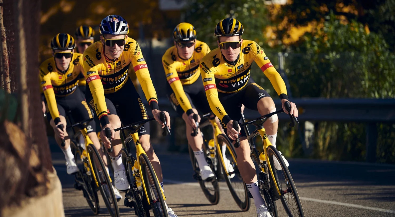
Not a lot has changed, but this is a solid effort from Jumbo-Visma, who manage to have multiple sponsors across the jersey without it looking like too much. The big Cervélo logos on the shoulders do not even really get in the way.
As long as they alter it for the Tour de France, it should work throughout the season. The women's team will wear the same kit, with Marianne Vos leading the line.
Liv Racing TeqFind - 2/5
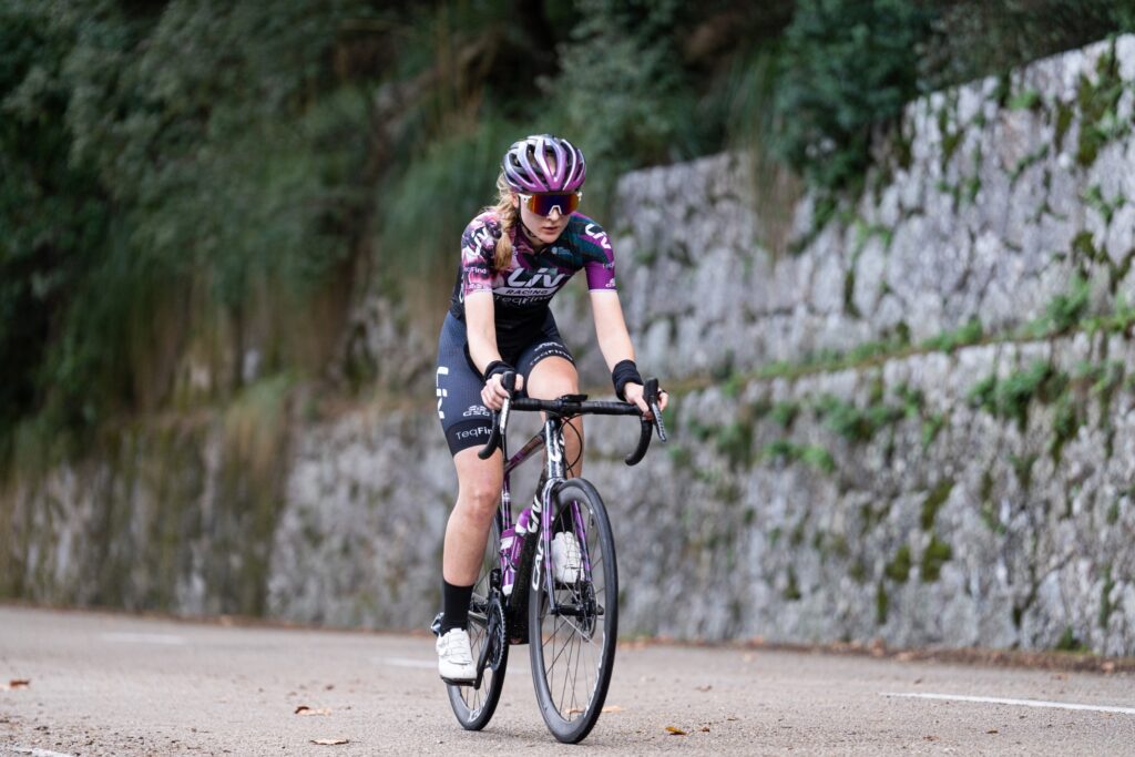
This Liv Racing TeqFind kit is bold, with its flower motif, and that should be noted. However, it is the same jersey as last year, just with the new TeqFind headline sponsor added. That means it's the same kit for a third year in a row.
Also, it is reasonably dark and I think I prefer a brighter kit, but it definitely is different from the rest of the Women's WorldTour peloton. Furthermore, thanks to other teams changing their colours, this Liv kit should not clash with others anymore.
Movistar - 2/5
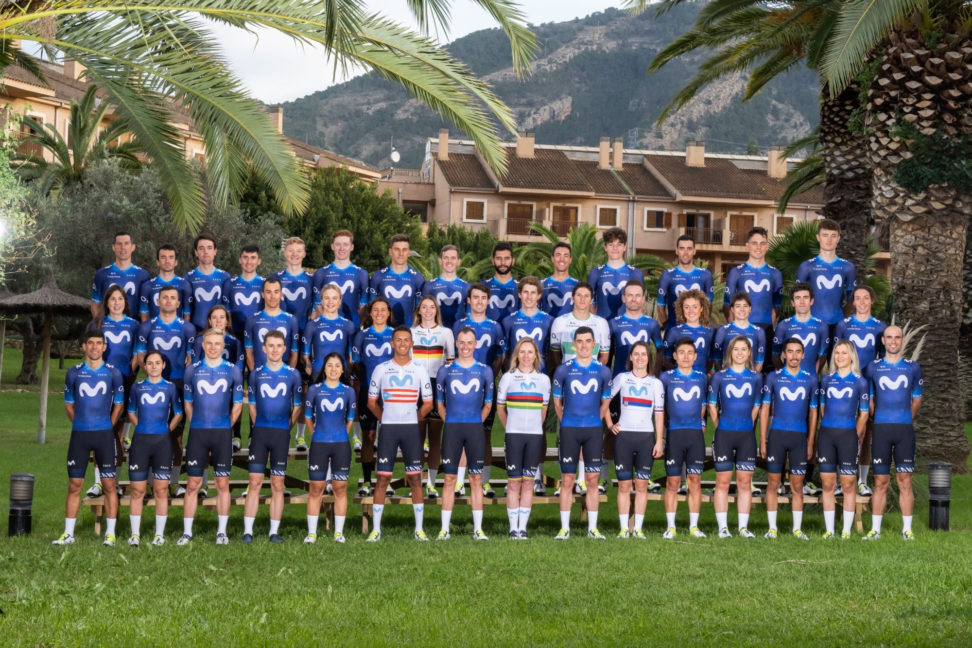
I'm bored, bored of Movistar and bored of blue. It's a slightly lighter shade than last year, but that's pretty much all I've got to say about it. Mix it up! Try something different! Come on.
The men and women will wear the same kit, and the national/world champion ones seem pretty nice, but that's all I've got to say. It's going to be weird seeing Fernando Gaviria in this jersey.
SD Worx - 4/5
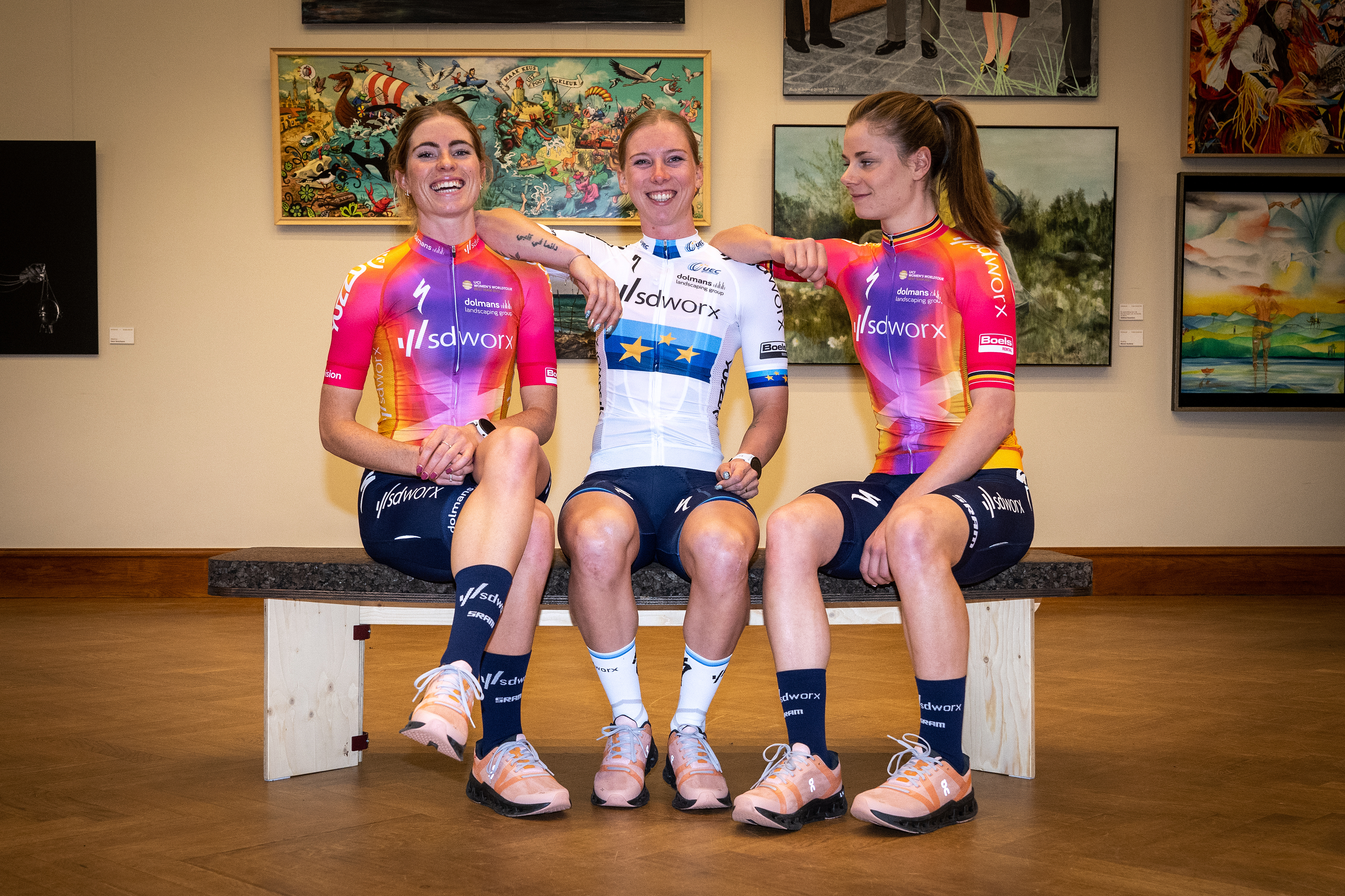
Thankfully, we’ve moved past all the Women’s WorldTour’s kits looking the same, with SD Worx, Human Powered Health and UAE Team ADQ all diverging. SD Worx’s is the best of the bunch, with pinks, purples and yellows all converging on a pleasing kit, which feels a bit less washed-out than last year’s offering. Expect to see this on the front of the bunch very, very often.
Soudal Quick-Step - 2/5

It’s said that Remco Evenepoel’s downstairs loo decor was the inspiration for the swatches that make up most of Soudal- Quick Step’s effort. We hear he’s very pleased with the addition of adhesive manufacturer Soudal as it saved him some money when putting the sink in; it cost the team in the style department.
I should say at this point I am biased against sports teams in the colour blue thanks to my dislike of Portsmouth Football Club. This might be why most blue kits are spoiled in my eyes, sorry to much of the WorldTour. The exception is FDJ, obviously.
Trek-Segafredo - 4/5
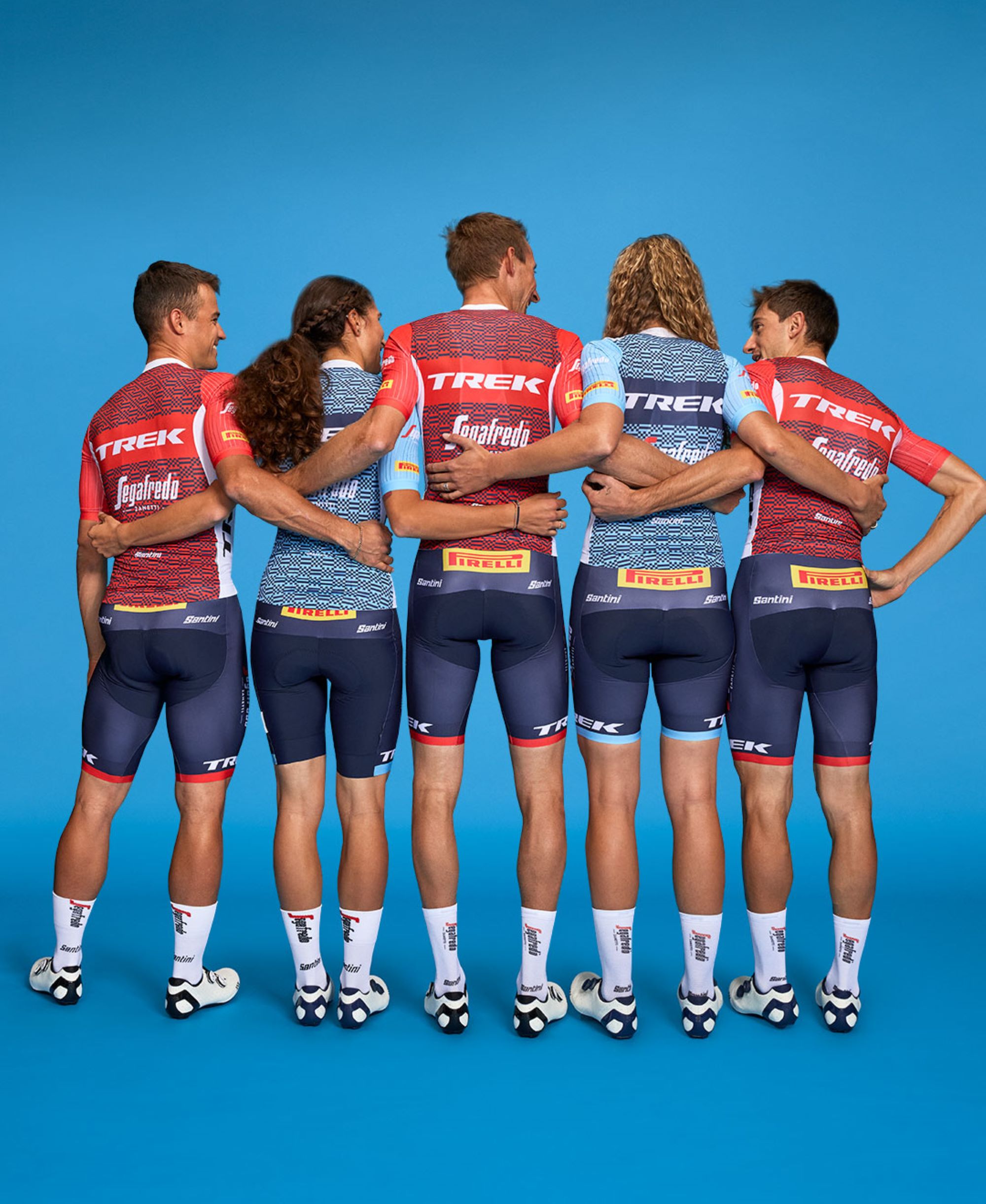
It’s business up front, party in the back for Trek Segafredo in 2023. The US-based team has kept its classic design, but added a dash of colour to the sleeves. The centrepiece, however, is the dazzling – perhaps even chaotic – block pattern on the back. Is it fun and original or does it just remind you of TV static?
Better than the other largely white kits on this list, for sure.
UAE Team ADQ - 2/5
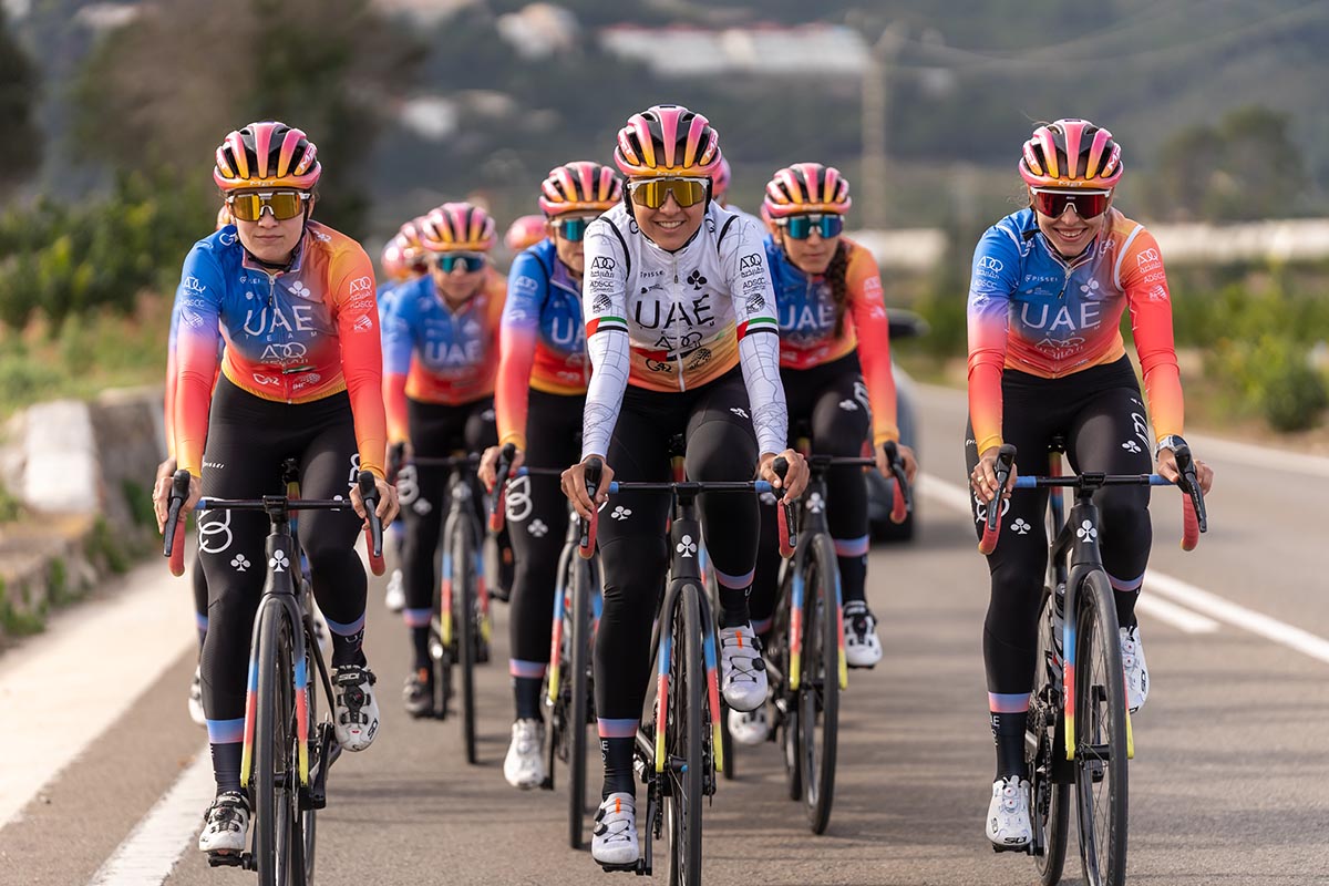
It's definitely better than last year's kit, but the UAE Team ADQ jersey just feels off to me. Something about the light blue and peach puts me off it, it's trying too hard.
The black bib shorts are smart, however, and it is definitely not the worst one out there.
UAE Team Emirates - 3/5
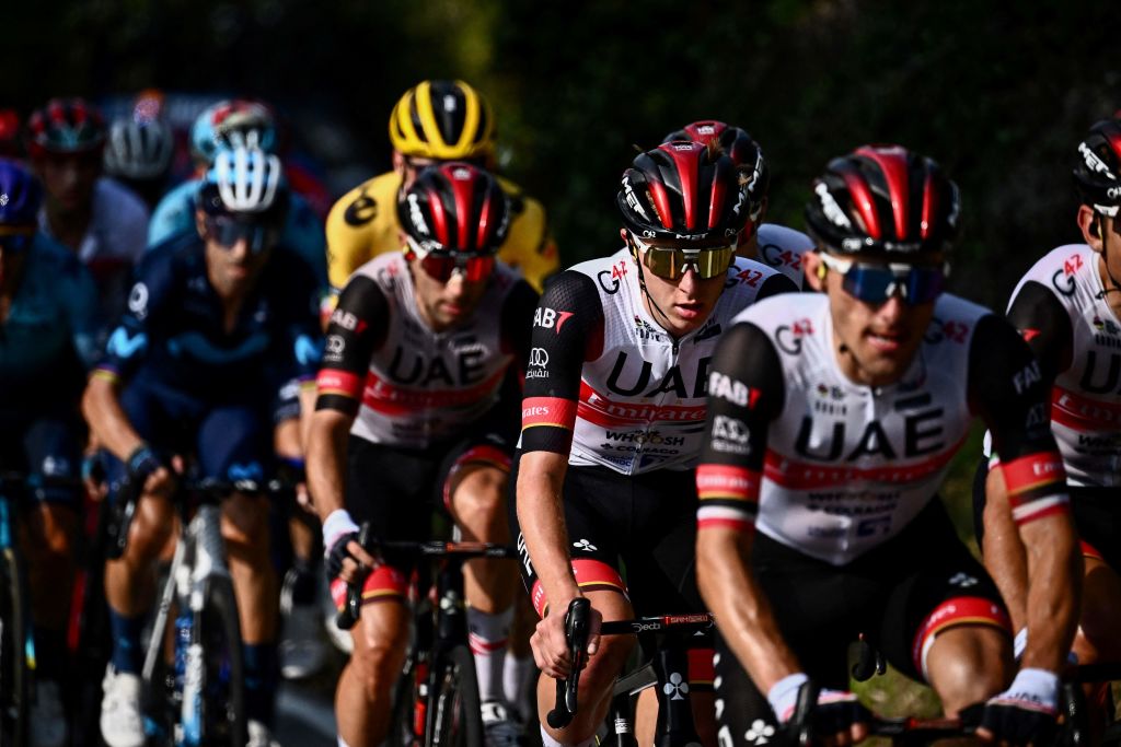
There should be penalties for teams that keep the same kit, where's the fun? I am hard-pushed to find a difference between this one and last year's UAE-Team Emirates' kit. The jersey of Tadej Pogačar is still quite smart and classy, however, with the little red and gold accents doing a lot.
It is made by Gobik, and is simple. However, it is yet another largely-white jersey in the peloton, which might blend together a bit.
Uno-X - 4/5
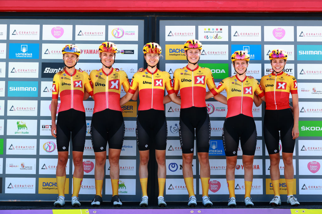
Norwegian team Uno-X are not the only ones not changing their kit much for 2023. Bahrain Victorious, Astana Qazaqstan, UAE Team Emirates, DSM and Jumbo-Visma all look pretty much, if not exactly, the same.
However, Uno-X are changing colours for lofty reasons: sustainability. The squad tweeted: “We need to reduce our consumption. Keeping the design allows us to cut our overall clothing order for 2023.”
An interesting approach, given that Uno-X runs a chain of petrol stations across Scandinavia, hardly the most sustainable thing. And with Alexander Kristoff and Amalie Dideriksen needing new kits with special bands anyway, one wonders how worthy the move really is.
All that said, I quite like this kit. It's different from the rest, and that means success.
The best and worst of the rest
Bolton Equities Black Spoke - 3/5
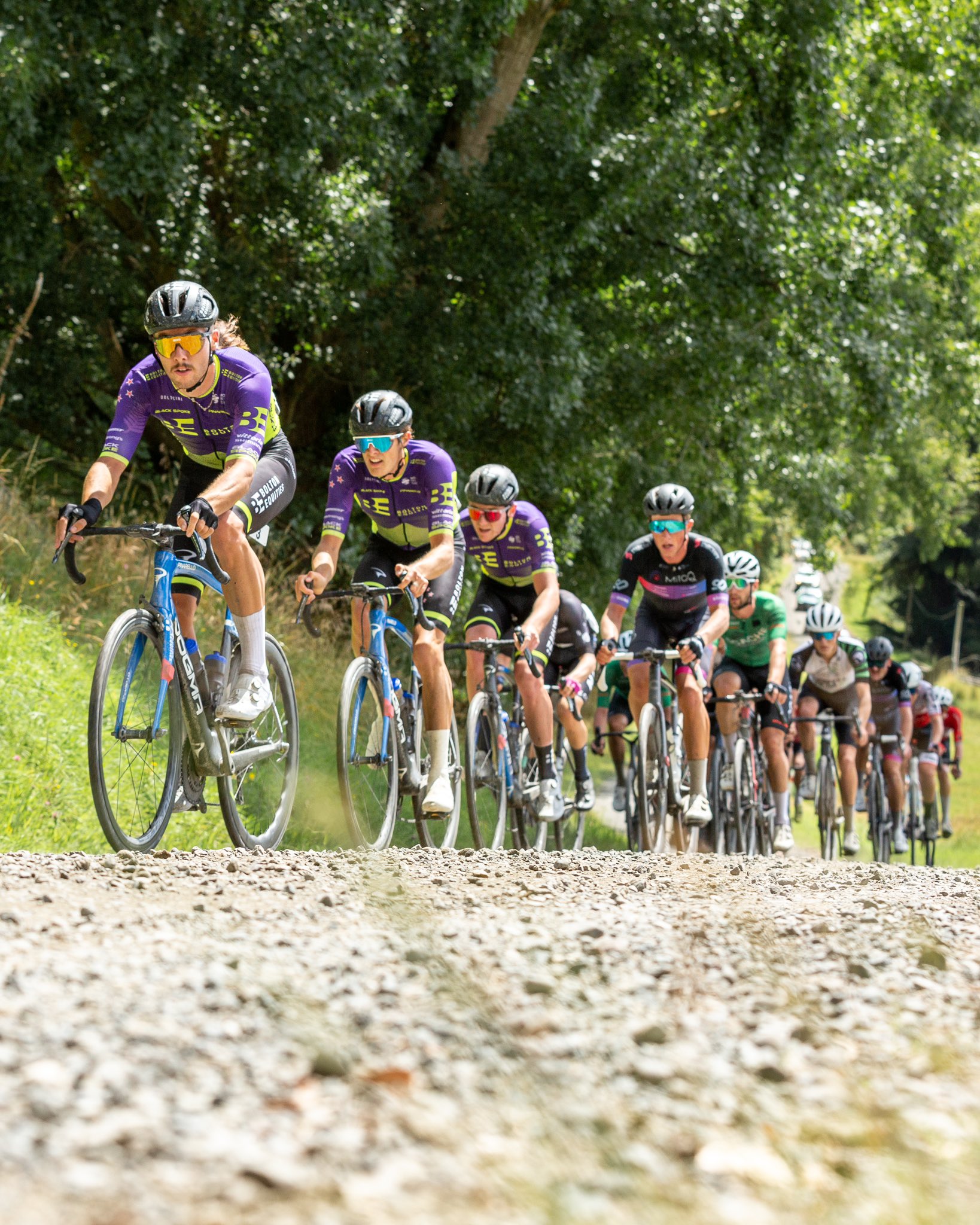
The ProTeam from New Zealand have gone for a simple but effective look with striking colours. With the yellow and purple colourway, they look like two of the best Power Rangers combined as they get set to take on the Megazords of the ProTour level.
DAS-Handsling - 5/5
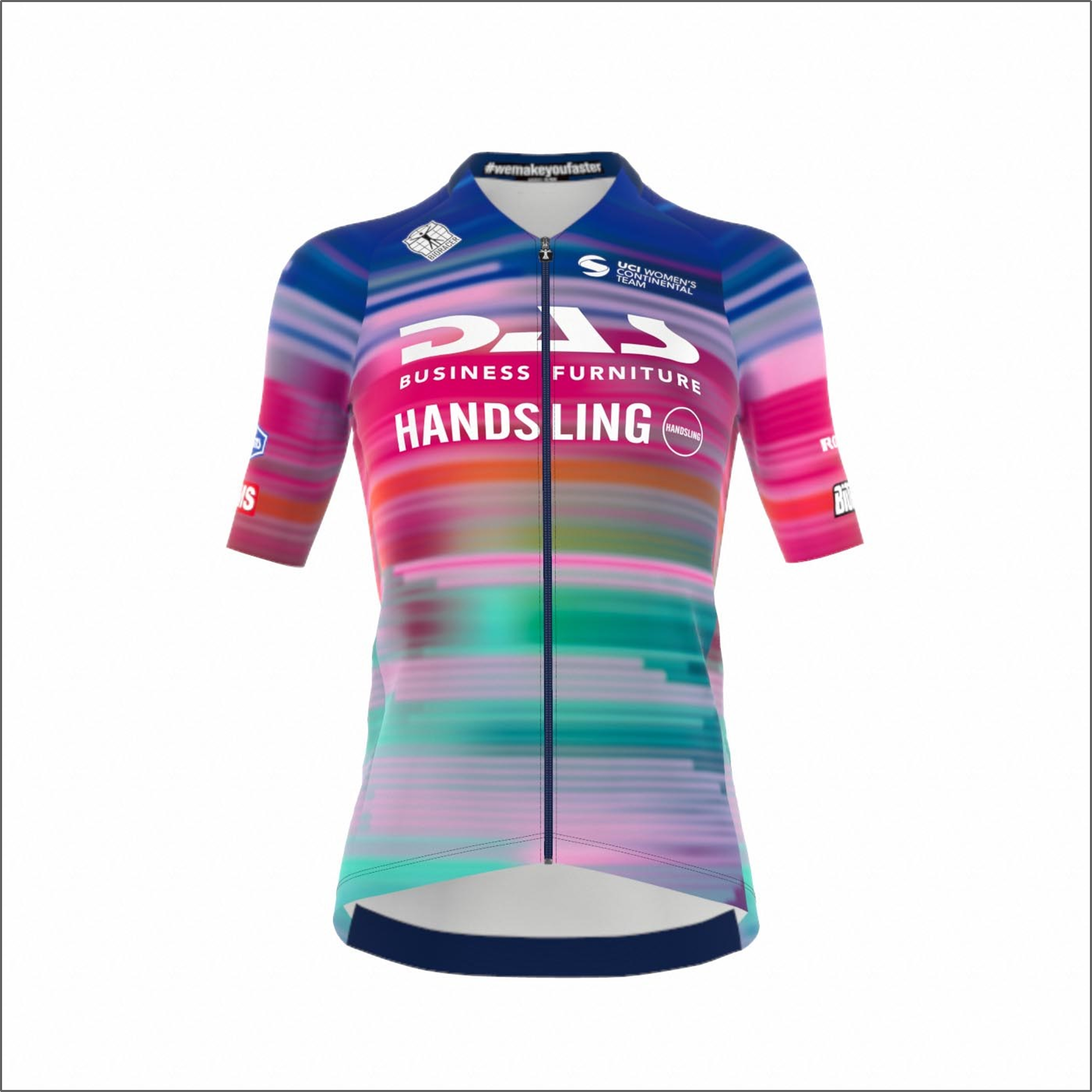
The team formerly known as CAMS-Basso, now DAS-Handsling, has this really fun kit for its racing across road, track, gravel and cyclo-cross.
It's a bit like Canyon-SRAM but a bit more tidy, and will stand out wherever it is worn.
Green Project Bardiani CSF - 1/5
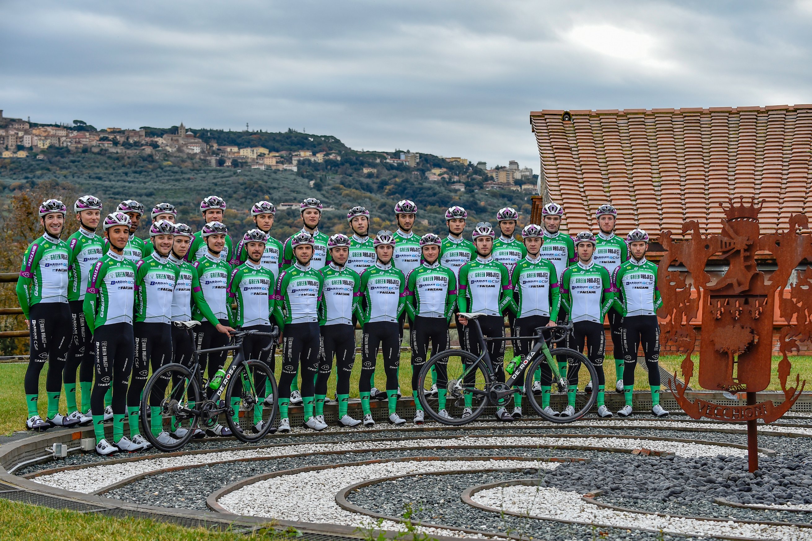
All kits are a fight between commerce and design, but at this longstanding Italian squad it feels less like the commercial bods didn’t just win the battle as much as waterboard the design team with a vat of green Dulux until they surrendered their first born children. The ciclamino shoulders were a last-gasp act of defiance.
Lotto-Dstny - 3/5
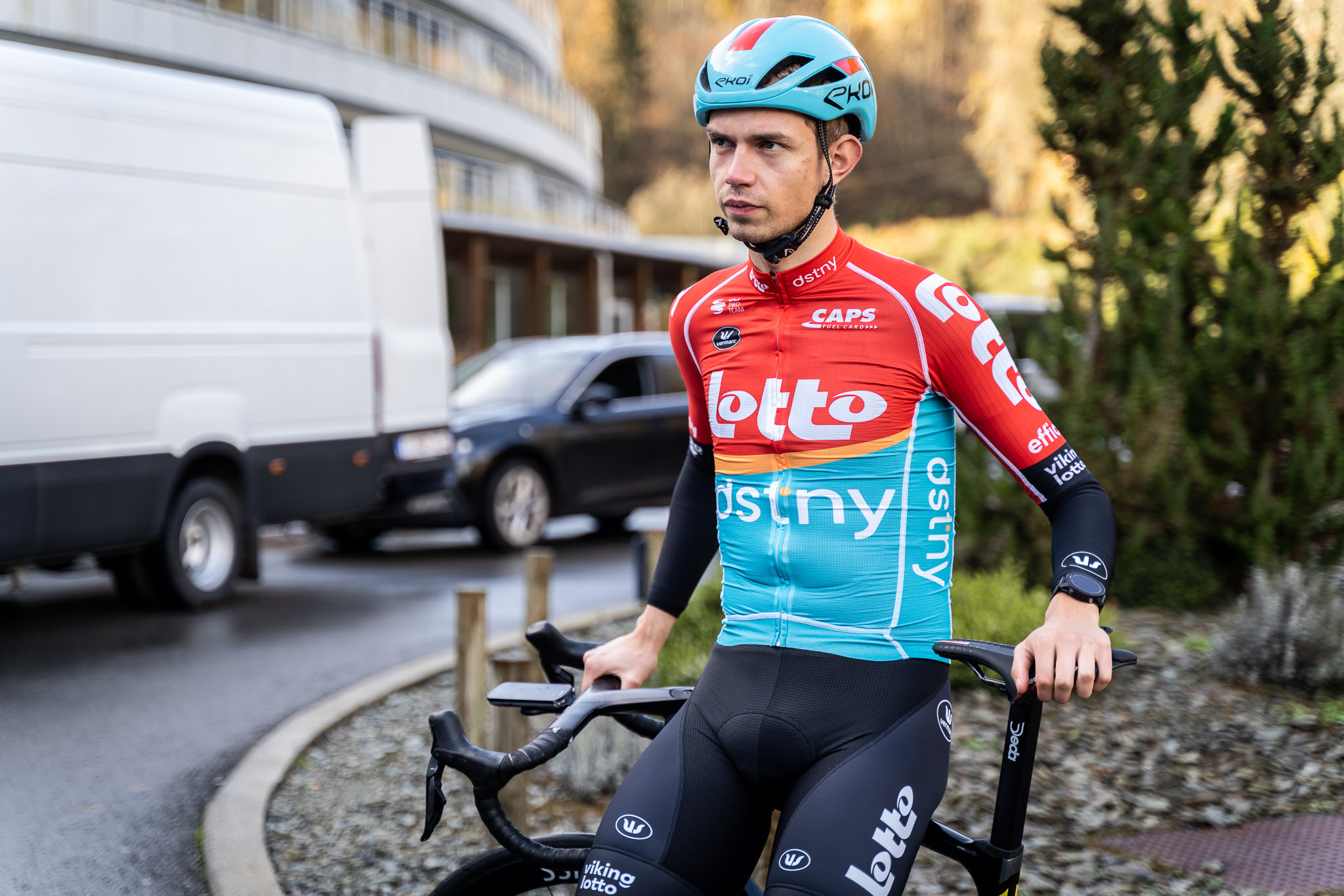
A less than subtle nod to the St Raphaël Géminiani team clobber sported by Jacques Anquetil and friends back in the day, Lotto Dstny’s red/ blue colour pairing is rather cool in a primary colours kind of way. The inclusion of an orange stripe separating the two, however, shall never be spoken of again... by us anyway.

Adam is Cycling Weekly’s news editor – his greatest love is road racing but as long as he is cycling, he's happy. Before joining CW in 2021 he spent two years writing for Procycling. He's usually out and about on the roads of Bristol and its surrounds.
Before cycling took over his professional life, he covered ecclesiastical matters at the world’s largest Anglican newspaper and politics at Business Insider. Don't ask how that is related to riding bikes.