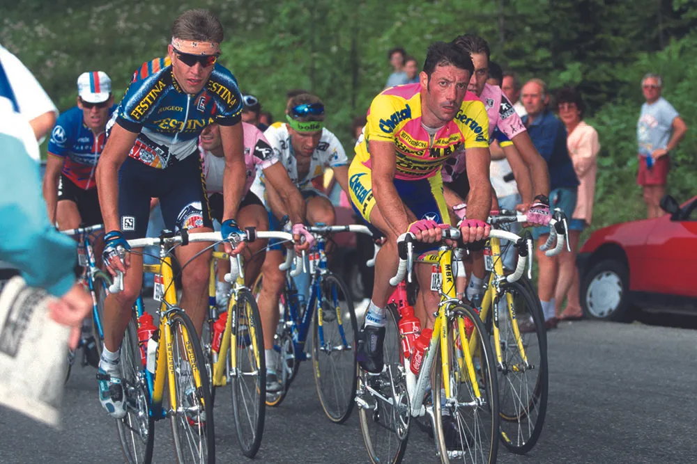
Laurent Brochard and Jean-Francois Bernard at the 1995 Tour de France
I spent the early weeks of the season half-heartedly watching the races from the Middle East. Such uniformity. So much that is drab and hard to get excited about. And that’s just the 2017 kit designs.
There has been an outbreak of style in cycling over the last few years. Jerseys are designed by professionals, using a sensible selection of colours chosen to complement the sponsors’ logos.
But for decades cycling was the sport that taste forgot. Cyclists were the people of the Day-Glo damnation. In the 1990s and early 2000s jerseys were terrible beyond imagining. The question was never so much “What colours are on it?” as “What colours aren’t on it?”
>>> Dr Hutch: Revealing the identity of my greatest cycling rival
A friend whose misreading of a party invitation once left him with 10 minutes to find a fancy dress outfit solved his problem by throwing on some Polti team kit and claiming he was a fat Djamolidine Abdoujaparov.
When he arrived his hostess greeted him with, “Oh, gosh, how wonderful! You’ve come as a migraine!” He could have worn any 1990s kit with the same result. If you really fancy a laugh google the kit for the Chazal team. It was like a test card for a TV channel that specialised in covering nuclear wars.

To design a 1990s cycling kit, you discarded any colours found in nature. Then you found one of those colour-wheels that show how colours can be used to complement each other, and you burned it at midnight under a full moon.
You remembered that stripes and checks famously don’t work together, not unless you have spots too. And then you produced four totally different jersey patterns, and overlaid them all onto a single design.
Loud and proud
Only then did you apply the logos of your sponsors. Main sponsor across the chest, minor sponsors (and what an awful lot of them there used to be) wherever the hell you liked, and at any orientation. Did you want to put a logo on upside down? You could knock yourself out. The image you were after was that of a collage created by four different five-year-olds.
I always wondered if the idea was that by avoiding any hint of visual harmony the logos would stand out better. But the logic is more likely to have been, “Hey, Luigi, let’s get this over with and we won’t have to come back after lunch.”
The tragedy is that we all used to wear this stuff. A 1997 club run looked like a cross-section through the previous 15 years’ Tours de France — and outside the context of a sun-drenched July afternoon it all looked a thousand times more dreadful.
>>> The 25 worst pro cycling kits of all time
We wore it because it was cheap. You could get a jersey, shorts, socks(!), cap and mitts by mail order for about £20. Motorola was a little more, because it was halfway to acceptable. Mercatone Uno was a bit less because, Marco Pantani notwithstanding, it was totally horrendous.

Shades of promise
Now? Well, Astana’s 2017 kit does have a hint of the colour-fade paintwork a 12-year-old boy might plan for when he grows up and customises his first Corsa. And Ag2r is still ploughing along on the old 1970s wallpaper theme (with the brown shorts), as if they can bring a whole era back into fashion by sheer determination. But otherwise, most big teams are quite restrained.
In truth, to say I miss the old days would be a small exaggeration. Certainly the stuff was distinctive, and it gave you a sort of identity, but it’s too easy to be nostalgic about it. It’s up there with the worst clothes ever created.
And I dread to think of the damage all of us did to the lasting image of cycling in the UK as we lumbered around the lanes in it.