The fabric of cycling: A look at the peloton’s most iconic jerseys (video)
Our writers tell us what makes a great jersey, and we look at the most iconic designs from years gone by
The latest race content, interviews, features, reviews and expert buying guides, direct to your inbox!
You are now subscribed
Your newsletter sign-up was successful
What makes a great cycling jersey? Let’s look at the Molteni jersey, a 1970s design made famous by the greatest cyclist of all time.
It’s a classic; one of the most recognisable outfits in the sport’s history and currently the most popular retro jersey sold by Prendas Ciclismo, the British online cycle clothing retailer specialising in replica team kits from cycling’s past and present.
“If you took a brown jersey with white writing and bits of black on it, and marketed it as a retro jersey, it wouldn’t sell,” says Andy Storey from Prendas (and brother to Barney and brother-in-law to Dame Sarah).
>>> Eddy Merckx: the man behind the legend
“Molteni is inextricably linked with Eddy Merckx, and you can’t get away from that. The Solo-Superia jersey that was Merckx’s first team looks far nicer, but it is nowhere near as popular.”
Molteni brings to mind an era when Eddy Merckx was in his prime, when sideburns prevailed throughout the peloton, and when brown was slightly less uncool than it is now. Never mind what Molteni did (they made salami in Arcore, near Milan), the jersey is a visual icon for the world of cycling in the 1970s.
>>> Cycling quiz: Identify these nine pro kits
The latest race content, interviews, features, reviews and expert buying guides, direct to your inbox!
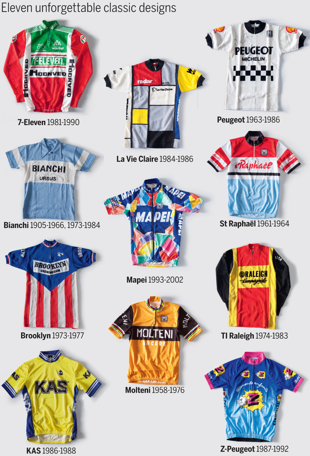
The same could be said for the baby blue of the Bianchi jerseys worn by Fausto Coppi either side of the war, and the red and blue of Jacques Anquetil’s Saint Raphaël team from the 1960s, which also graced the shoulders of Britain’s first Tour stage winner, Brian Robinson.
For us Brits the iconic chequerboard pattern of Peugeot recalls an era from the time of Tom Simpson right through to Sean Yates and Robert Millar, before it turned into another memorable incarnation when the Z-Vêtements children’s clothing brand came on board as sponsor.
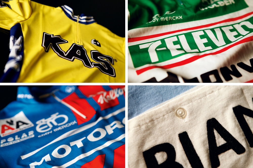
There is an inherent beauty in some of cycling’s greatest jerseys. They are simple, elegant, and evocative of a bygone age, which partly accounts for their increasing popularity. Indeed, sales of current replica kit are making up a smaller proportion of revenue for cycling clothing companies than they did in the past. Steve Smith, brand manager at Castelli, sees today’s replica jerseys as being in a particular trough.
“We’re responsible for this, particularly with the Cervélo Test Team,” he says. “We put a lot of effort into giving those guys a competitive edge with the clothing. And because we wanted people to experience what our brand could do, we sold the same stuff as the pros were wearing.
“So the prices went up, the technicality went up, the kit looked great and millions of people bought it. And so that took your [team kit replica] market from being fan T-shirt territory into high-end, technical clothing.”
Whether or not it’s a recent trend, cyclists these days want to look good. As one staff member at CW puts it: “we’re no longer just a bunch of knobs in Lycra.”
Not sure what to wear?
And cycle clothing companies have taken note; not only is there a lot more choice for cyclists but the standard plain cycling jersey has morphed from a baggy red top you’d buy for £20 into something that fits properly, looks good and performs well. Many come with price tags to match their designer status.
Meanwhile the professional peloton has undoubtedly become a bluer, blacker, greener and visually straighter place than it used to be, and surely not just because there are fewer sponsorship deals going out to small European companies making sausages. Thanks to some recent corporate blue sky thinking, there isn’t always that much difference between a modern-day replica kit and a company’s own-brand clothing.
And with club kits also getting better looking and better performing, the benefits of rocking that
prized Renault-Elf-Gitane jersey on the local club run no longer really exist. That’s before you even take into account perhaps the biggest factor of them all: the shame of being outed as what we’ll call a ‘Full Kit Wally’ (although you may know it by a slightly different term).
This year's top pro kits
Dream designs
Even if we like to pour scorn on amateurs with delusions of grandeur, us cyclists still have a lot of time for nostalgia. Remember Johan Museeuw, Gianluca Bortolami and Andrea Tafi storming into the Roubaix velodrome in the spring of 1996? Remember what jersey they were wearing? Of
course you do.
>>> Can an amateur beat Johan Museeuw up the Oude Kwaremont with the help of a motor? (video)
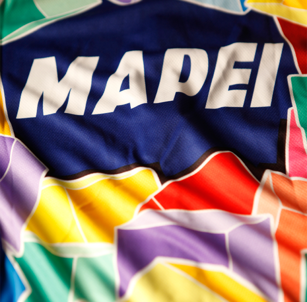
But would that Mapei jersey have looked anywhere near as good had it not signified the Classics super-team of the 1990s and early 2000s? What made a fabric-based icon out of the muddled daydreams of a graphic designer with an unhealthy interest in Lego, Super Mario and psychoactive drugs?
The thing about jerseys is that they aren’t just static works of art. Jerseys are designed to be worn, to be ridden, and to be proudly displayed underneath raised arms on the finish line. We’ve forgotten all about the 1995 Le Groupement jersey even though it went for the same multi-coloured style as Mapei.
This is not because the designer went for a military-inspired camouflage design that would have only offered cover in a children’s soft-play area, but because (unlike Mapei) the team never got off the ground.
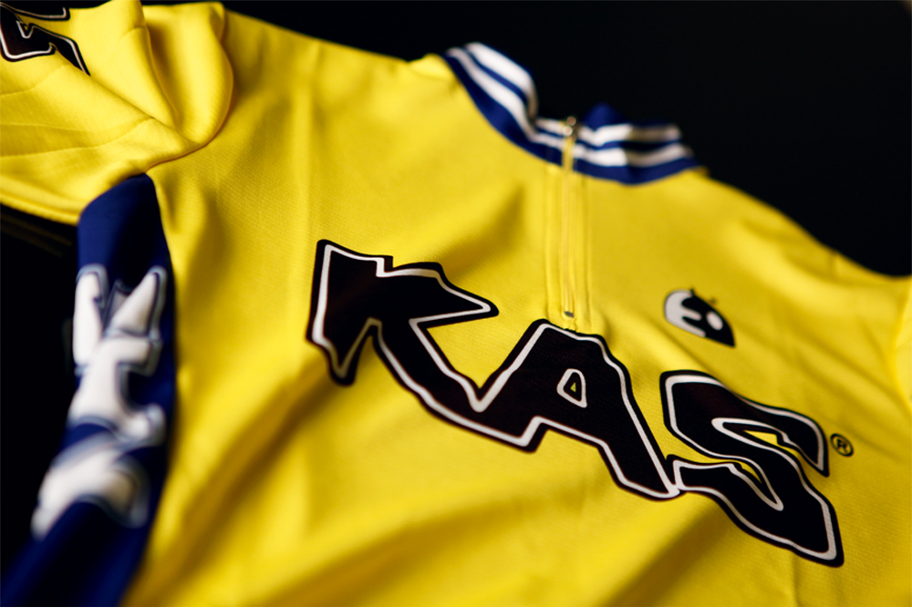
It’s hard to distinguish the good kits from the wonderful stuff that happened in them. The same could be said for the likes of KAS and TI-Raleigh. They are classic jerseys, but do we love the jerseys because of what they look like or what they came to represent?
Well, the answer to that is: probably a bit of both, although not in every case. The blue mock workman’s overalls on the Castorama jersey of the early 1990s looked no better for being modelled by French stars Laurent Fignon and Laurent Brochard. Whoever rubber-stamped the incorporation of dungarees on a cycling kit should not be allowed near a sewing machine ever again.
However, and bear with us here, in one sense the Castorama jersey should actually be considered one of the greatest of all time. Whatever we think of the jersey, we all remember the brand name, and that can’t be a bad return on their investment. ‘There’s no such thing as bad publicity’ would do a good job of epitomising 1990s pro cycling sponsorship; the marketing teams at Castorama and Festina probably got used to saying that quite a lot.
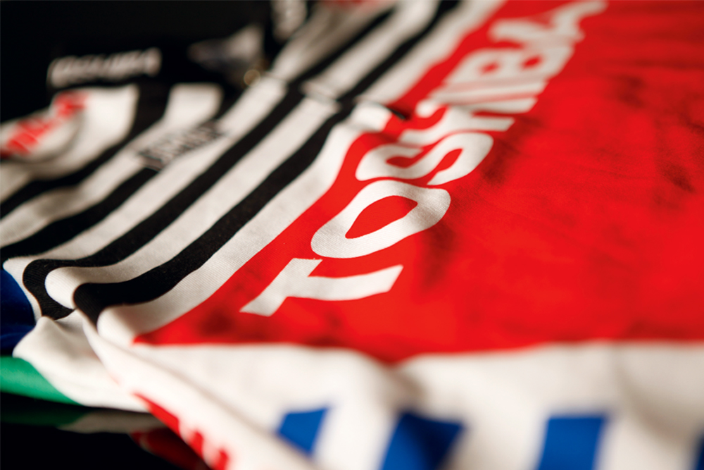
Famous faces pick their favourite jerseys
Sir Bradley Wiggins
“I’ve got a few old jerseys, but my favourite is probably GIS-Campagnolo from 1976. Francesco Moser. I love it. I’ve got quite a few of those few from the different years because they used to change the jersey every year. I go riding in them. I’m a bit of a geek: I’ve got all the kits to the bikes to match. It’s just my little thing.”
>>> Exclusive: Sir Bradley Wiggins discusses his classic bike collection
Graham Watson (cycling photographer)
“Acqua e Sapone, both in the days of Mario Cipollini with its zebra-like patterns and more lately in 2012 when Carlos Betancur wore their bright-red colours in his first pro season. As a photographer you need a jersey you can see from a long way off, and both sets of Acqua e Sapone did this. I think fans, cyclists and photographers love a jersey that is different yet classy — they can see it a mile away and will remember it way beyond the life of a team. Sponsors have to get it right too.”
Michael Mørkøv
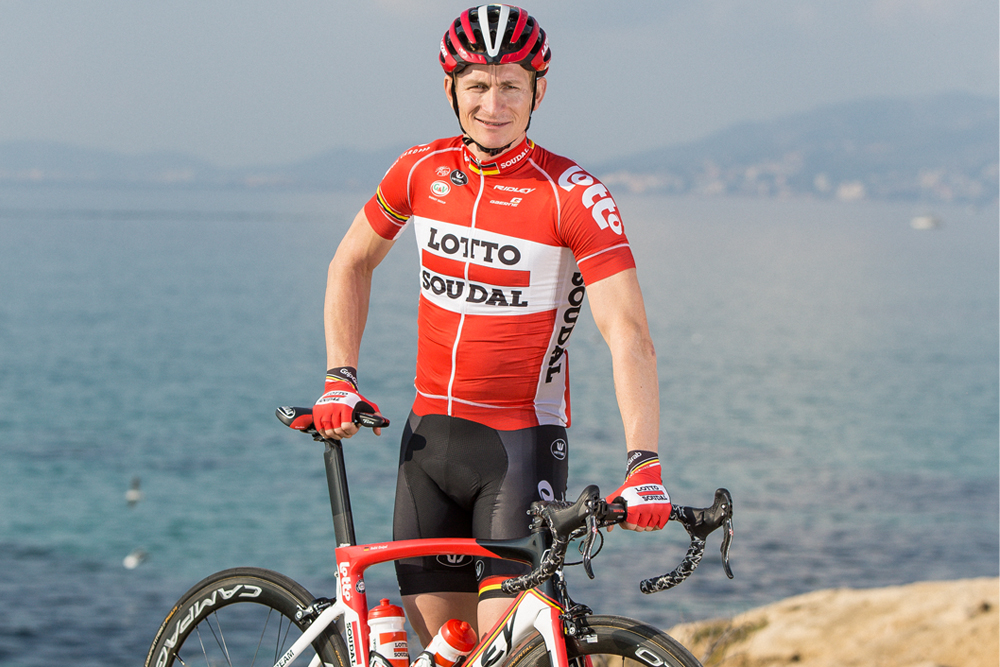
“I think the Lotto-Soudal kit at the moment is really nice. It’s old-school, it’s clean, it’s got some good colours on it.”
Tao Geoghegan Hart
“Peugeot. You can’t go wrong with it. It’s plain and simple, easy to spot in the bunch, and there are so many great pictures of Tom Simpson in it.”
Heinrich Haussler
“To be honest I think most modern kits are pretty ugly. But Alexis Saramontins had the Latvian national champs jersey and I love that. He even gave me one. I don’t know if I can get away with wearing it during the season, but at home I can wear it.”
Ed Clancy
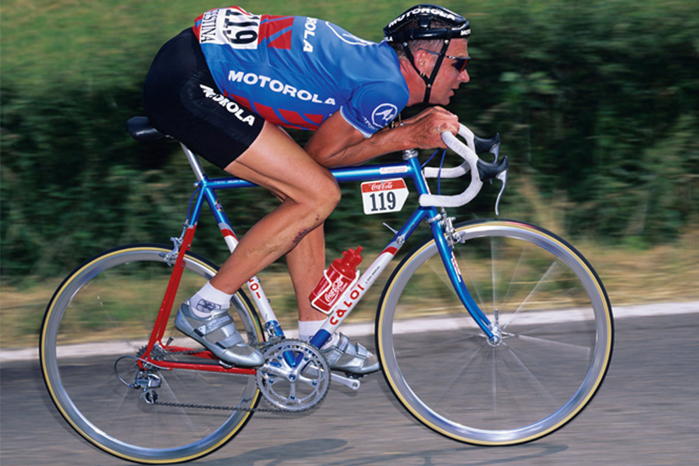
“I love the Motorola kit. It looked cool — I used to watch Sean Yates when I was a kid and he always looked good in it.”
Bram Tankink
“I actually like the LottoNL-Jumbo jersey! I like the lottery balls on it, and it’s easy to see on television. It’s nice for my mother, she recognises me easily.”
Stef Clement
“I like the old TI-Raleigh kit. That team was full of superstars, it may even be the best team of all-time, and the jersey was special to so many people in the Netherlands.”
Taylor Phinney
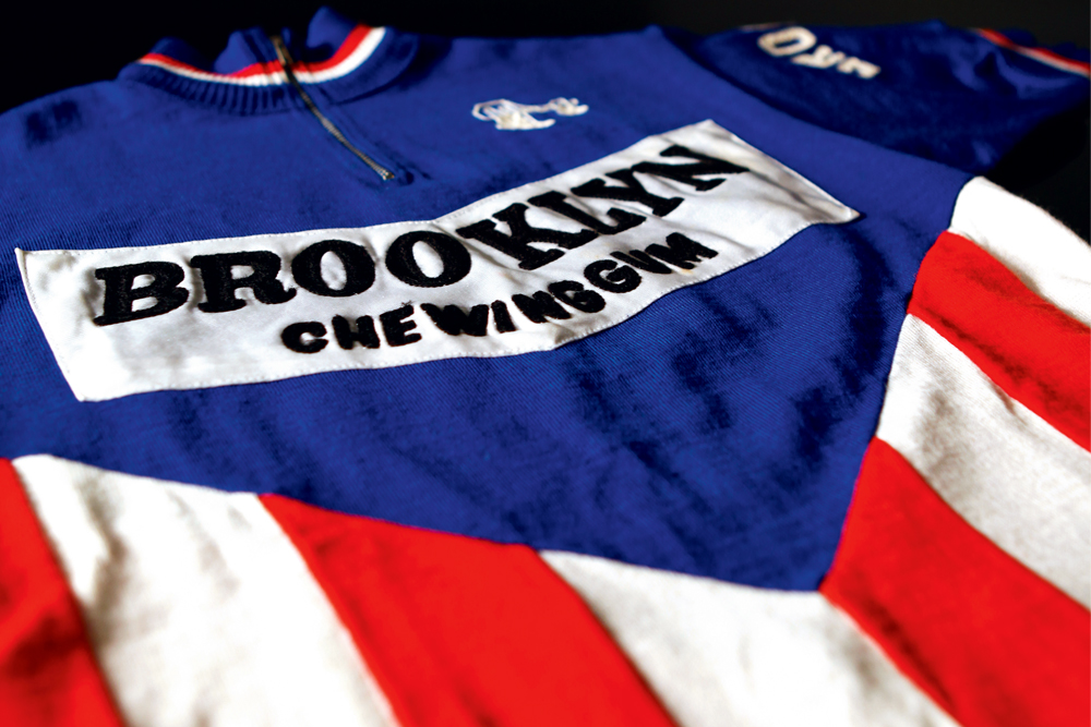
“I’d probably go for the Brooklyn Chewing Gum jersey, I really like that. Because they have a US sort of theme on there. It’s got the US stripes and stuff going on. They also had the Belgian guy racing for them, Roger De Vlaeminck.”
Brett Horton (owner of the Horton Collection of cycling memorabilia)
“My favourite jersey is Eddy Merckx’s 1975 Liège-Bastogne-Liège jersey. I bought it from Eddy. That hits so many of the things that I love. First it’s a Merckx jersey. Second, it’s a world champion jersey. Third, it’s Molteni-Campagnolo and fourth, he was wearing that jersey when he won Liège for a fifth time. My favourite thing about that world champion’s jersey is the repair on it; there was a little hole that had been sewn up and Claudine [Merckx] looked at it and said to me, ‘That’s my sewing.’”
Tyler Farrar
“I really like the Quick Step jersey from a few years back, when it was white and blue. It wasn’t anything flashy, but I thought it was classy. It was the best in an era when lots of kits were blue; before black became the colour to use.”
Printing revolution
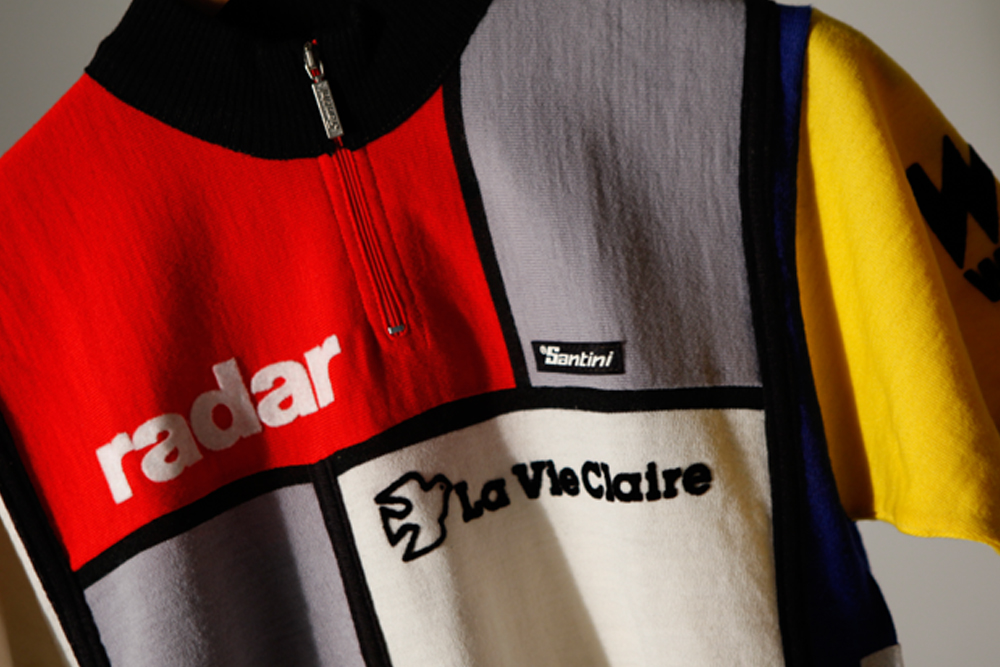
Now cast your mind back to 1984 and a team that hit the world of cycling like a whirlwind. It wasn’t just because it was run by a maverick tycoon, popstar and politician called Bernard Tapie (Tapie, now 73, is still making headlines over a €400m payment signed off by former French finance minister Christine Lagarde).
It wasn’t just because of a zany new-age pseudo-scientist called Paul Koechli who liked to think of himself as the team’s nutritionist and spiritual leader, even though in reality he was just a rubbish DS.
It wasn’t even just because it was home to the two greatest Tour riders of a generation — Bernard Hinault and Greg LeMond — representing both cycling’s golden past and its exciting future. It wasn’t just because of the revolutionary Look clipless pedals either.
The team was called La Vie Claire, and it stormed into the pro scene with a groundbreaking Mondrian-inspired multicoloured jersey. Nothing had ever looked like it before, and with good reason.
>>> Show us your scars #3: Bernard Hinault (video)
Even well into the 1980s, team kits were still put together by a squad of seamstresses tirelessly stitching designs together in wool, by hand. Look inside the La Vie Claire jersey and what you see is a heavy, itchy, woolly mess. Goodness knows what Bernard Hinault’s nipples looked like after a Grand Tour.
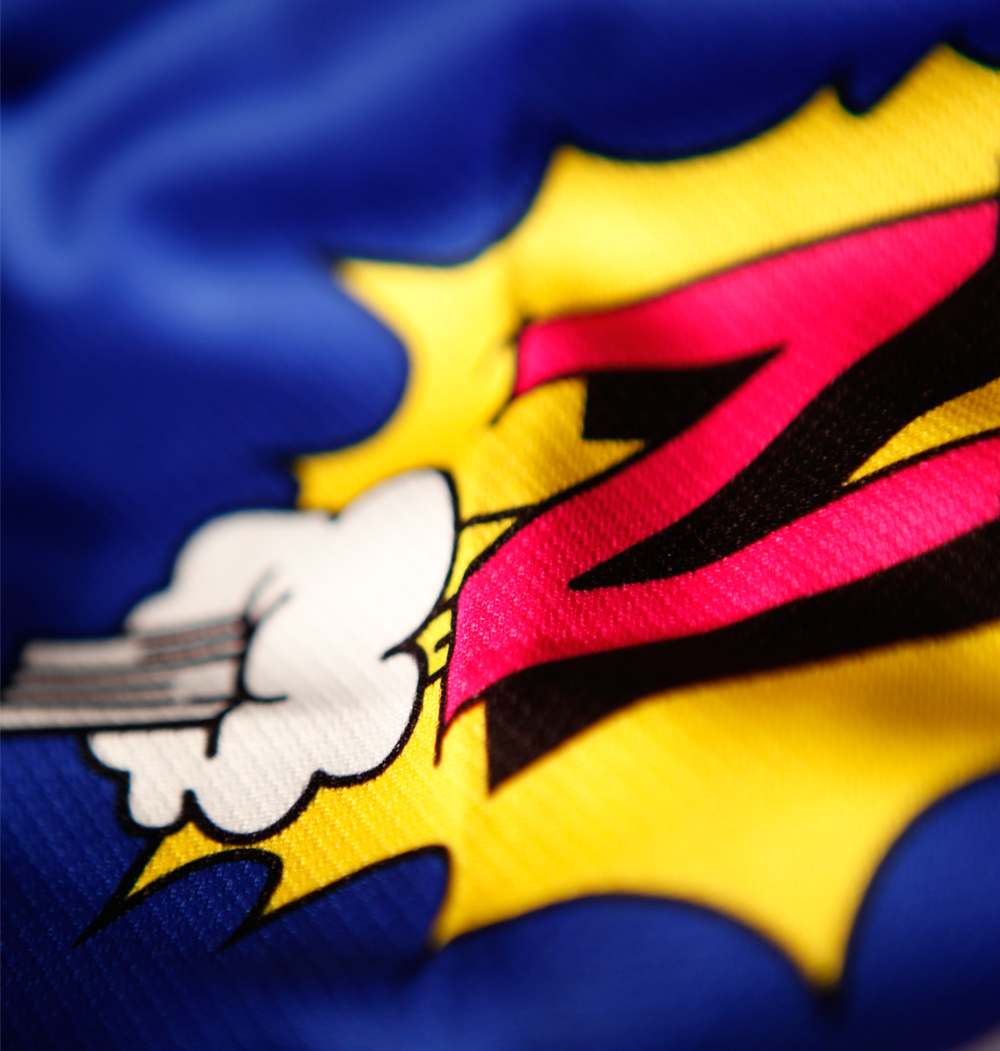
But things were about to change, and all thanks to a revolution brought about by sublimation printing. Allowing dye to be directly printed onto fabrics, which now included polyesters, in hindsight the process should have come with a recommendation that Italian clothing designers should be supervised by a responsible adult at all times.
What followed was an explosion of colours, logos and outrageously enthusiastic ideas, most of them originating in Italy. Apparently no motif was too wacky for the designers of the time who, free from their woollen shackles, tended to print first and ask questions later.
Just look at the GIS-Gelati team. Its jersey of the late 1970s and 1980s was white with simple red and blue stripes dropping down from the shoulders. A couple of years later and along came the 1990 edition, containing no fewer than 11 colours and 10 different sponsor logos. It was mainly yellow and pink, presumably like the ice cream made by its main sponsors, but barely a square centimetre was left without some sort of pattern, colour gradient or logo. It is wonderful.
The contagion was by no means limited to Italy (remember ANC-Halfords in 1987 and Z-Peugeot a few years later?), but while we’re on yellow and pink jerseys, the Chazal team sponsored by the French pork product firm (what is it with great cycling jerseys and processed meat manufacturers?) came up with another classic. This one went so far as to have a purple and yellow teddy bear printed on the front, though we’re still not sure why.
Colourful history
And, unlike football teams, the beauty of cycling kits is that they change along with sponsors on a regular basis. That Chazal team would go on to wear the red and yellow of Casino (1996-1999), the blue and yellow of Ag2r Prévoyance (2000-2009), and finally the blue and brown of Ag2r La Mondiale that we know — and love — today.
Today’s blue and green Movistar team has been pink and white (Reynolds, 1980-82), blue and white (Reynolds, 1983-89), red, blue and white (Banesto, 1990-2000), blue, yellow and orange (iBanesto, 2001-03), multi-coloured (Iles Balears, 2004-05) and black and red (Caisse d’Epargne, 2006-10).
It’s ironic that the sport’s darkest era produced some of its brightest jerseys: think Polti, Kelme-Costa Blanca, T-Mobile, Mercatone Uno and the hundreds of permutations that were made possible by leaders’ jerseys, national champions’ stripes and the rainbow bands of world champion. It was still going on as late as 2008, notably with the purple and orange South Australia-AIS-Bianchi kit that featured a pair of kangaroos on the front and a sprinkling of Mapei coloured blocks on the sleeves.
Today, with the notable exception of Lampre-Merida (Italian, of course) cycling is in a bit of an artistic hangover. Having spent the 1990s in a chemically enhanced rave of neon colours, it is now shunning bright lights and drinking lots of plain water, knocking back the painkillers and trying to forget some of the embarrassing things it did.
Amidst this context the simple black, blue and white kit of Team Sky has been the game changer for modern jerseys, just as the team’s marginal gains obsession has been for the sport. Even if critics lambast it for being corporate and uninspiring, we’ll definitely remember Sky’s jersey, if only because it was the first to ride into Paris with a British Tour winner. Could the same be said of Giant-Alpecin’s or LottoNL-Jumbo’s creations? Probably not.
The best jerseys are the ones that are the most unforgettable. Those precious gems of European exoticism that bring a little bit of Continental colour to the bland British roads, and allow the aspiring youngster to dream of emulating his or her heroes. We’re lucky that cycling is full of jerseys that were so good that they were great, and others that were so bad that they were great too.
And, in a sport full of bad news, those jerseys cut through all the negativity and still have the ability to inspire even the most disenchanted fans. A great jersey puts a smile on your face. You just know one when you see it.
Richard Abraham is an award-winning writer, based in New Zealand. He has reported from major sporting events including the Tour de France and Olympic Games, and is also a part-time travel guide who has delivered luxury cycle tours and events across Europe. In 2019 he was awarded Writer of the Year at the PPA Awards.