From palette to panache: How cycling brands decide on colours for your kit
Who chooses the colours for the latest season’s cycling kit, and how do they identify the hottest hues? Adam Becket explores the competing priorities – flair, fashion and function


“Colour is the place where our brain and the universe meet,” wrote the art critic John Berger. He might have been referring to a Paul Cézanne exhibition, but the idea applies more widely. It speaks to what colour is, its essence, and how our perception of it creates the world as we know it. Cézanne was one of the masters of colours, from pale greens to pure black, but you don’t need to be one of the greats to care deeply about tints, shades and hues – especially the colour of your cycling kit.
Rosalind Borwick, a senior designer at Le Col, takes some of her inspiration for her brand’s colour palettes from going to exhibitions; the Berger quote seems even more apposite now.
“When we start the palette at the beginning of the season, we take into consideration our inspirations,” she tells me. “Some of that might be trends, but we’re not led by trends. We use a digital platform that is a big canvas, and we add to it. And then we see what we’re drawn to, what we’re seeing. Some of that is inspired by photographs, some from things that we see at exhibitions. It’s just a starting point.”
Georgia Kasmin, colour designer at Rapha, echoes this approach: “We keep an eye on broader trends in culture and fashion, allowing them to naturally influence our creative process. Drawing inspiration from various realms such as art, design, culture and performance, we embrace a holistic approach. However, we don't feel the pressure to be overly trendy. Our focus lies in crafting enduring products, with colours to transcend the short-lived nature of fashion seasons.”

It is not quite as simple, though, as picking a colour that you like and putting it onto a cycling jersey. “We look at the collection on a couple of different levels,” Jenniefer Choi, the head of product at Le Col, explains. “When you're looking at colour, you look at things like your core colours that always stay the same – your black and navy bib shorts, for example. Then you also look at seasonal colours that carry through a couple of seasons. These might be colours that have done really well for us, or our core critical colours that are associated with the brand. Then there are seasonal trend colours, which could be dictated by trend forecasting companies or things that you see that's happening in the industry, or if there's a shift towards a certain colour palette. Colour is broken down into those three core pillars.”
Rapha designer Kasmin highlights the importance of material considerations: “When we are introducing new colours, we make sure that we can do it sustainably. Choosing new jersey colours follows a natural cycle for us. Our colour palettes are carefully chosen based on the specific collection we're working on, and the stories we are looking to tell for the season. We seek out hues that embody the essence of the cycling style we're focusing on and align with Rapha's approach.”
Performance fabrics
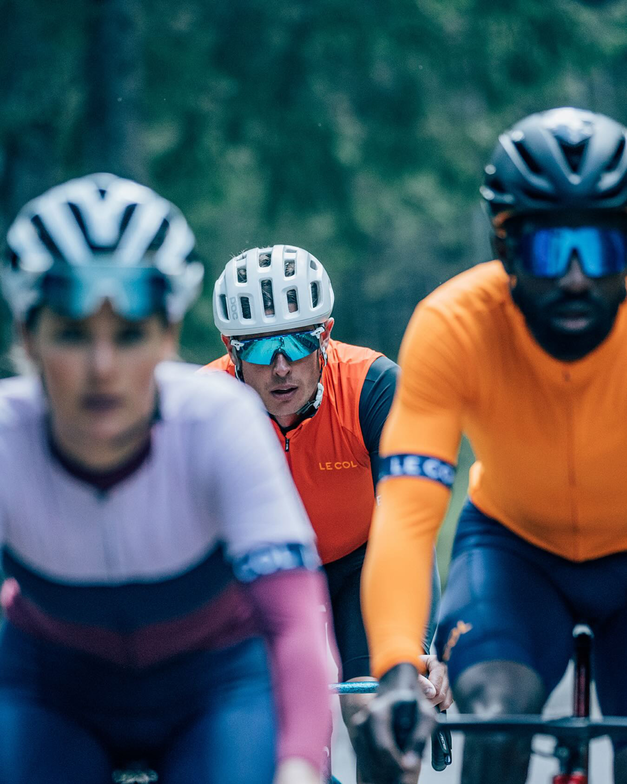
There is one further difference separating cycling from fashion: performance. Unlike high-end or high street fashion, bike kit can’t just be about what sells well or looks good. Colours are chosen partly based on how they behave on the skin. “Summer colours are quite different,” Borwick says. “Obviously, in high summer there is more of a consideration of sunlight and breathability. In other seasons, you've got to consider low light visibility and reflectivity, so that has something extra when we think about colours.”
The latest race content, interviews, features, reviews and expert buying guides, direct to your inbox!
The importance attached to kit colour varies widely from one rider to the next. For those who obsess over appearance and obey self-imposed rules such as brand-matching jersey and shorts, then how it all looks together is clearly crucial. All of us care about how the kit works – its comfort, aero and thermal qualities.
“Another key factor with cycling is layering – how it’s all going to look together,” Choi adds. “You have to go through things holistically and make sure it all fits together from a colour palette perspective, not just throwing together things.” The specialist nature of cycling clothing obliges brands to prepare far in advance; Le Col is currently planning its kit for late 2025, more than a whole year ahead, such are the lead times involved.
Hue and cry - What's coming up
Thanks to forecasted trends and long-term planning, brands know what’s coming down the line long before it is actually sold to us. Which have been the most popular colours in recent seasons? “Grey tones and dark red have been successful for us,” says Rapha’s Georgia Kasmin. “Looking ahead, we anticipate purple to be popular, and we're excited to introduce a Rapha interpretation of that in the upcoming year.”
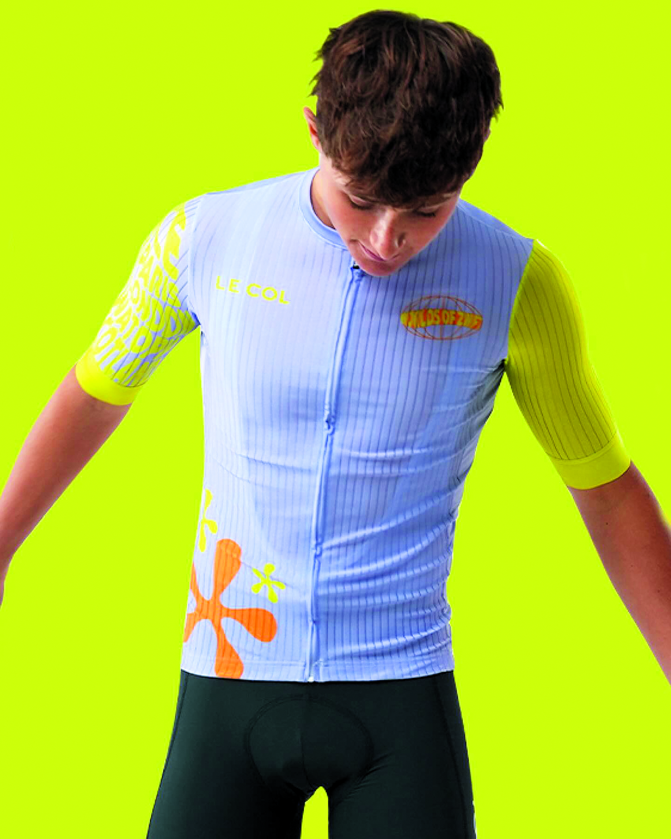
For Borwick, from Le Col, this question is more difficult to answer, but she predicts bright will once again be best: “What is in vogue right now is probably already old. I think, generally speaking, there will be a shift from these softer neutral, earthy tones, and we'll see more bright colours. We do already see this trend, but I think it will become more and more, as the pendulum swings.”
On trend
Despite all the talk about performance fabrics and the importance of being led by customer preferences over what is currently fashionable, brands do take into account what is currently on trend or upcoming. There are organisations that help brands by producing colour forecasts, the best-known of which is Pantone, but there’s also others, like the International Colour Authority, which helps determine what is cool now, and what is going to be cool soon.
If you’re browsing the website of your favourite kit company and finding that some colours seem to be popping up more than others, or you’re confused over the dominance of one particular shade, forecasters’ trends might be to blame, not that they are always followed. “Some colours popular now were unpopular before, highlighting the cyclical nature of colour,” Kasmin says. “Pink has been having a resurgence with cultural influences like Barbie and the Pantone Colour of the Year, Viva Magenta [2023’s colour, which is a dark-ish pink]. Browns have also gained popularity in recent years. There's always the time for a colour comeback.” Take note, AG2R – brown shorts are coming back.

Borwick prefers not to be too influenced by forecasts. “We’ve not been so successful when we’ve followed those seasonal trend colours. We had a colour in the collection a couple of seasons ago called Sunset, it was very earthy, beautiful, almost like a blush brown tone, which is very much in trend in wider fashion. It just didn’t do that well. I think this goes back to cycling being a specific thing, whether that’s visibility or reflectivity. That’s reflected in the colours that do well, like bright lime green.”
Kasmin picks up on the theme of luridness: “Bold and vibrant colours, though polarising, can surprisingly shine in the right context. The success of a colorway depends on timing, the product, combination, and execution.”
Black bib shorts and plain, primary colour jerseys will not be going anywhere, but next time you’re looking for a new jersey, or are puzzled at a particular colour’s popularity at a club ride, consider that there are wider forces at play.
Cézanne might have mastered colour, according to Berger anyway, but it is something that is around us all, and important in the making of everything we wear. Perhaps give it a thought next time you open your cycling wardrobe.

Adam is Cycling Weekly’s news editor – his greatest love is road racing but as long as he is cycling, he's happy. Before joining CW in 2021 he spent two years writing for Procycling. He's usually out and about on the roads of Bristol and its surrounds.
Before cycling took over his professional life, he covered ecclesiastical matters at the world’s largest Anglican newspaper and politics at Business Insider. Don't ask how that is related to riding bikes.