Ranking the best pro cycling kits of 2026 – from all-time classics to sponsor overloads via 'light grey' shorts
From sharp designs to visual crimes, we size up the peloton's latest wardrobe
It's awards season, and the red carpet has been rolled out for the kits of the pro peloton, dazzling in their various colours and patterns, although they're mostly blue.
As the season is very much underway, we thought it was high time to cast our expert* eyes over this season's offerings, as we all become accustomed to what the various teams look like.
If you think we're wrong, we are missing out on something or you'd just simply like to agree with us, please comment away.
Interestingly, in a poll we ran on our main 2026 kits page, the far and away winner, with almost a third of a vote (28%), was Pinarello-Q36.5, with Canyon-SRAM zondacrypto coming in second with. That much-derided Ineos Grenadiers effort managed a massive 10% of the vote. Sometimes, the public is wrong. Or maybe we're wrong!
Anyway, it's time for the main event. Presenting the awards are Adam Becket (AB), Meg Elliot (ME), James Shrubsall (JS), and Tom Davidson (TD).
*not actually experts.
Best in show
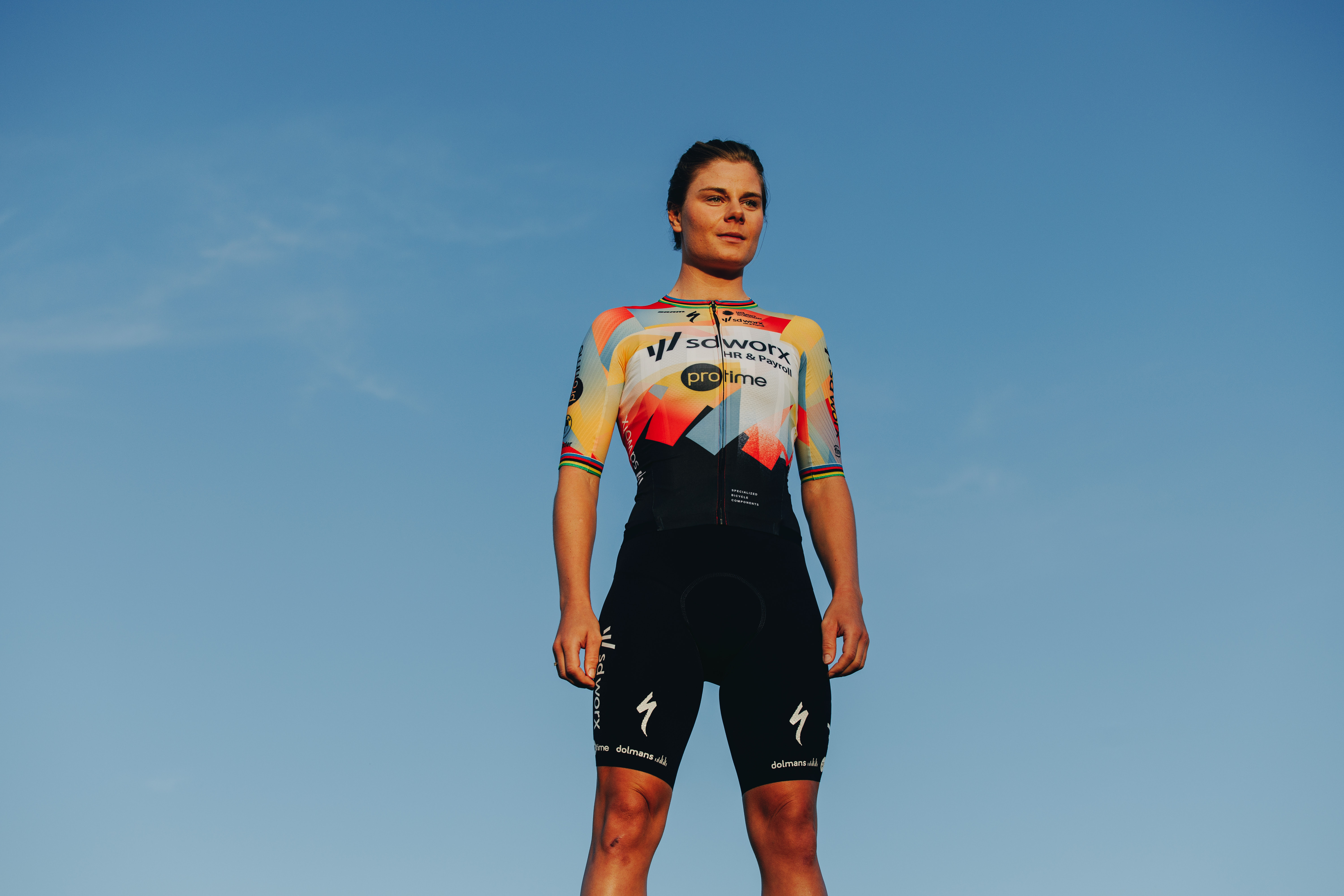
Winner: SD Worx-Protime
The latest race content, interviews, features, reviews and expert buying guides, direct to your inbox!
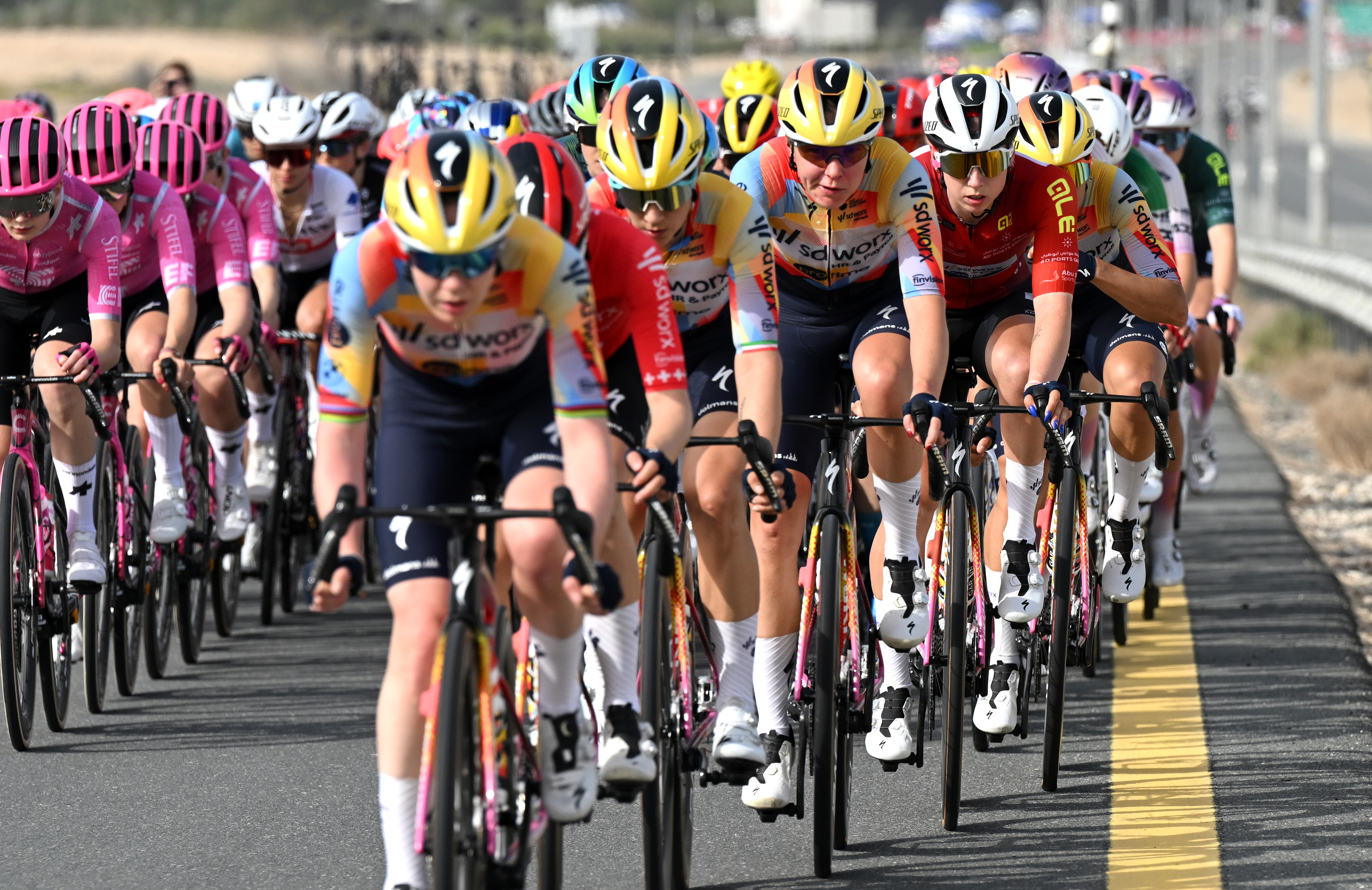
A few years ago, SD Worx-Protime held their media day in KMSKA, Antwerp’s premier art gallery, and we wonder if this explosion of colour was inspired by Rhythm of Light Waves by Jules Schmalzigaug. There’s definitely a resemblance there. When this design was announced, we called it already as kit of the year, and we haven’t changed our minds since. Forget the purples and pinks of previous years, this carnival of shades will make SD Worx easy to spot. AB
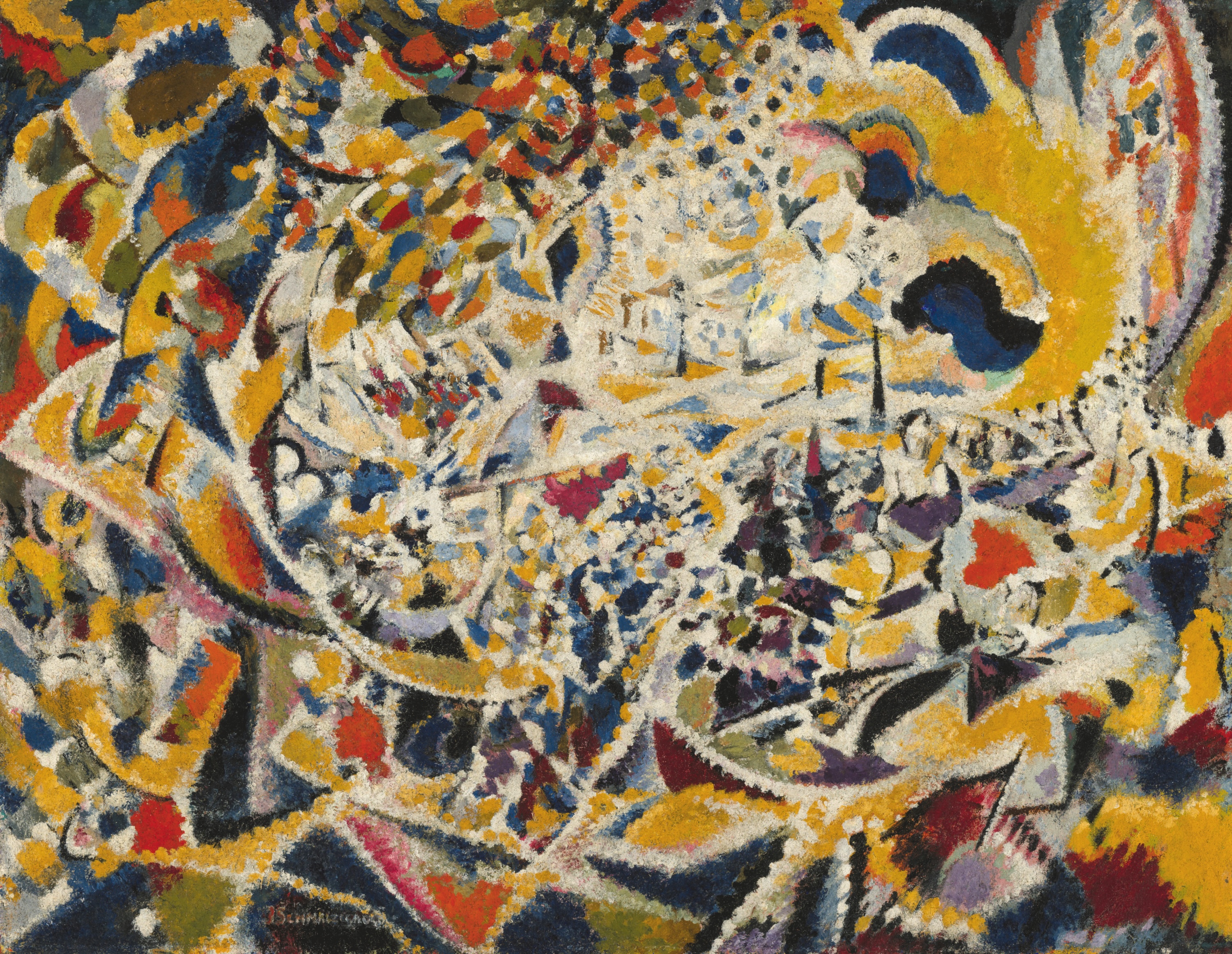
Runner-up: Canyon-SRAM zondacrypto
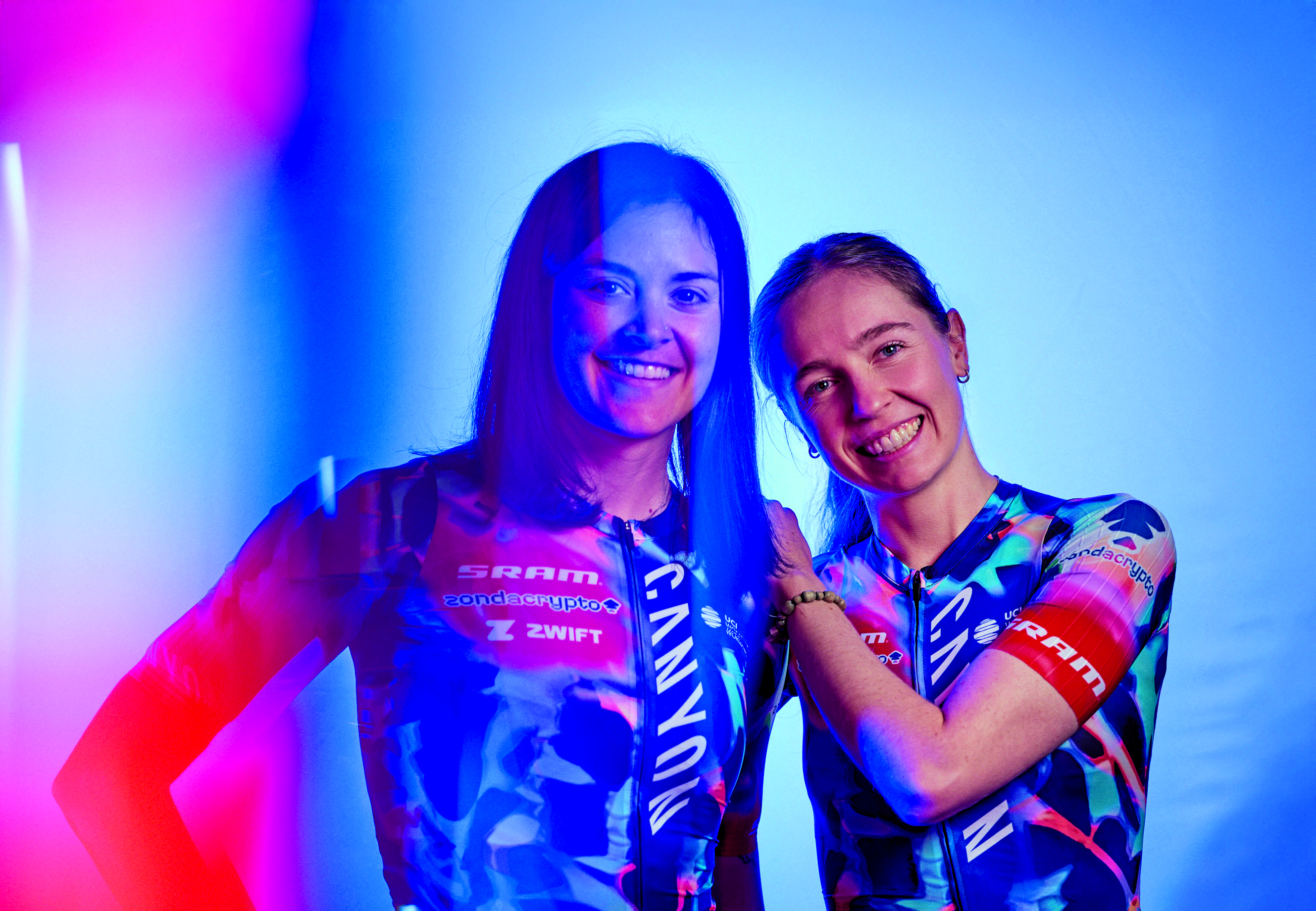
Maybe women’s teams have more of a licence to do something bolder, or perhaps Canyon-SRAM’s designers are just repeatedly on the money. This jersey is called ‘Luminous’ and you can see why, thanks to the streaks of light across it. Often, jerseys look better in the press releases to reality, but having seen Zoe Bäckstedt wear it in CX already this year, we can confirm this is a banger. Kits like this make us wonder why so many others are a drab, monotone blue. AB
Special mention: EF Pro Cycling
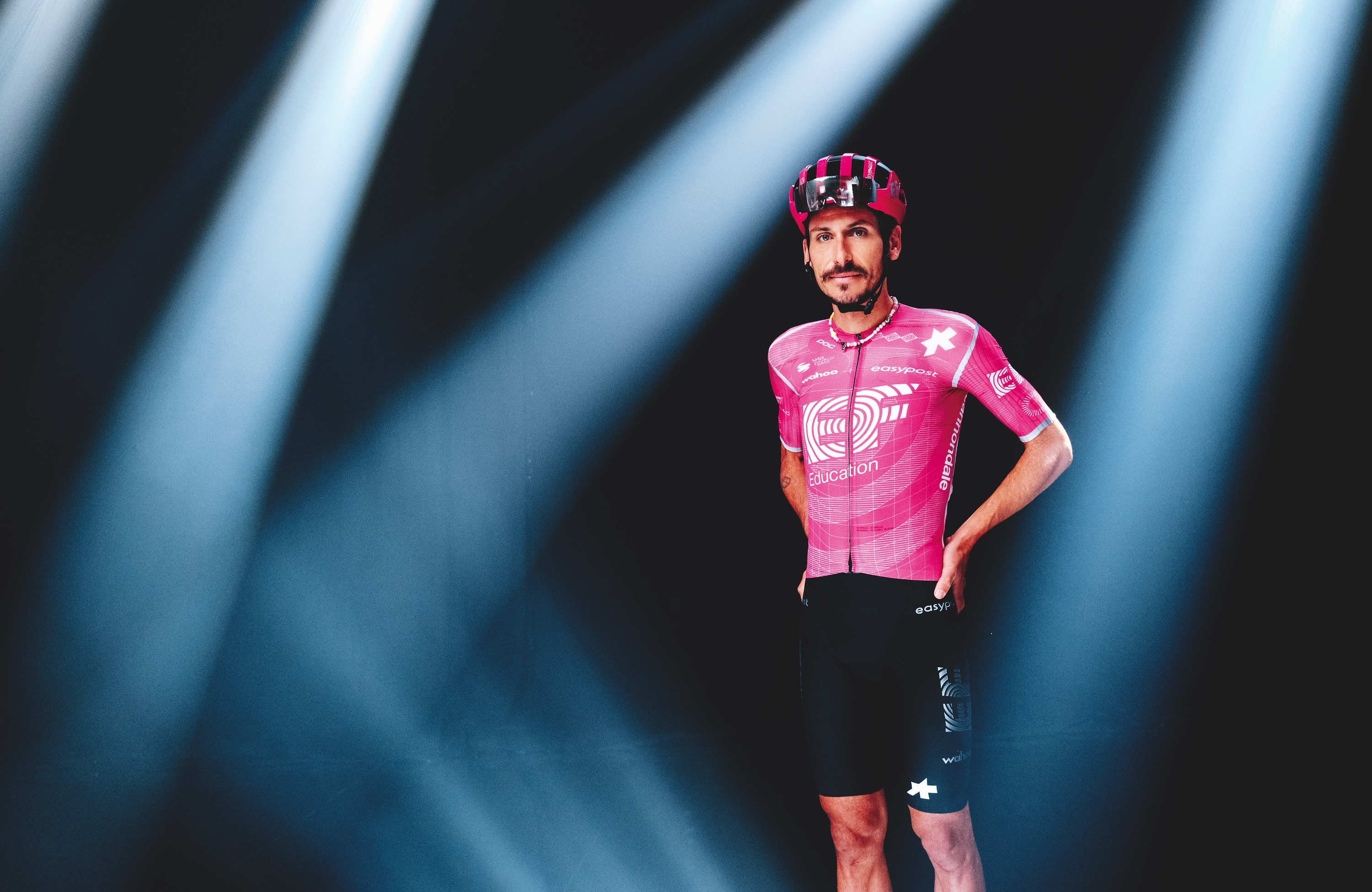
This could have so easily gone wrong. After years with Rapha, EF Pro Cycling switched to Assos, a brand known for high-quality but functional kit. Fortunately, the pink is as vibrant as ever, like EF have been let loose in Barbie’s Dreamhouse, and the silver accents give the jersey a space-age look. There’s no utilitarian blandness to this design, but instead a reminder to the rest of the peloton that the American team is here. The next question will be what they do for their Giro switch-out number. AB
Classy understatement
Winner: Pinarello-Q36.5
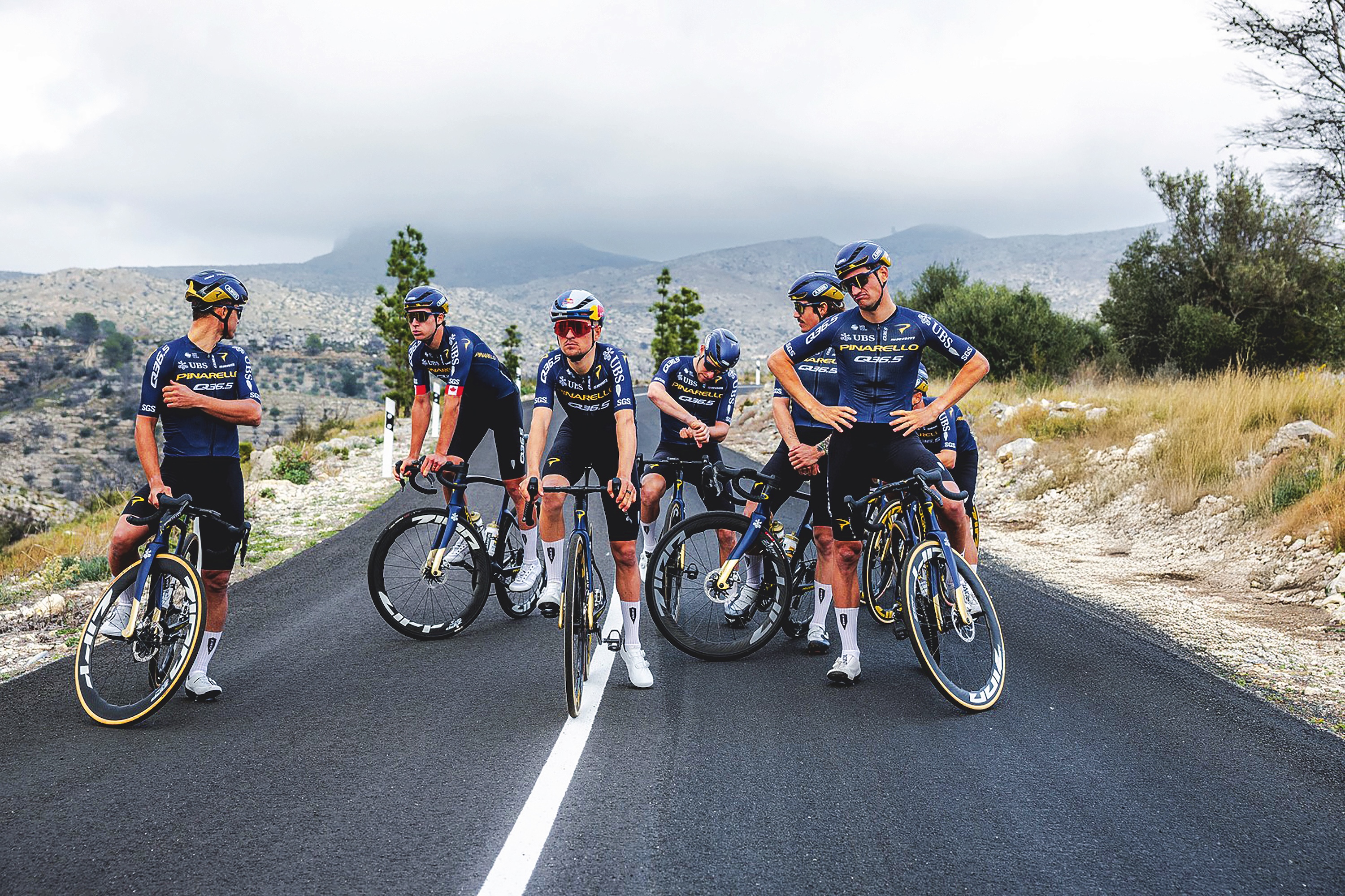
With a blue so deep you could launch a cruise liner across it, Pinarello-Q36.5 has gone dark for 2026. Sponsors will be glad to see their names still clearly readable, with the new bike sponsor in particular given the golden treatment – a hopeful nod to results to come, perhaps? The white-on-black shorts complete the classy design and will no doubt be eyed with an envious sigh by certain other riders in the bunch. Isn’t that right, Ineos Grenadiers? JS
Runner-up: Movistar
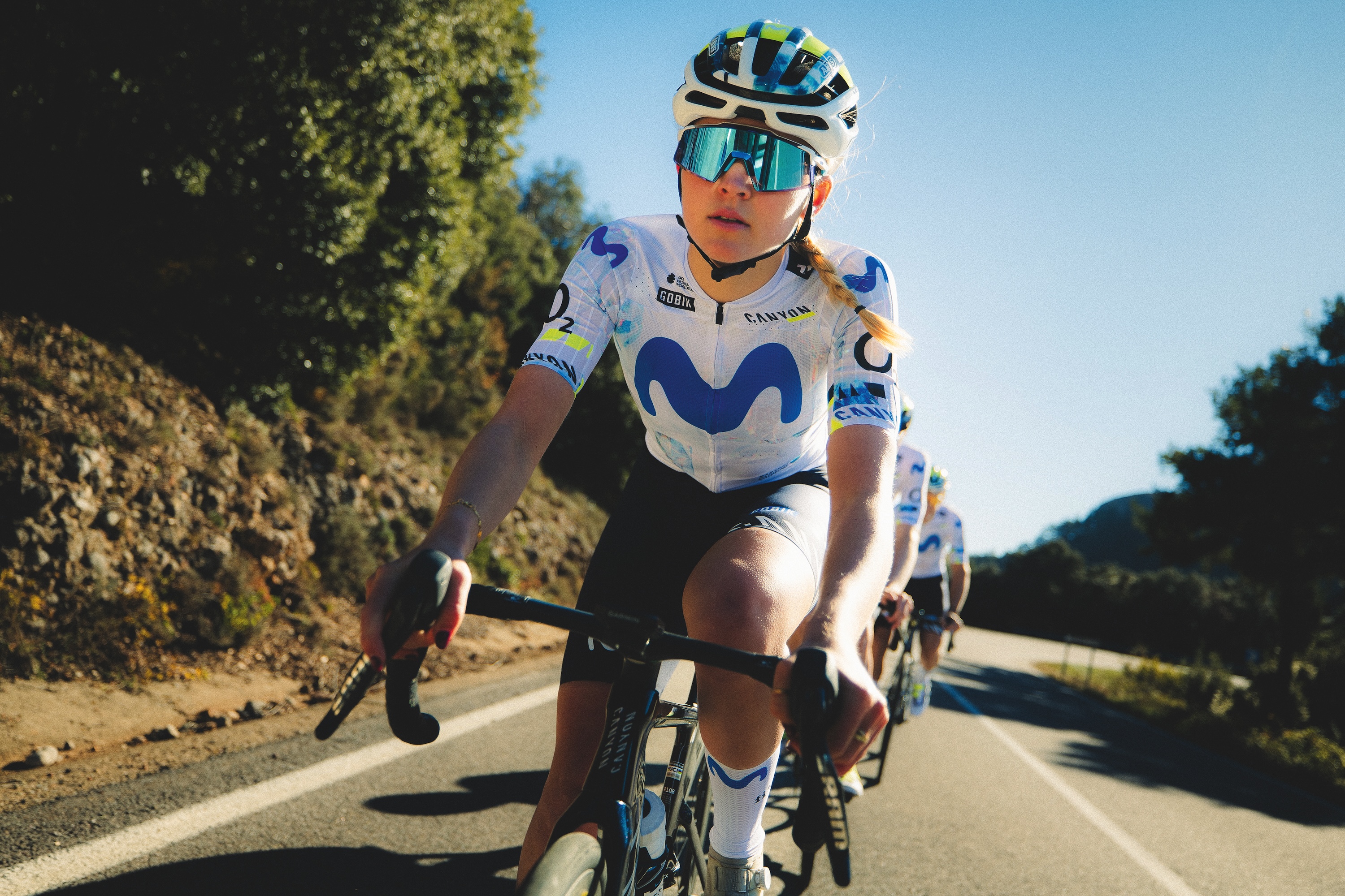
From a distance at least, there are no words to read on this kit. And yet it could only ever be the Movistar kit. It has achieved that rare status that all kit designers aspire to – iconic. Possibly the sartorial embodiment of the phrase 'don’t mess with a good thing', Movistar's kit changes every year, somehow while barely changing at all. The team's women's squad are doing it justice too – now it's just down to the men to pull their weight and get it seen. JS
Special mention: FDJ-Suez
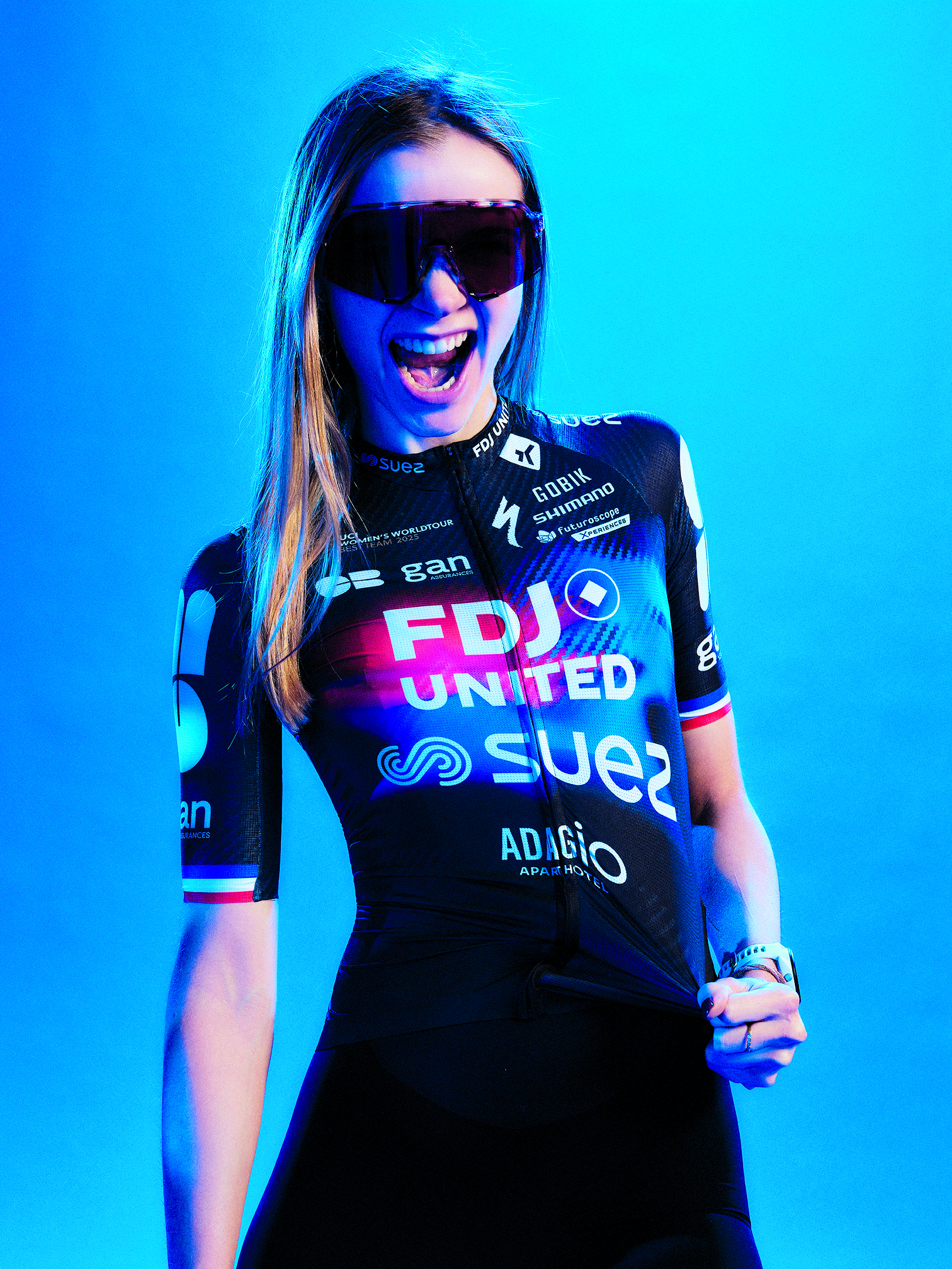
Crammed with branding and daubed with primary colours, FDJ-Suez has scraped into the 'Classy Understatement' club thanks to a trump card that few can argue with: it's mainly black. It's hard to argue with a black cycling kit, at least for sleek and stealthy looks, and there might just be a few kit designers, still smarting from being given ‘Corporate Overload’ status, who are looking at this and thinking, 'Black. Next year it's black.' JS
Bold and Brave
Winner: Jayco AlUla
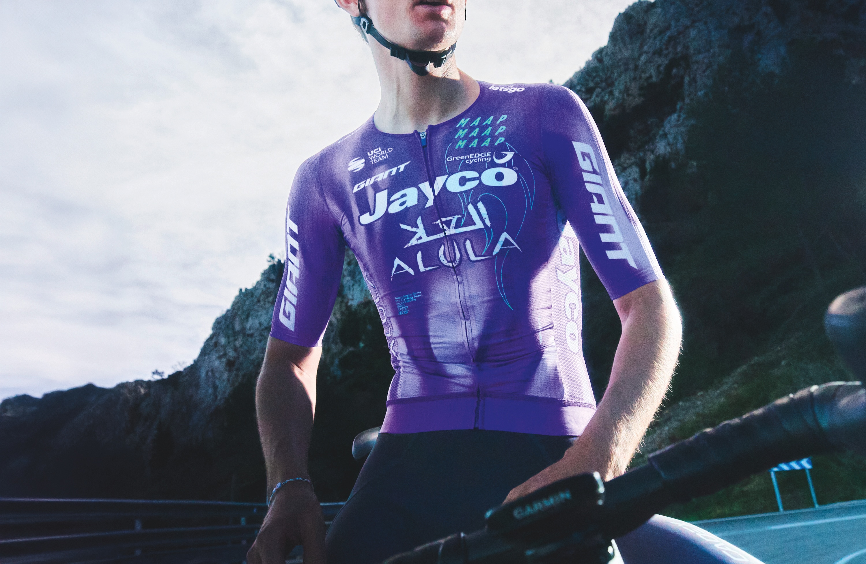
In a peloton still riddled with boring kits, it doesn’t take much to be bold in a bland bunch. But Jayco AlUla, in collaboration with MAAP, have delivered another unique design for 2026. Returning with another purple kit, white flames now rip up the torso of the jerseys. Although they won’t be seen in races, the socks are where the real party is, this time purple flames licking the toes. If not enough of a departure from the 2025 kit to be totally brave, this kit certainly is bold. ME
Runner-up: Red Bull-Bora-Hansgrohe
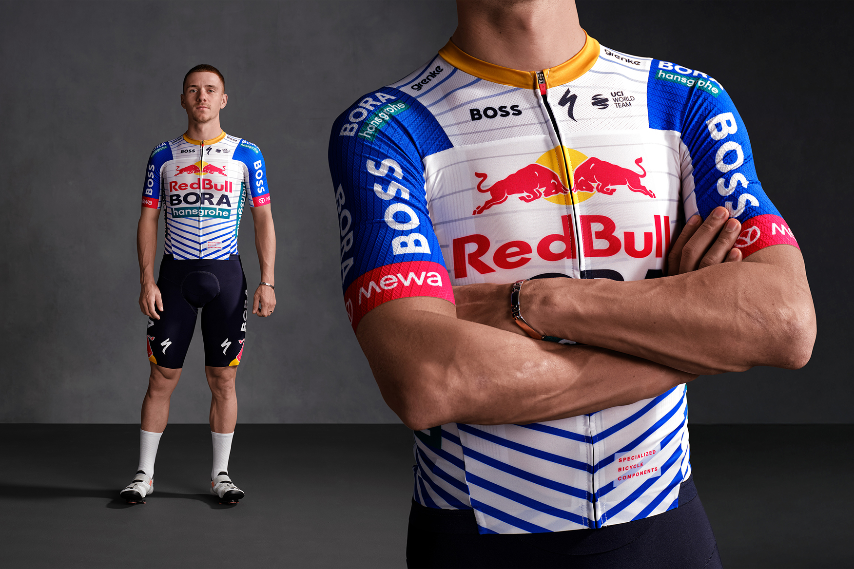
Primary colours abound in this sleek kit from Red Bull-Bora-Hansgrohe, which, while perhaps slightly uninspiring, will certainly stand out on race day. A lesson in simple, impactful design, the jersey is bold – not beautiful – and testament to the power of punchy branding: what’s cooler than a pair of red bulls dueling in front of a sun? Maybe all it takes to make a great kit is some bold typeface and your kids’ poster paints. ME
Special Mention: Unibet Rose Rockets
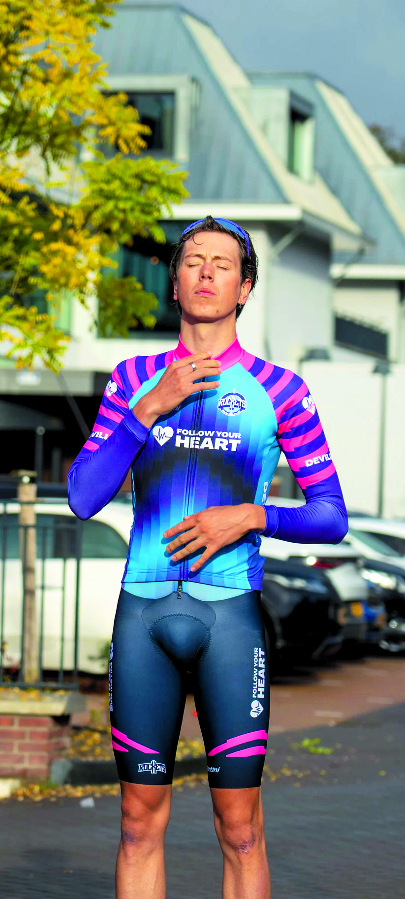
This rogue ProTeam contender might not have won this award, but it’s worthy of its place on the page. Blue merges, pixellated, into a Jayco AlUla purple, with pink stripes ribboning the sleeves. The colours of this kit feel more Lazy Town than pro peloton (that’s a good thing), but a few fumbles on the way to design innovation are bound to occur. The Rockets’ latest spacesuit walks a fine line between garish and cute – and we’re here for it. Truly brave design isn’t afraid to be a little ugly. ME
Corporate overload
Winner: Solution Tech Nippo Rali
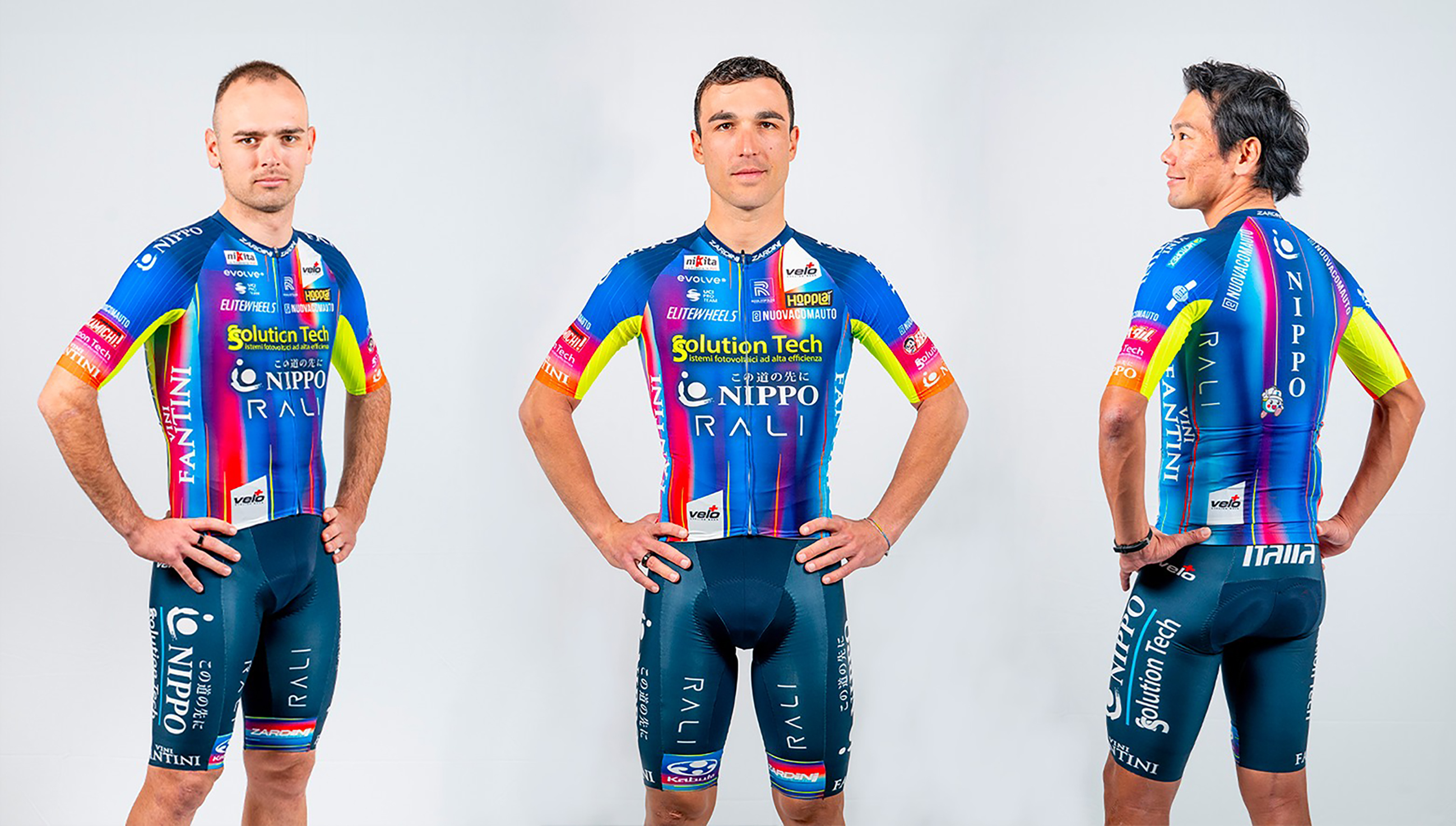
Sponsor-cramming apprentices take note: this is how it’s done. The team formerly known as Solution Tech-Vini Fantini, a stalwart in this awards category, has delivered the goods once again. This year’s get-up features no fewer than 10 different sponsors on the front of the jersey, and five on each sleeve. The result is a kaleidoscopic sensory overload, the fabric equivalent of Times Square. It’s a Pop Art masterpiece of which Andy Warhol himself would be proud. TD
Runner-up: Lidl-Trek
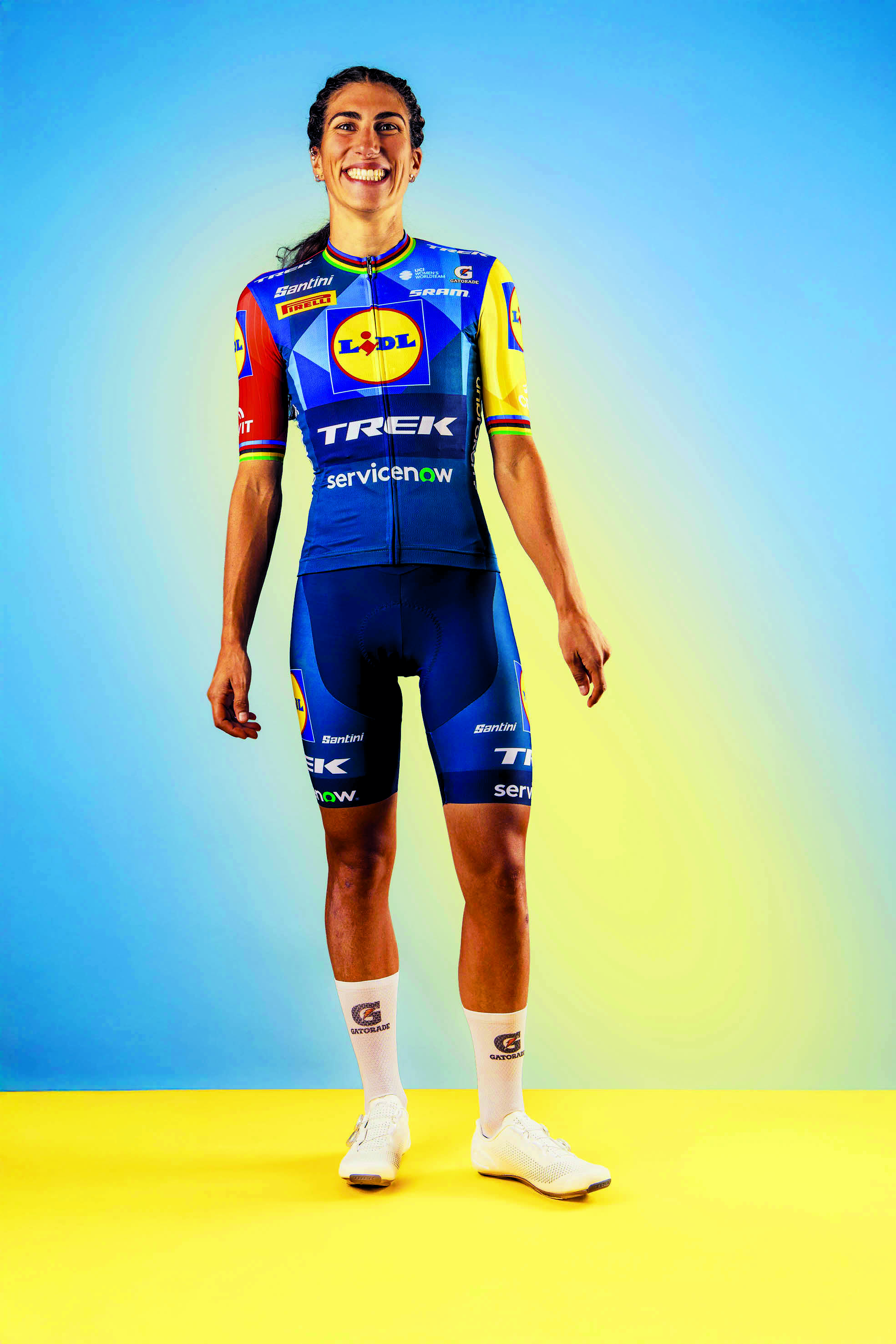
This kit is so Lidl-branded, it almost emanates the supermarket’s scent of fruit, vegetables and cardboard boxes. Listen carefully and you’ll hear the distant beeps of self-checkout scanning. Lidl’s logo isn’t the prettiest (why is the ‘i’ like that?), but that hasn’t stopped Lidl-Trek plastering it everywhere – one on each sleeve, the same on the legs, and then slap bang in the middle of the chest. Yes, it’s cool, but that’s only because Mads Pedersen wears it. Don’t think you’d be able to pull off full Asda lycra on the club ride. TD
Marmite
Winner: Ineos Grenadiers
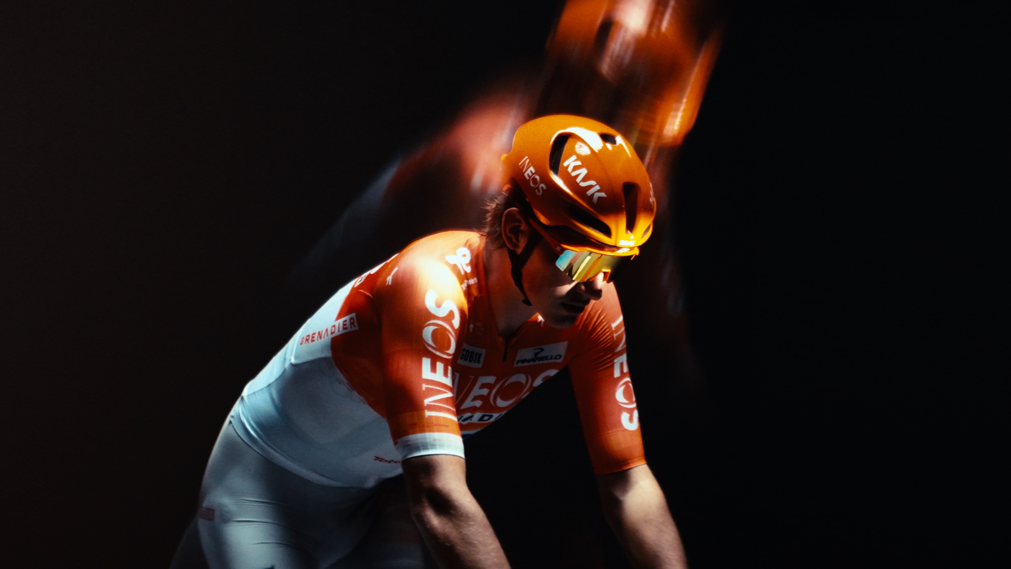
Ineos Grenadiers have released perhaps the biggest love-it-or-hate-it kit of the century, and if the social media reaction is anything to go by, most fans are in the latter camp. We’ll start with the elephant in the room: the white shorts – cycling’s biggest taboo, and these greyish ones could use a scoop of Vanish. The no-nos don’t stop there, though. Note the sponsor names in slapdash white boxes, and the black bib straps that peak through the jersey’s translucent bottom half. It’s an instant classic, but not for the right reasons. The decision to not wear the white shorts for a few months in Europe is a blessing. TD
Runner-up: NSN Cycling
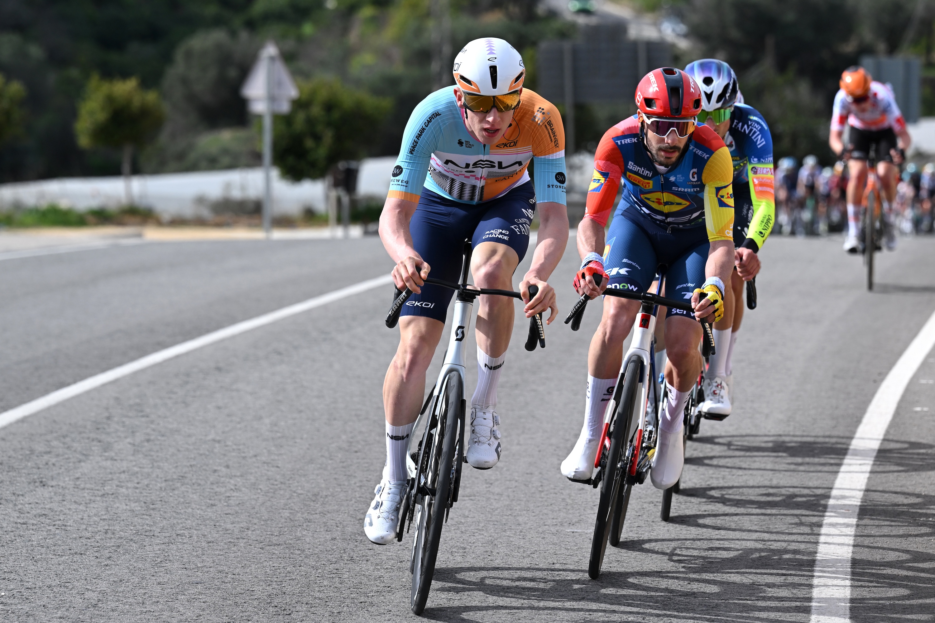
NSN Cycling, the team born out of Israel-Premier Tech, have gone abstract with their debut kit. There are triangles and squares, as well as lines, both straight and squiggly, all in hues of blue, orange and black. The patterns are said to be reminiscent of contemporary Barcelona, the team’s home city. But you’ll have to excuse us for not spotting the Salvador Dalí or Joan Miró undertones. We’re into the colour palette, though, which pops like a freshly-served seafood paella. TD
If it ain’t broke
Winner: Cofidis
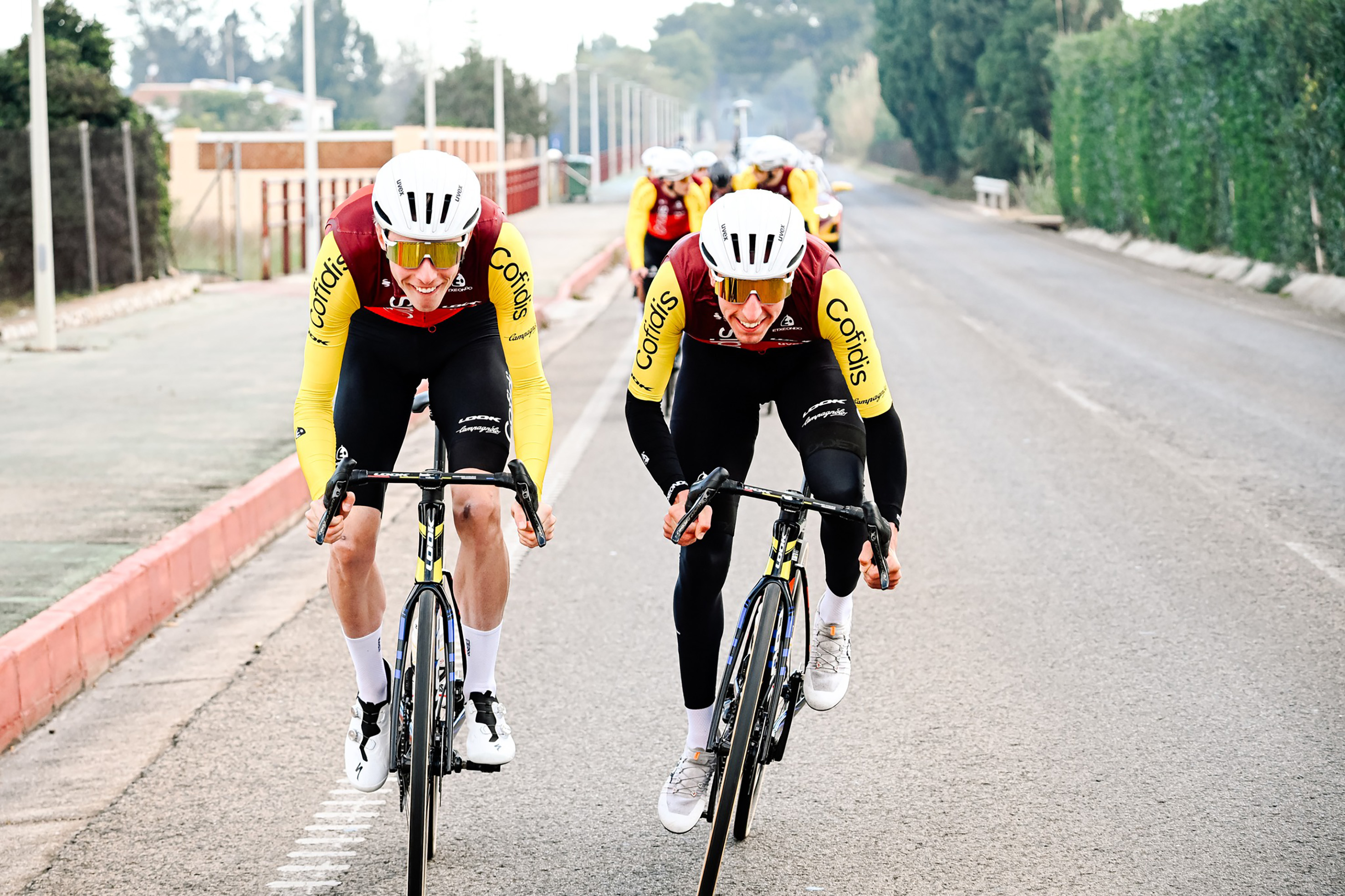
Even the most fervent spot-the-difference fans might struggle to distinguish this Cofidis design from last year’s. We’ll put you out of your misery: there are two tiny text swaps – sponsor Uvex takes Ekoi’s place, while the UCI WorldTeam logo has been relegated to ProTeam. Everything else is the exact same. For a French team, it’s got a rather Spanish hum to it. Now all the riders need to do is get their mustard-yellow sleeves in the air and restore their place in cycling’s top ranks. TD
Runner-up: Visma-Lease a Bike
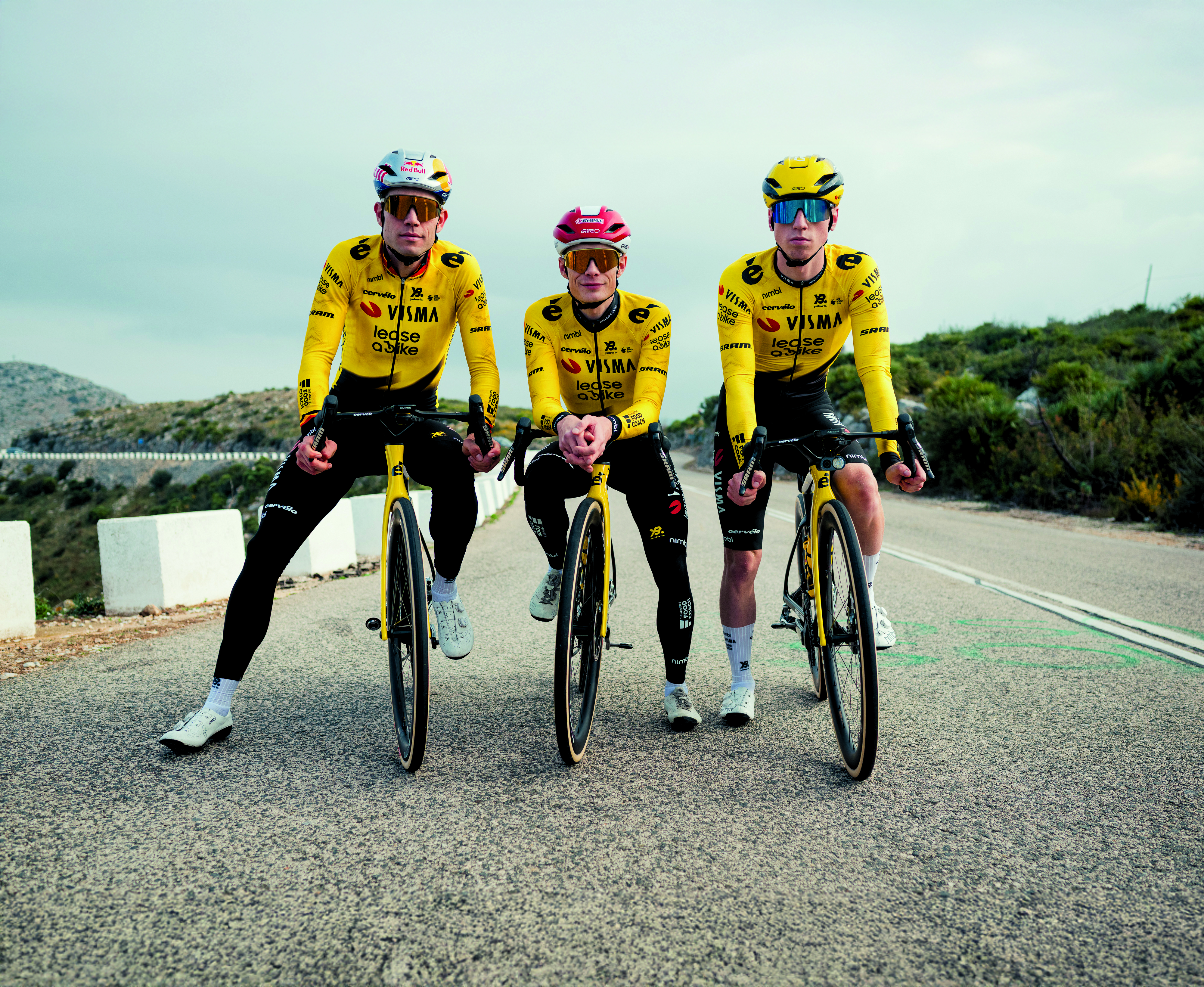
Three things are certain in life: death, taxes, and Visma-Lease a Bike wearing an inoffensively yellow kit. This latest offering is much like last year’s, which was much like the one before that, and… you get the picture. Why always yellow and black? Well, the team like to refer to themselves as the beehive, their riders the bees who work busily in races. For 2026, a small design shift from a honeycomb pattern to two barbed spikes suggests a change in approach: no more sweetness, it’s time to swarm and sting. TD

Adam is Cycling Weekly’s news editor – his greatest love is road racing but as long as he is cycling, he's happy. Before joining CW in 2021 he spent two years writing for Procycling. He's usually out and about on the roads of Bristol and its surrounds.
Before cycling took over his professional life, he covered ecclesiastical matters at the world’s largest Anglican newspaper and politics at Business Insider. Don't ask how that is related to riding bikes.
You must confirm your public display name before commenting
Please logout and then login again, you will then be prompted to enter your display name.


